GPT Image 2.5 包装设计提示词:8组品牌包装创意
包装上的字不用一开始就塞满。先看清袋子或盒子的形状、主色和正面布局,才容易判断这个方向值不值得继续。AI 包装设计适合用来做这一步:把几句想法变成可比较的外观提案,再交给设计师细化。
下面这8组 GPT Image 2.5 包装设计提示词,分别处理单品识别、瓶盒搭配、系列区分、纸套包裹和开箱展示等问题。做品牌提案、准备新品包装或与供应商沟通外观时,可以按包装类型挑选。每组都有可复制的英文提示词、对应效果图和修改要点;生成的图片用于讨论设计方向,不能代替印刷稿。
一、包装设计提示词里,先确定容器和正面信息
“高级、简约、有质感”很难说明你到底要哪种包装。把要求写具体会更有用:是自立袋还是纸盒?要保留现有瓶型,还是从零探索容器?正面最先看到的是产品名、品牌名,还是一幅插画?
已有实物包装时,上传正面清晰、轮廓完整的照片,并要求保留外形、开口和比例。下面的例子从文字生成概念图;若要套用到现有包装,在提示词开头补上:“Use the uploaded package photo as the structural reference. Preserve its silhouette, closure, proportions and visible seams. Change only the surface artwork.” 这句话的意思是只改表面设计,不重新设计容器。
还没有包装样品,也可以先比较外观。先固定容器类型,再试两种配色或两种图案,别在同一轮里同时换瓶型、文字、材质和背景,否则很难判断自己喜欢的到底是哪一项。
可以在 PixPix 的 GPT Image 2.5 页面输入下面的提示词。有包装照片就一并上传;没有照片则按文字描述生成。文中的插图是原创 AI 概念示意,不是 GPT Image 2.5 的实测结果,也不表示包装已打样。
二、单品包装创意:让产品名和容器互相配合
1、咖啡自立袋包装提示词:先做好正面识别
咖啡袋正面不必同时展示产地故事、风味描述和所有参数。第一版可以只放产品名,再用大色块区分设计方向。这里的重点是袋子站得住、拉链位置清楚,文字没有跨到褶皱上。
Create a photorealistic packaging concept for one upright resealable coffee pouch. Use a warm ivory matte surface with a bold burnt-orange lower panel and a small cobalt-blue circle. Print only the word “COFFEE” in large, clean dark lettering on the flat front area below the zipper. Keep a believable sealed top, zipper line, side gussets and stable flat base. Show the full pouch from a slight three-quarter angle on a pale blue studio surface, with crisp soft shadows and generous space around the package. No extra words, brand logos, coffee beans, badges, barcodes or props. Vertical 4:5 composition, sharp paper texture and realistic folds.
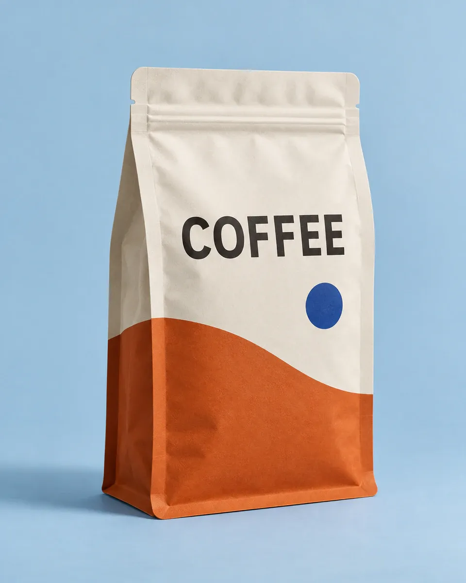
象牙白与橙色咖啡自立袋,产品名位于拉链下方的平整区域
如果生成结果把“COFFEE”挤到封口上,直接要求“Move the word COFFEE lower, entirely below the zipper. Keep the pouch shape and colors unchanged.” 不必为这一个排版问题重写整段提示词。
2、护肤品瓶盒包装提示词:统一瓶身和外盒的视觉
瓶子与盒子放在一起时,先看它们是否像同一个系列。这里保留相同的短字标和色带,瓶身留白多一些,纸盒承担更完整的正面图形。
Design a photorealistic skincare packaging concept with exactly one frosted pale-sage cylindrical pump bottle and one matching closed rectangular carton beside it. Both packages use the exact words “DAILY CARE” in dark green, with the same narrow terracotta color band near the lower third. The carton is slightly taller and wider than the bottle, with enough apparent room to contain it. Show the bottle front and the carton front plus one narrow side. Keep the pump physically plausible and the bottle label aligned with the carton typography. Place them on a warm ivory studio surface with angled morning light. No extra products, ingredients, claims, quantities, certification symbols or readable small print. Horizontal 3:2 composition, refined commercial photography.
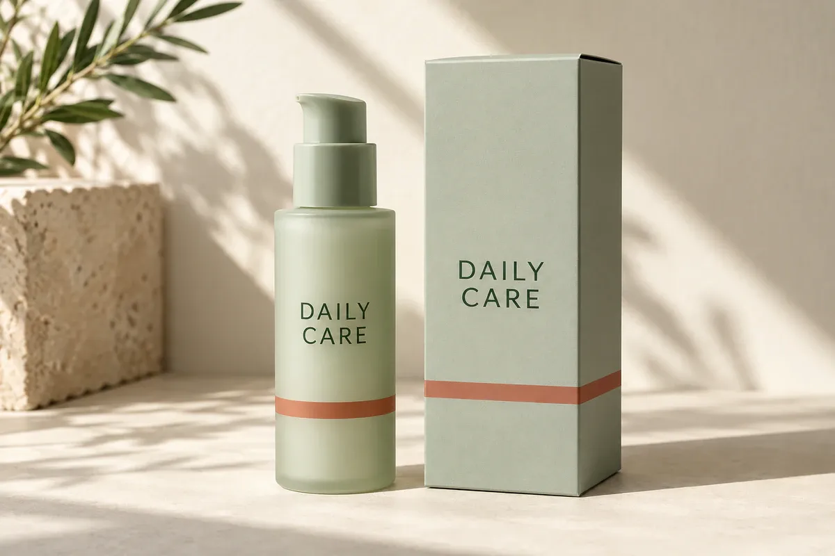
浅鼠尾草绿护肤瓶与外盒使用相同字标和陶土色带
要改配色时,先保存这一版的瓶型与排版,再用 PixPix 产品换色制作候选颜色。换色后仍要核对瓶型、泵头和字标是否保持原样,避免把意外变化带进下一版。屏幕效果只用于选方向,最终颜色仍要通过实际材料上的打样确认。
3、巧克力纸套包装提示词:看清图案怎样绕过边缘
纸套是包在内包装外的一圈纸,不等于另加一个完整盒子。这个例子用侧面露出的深棕色内包装,帮助判断纸套的覆盖范围。
Create a top-down editorial packaging photograph of one rectangular chocolate bar in a dark-brown inner wrapper, fitted with one snug cream paper sleeve around its middle. The inner wrapper remains visible at both short ends. The sleeve carries a simple cobalt-blue botanical line drawing that wraps cleanly over the long side edges, plus only the words “DARK CHOCOLATE” on its flat top face. Show subtle folded paper edges and a believable thin sleeve, not an outer carton or a floating label. Place the single wrapped bar diagonally on a full-bleed warm peach background, with a small natural cast shadow. No unwrapped chocolate, crumbs, ingredients, seals, percentages or additional text. Square composition, crisp paper detail.
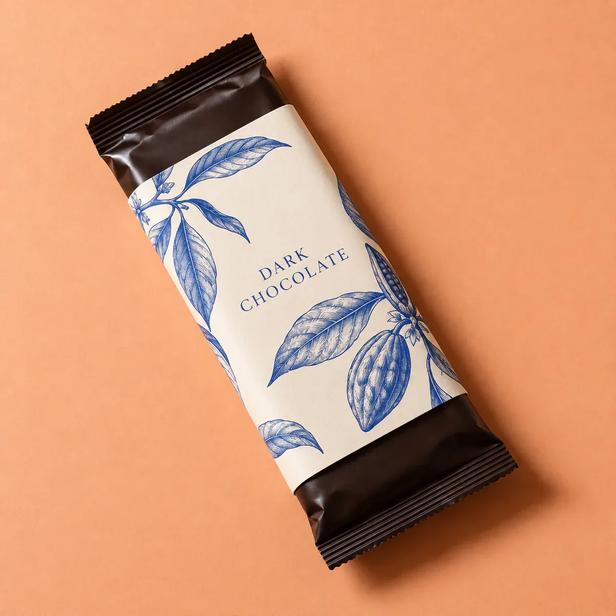
奶油色巧克力纸套包住中段,两端露出深棕色内包装
放大看两个长边:图案应当随纸面转向,不能像贴在画面上的平面贴纸。若两端都被封住了,这一版就没有表达出纸套结构,需要重新明确“inner wrapper visible at both short ends”。
三、系列包装与材质提案:把变化控制在一两处
4、茶罐系列包装提示词:换口味,不换整套版式
三个口味可以共享罐型、字体和文字位置,再用色带与图案区分。先做这组并排图,比单独生成三个风格各异的茶罐更方便检查系列感。
Create one front-facing packaging lineup containing exactly three identical cylindrical tea tins, equally spaced and the same height and diameter, with matching flat metal lids. Use warm off-white bodies and one consistent dark serif typeface at the same position and size. The left tin says “GREEN TEA” with a sage-green lower band and a simple leaf symbol; the middle says “BLACK TEA” with a terracotta lower band and a small sun symbol; the right says “MINT TEA” with a muted blue lower band and two slender leaf shapes. All lettering stays on the visible front surfaces. Use a clean ivory seamless background, evenly lit like a design presentation photograph. No extra tins, packaging boxes, claims or decorative props. Wide 16:9 composition, sharp and orderly but not a digital flat illustration.
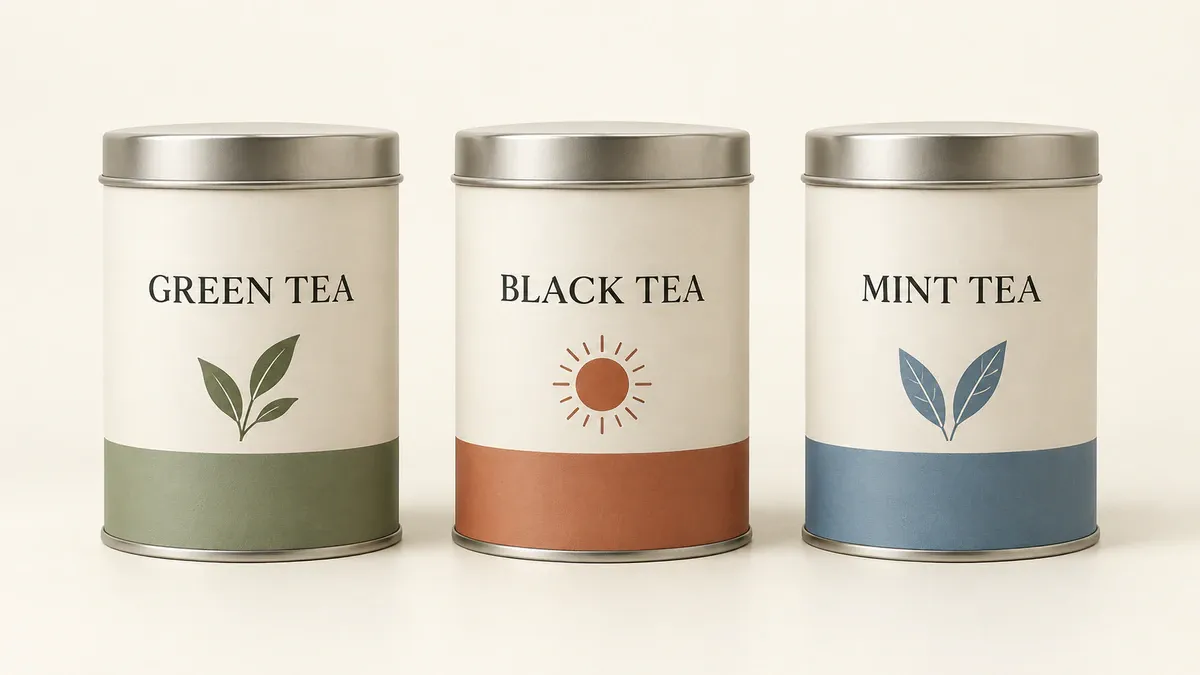
三只茶罐保留相同罐型和文字位置,用色带与图案区分品类
审核时把口味名称暂时遮住,看罐型与版式是否还一致。接着核对颜色与名称的对应关系。如果只有一只罐子的字跑偏,限定修改那一只,不要让模型重新安排整个系列。
5、香薰蜡烛包装提示词:用近景看纸张与瓶身的搭配
磨砂玻璃、纸面纹理和细小的金属色文字都容易被做得过亮。与其堆满金色装饰,不如先看一只烛杯与一个盒子的材质是否协调。
Create a close but complete studio packaging photograph of exactly one unlit candle in a smoky amber glass jar beside one closed rigid paper box. The box has a deep plum, lightly textured paper surface and a small restrained gold-toned title reading “SLOW EVENING”; the jar uses the same words on a small cream label. The box is visibly large enough to contain the jar. Show realistic glass thickness, a level ivory wax surface and one centered wick. Use a burgundy background with soft side lighting that reveals paper grain without glossy plastic reflections. No flames, flowers, extra jars, metallic gradients covering the whole box or additional words. Vertical 4:5 composition, full objects in frame, tactile and understated.
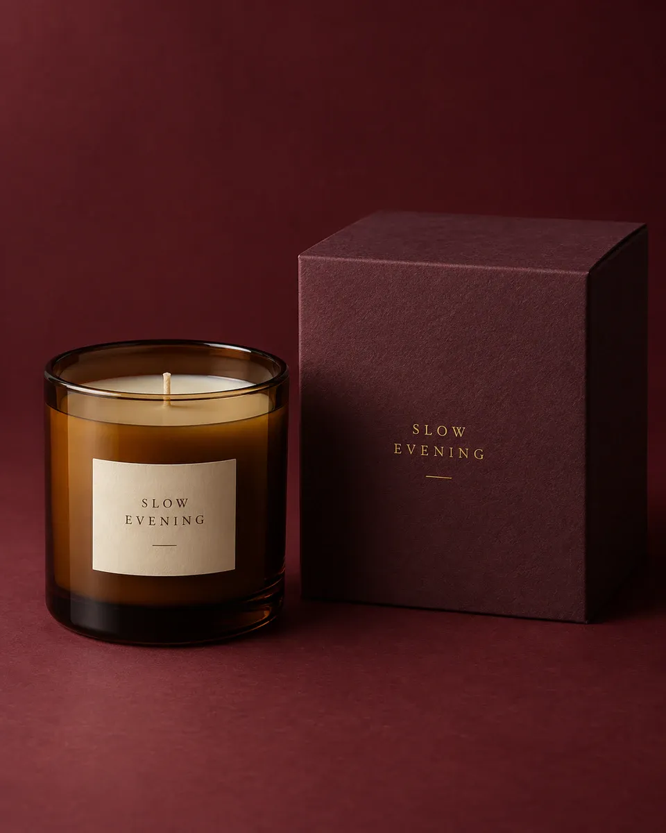
琥珀色烛杯搭配深紫色纸盒,侧光呈现玻璃和纸面的不同质感
图片里的金属色只能表达想要的视觉。是否采用烫金、怎样处理细字和纸面纹理,要由设计师与供应商结合实物样品确认。不要根据这张效果图直接承诺工艺结果。
四、纸盒包装的内外展示:正面信息、开箱与内托
6、服装快递盒包装提示词:把品牌信息放在开箱时看得见的地方
有些外箱需要保持简单,开盖后再出现问候语和品牌色。这个例子把短句放在内盖,薄纸包住衣物,不用额外道具制造“开箱氛围”。
Create a realistic three-quarter overhead photograph of one open kraft corrugated apparel mailer box. The lid is attached at the back with a believable fold, side flaps and locking tabs. Print the exact words “GOOD THINGS INSIDE” once, centered on the inside lid in cobalt blue. Inside the box is one folded cream T-shirt, partially covered by a single sheet of blue tissue paper folded neatly at the sides. Keep the shirt visibly inside the box and the tissue thin and flexible. Place the box on a pale warm-gray studio surface with soft daylight. No hands, ribbons, thank-you cards, extra clothing or outside labels. Horizontal 3:2 composition, full open lid and complete box visible.
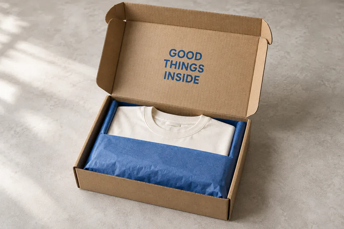
服装快递盒打开后露出内盖短句,蓝色薄纸覆盖部分折叠衣物
先检查盒盖与盒身是不是连着,再看折叠衣物有没有穿过盒壁。文字漂亮但结构接不上,这张图仍然不适合拿去沟通包装。
7、数码配件纸盒包装提示词:分清正面标题与侧面信息
数码包装容易被生成一堆看似专业、实际无法核对的小字。概念阶段可以先只确定信息放在哪里,把接口数量、功率和认证留到有确认资料后再排。
Create a photorealistic packaging design concept for one compact desktop charger carton, shown from a three-quarter angle so the front and right side are visible. Use a pale warm-gray carton with a bold ultramarine block across the lower front. On the front, place only the title “DESK CHARGER” and a small simple silhouette of a compact rectangular charger, with no visible ports or technical details. Keep the right side plain except for two narrow decorative blue rules near the base, clearly graphic accents rather than text. Show crisp folded carton edges, realistic thickness and a closed top flap. Use a cool gray studio background and subtle shadows. No power ratings, compatibility claims, certification marks, QR codes, barcodes or fake tiny writing. Horizontal 3:2 composition, full box visible.
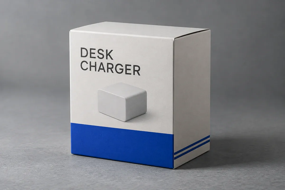
数码配件纸盒正面保留产品名和简化轮廓,侧面没有虚构参数
这里的轮廓只用于占位。确定方向后应换成真实产品的图片或准确绘图,不能把 AI 猜出来的外形当成商品信息。若画面出现了条码或认证图标,要求移除,不要因为“看起来完整”就保留。
8、双件礼盒包装提示词:固定数量与内托位置
礼盒概念图最容易出错的是数量。先明确装哪两件东西、各有几个,再让内托围着商品安排位置。
Create a refined overhead packaging photograph of one open rectangular botanical soap gift box with its separate lid placed behind it. The box contains exactly two rectangular soap bars in two separate snug compartments, each bar wrapped in cream paper with a simple dark-green leaf drawing and no words. A straight central divider separates the compartments. Use a muted forest-green exterior and a pale cream paperboard insert with realistic folds. The lid carries only the title “BOTANICAL SET” in cream lettering. Both bars must sit fully inside their own compartments, with no overlap and no extra products. Place everything on a light warm-stone surface, full-bleed background, with soft natural shadows. No flowers, loose leaves, ribbons, fillers or hands. Wide 16:9 composition with the full box and lid visible.
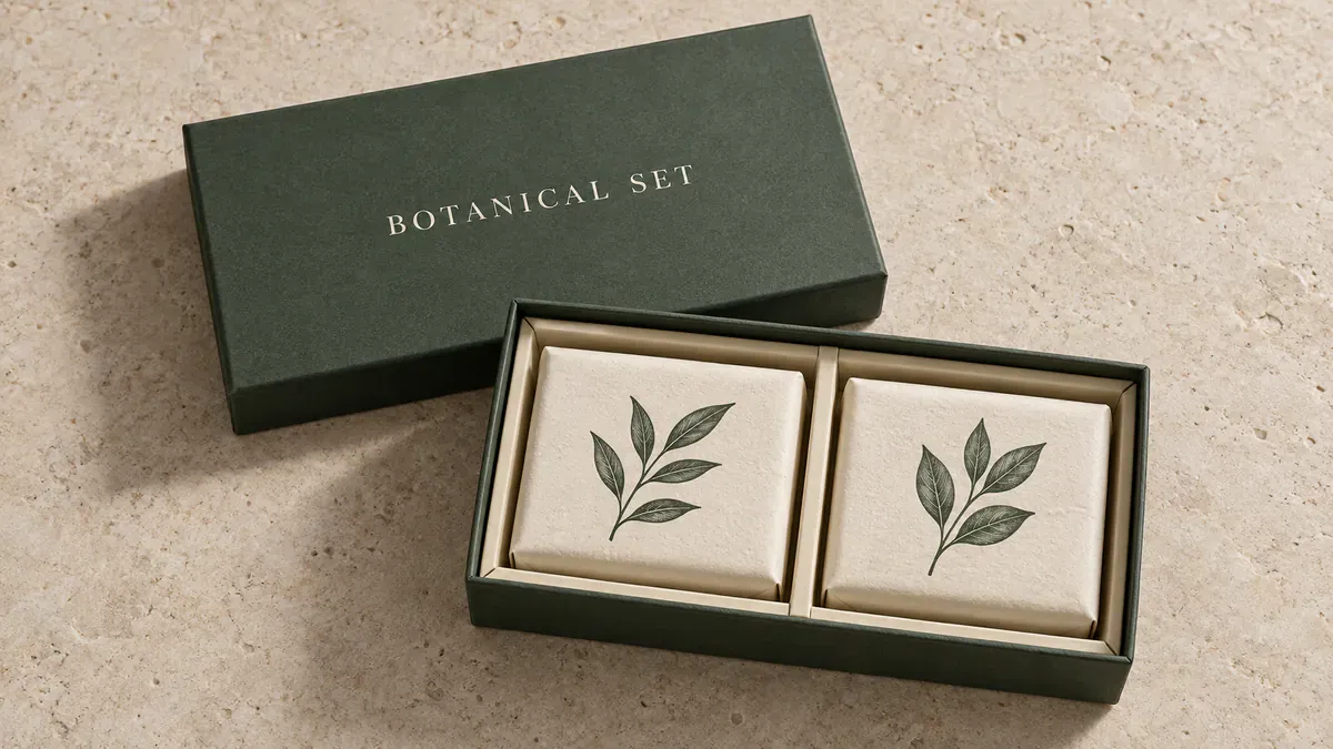
双件植物皂礼盒用中央隔板分出两个独立位置,盒盖单独放在后方
看图时按实物清点:两件商品、两个容纳位置,一个都不能多。效果图不能验证内托的实际松紧;给供应商打样时,还需要每件商品的真实尺寸。
五、从 AI 包装效果图到设计交接,要补齐什么
选中方向后,保留那张图,再补一份明确的修改说明。例如:“保留咖啡袋的象牙白与橙色分区,缩小蓝色圆形,产品名整体下移。” 一次改动尽量集中在同一件事上,便于对照前后版本。
给设计师或供应商的资料不能只有一张图片。下面几项决定了概念能否继续往下做。
资料 | 需要说清楚的内容 |
|---|---|
选定的效果图 | 哪些颜色、图案和布局要保留;哪些只是占位 |
实物与尺寸 | 装什么、装几件、商品长宽高、已有容器规格 |
供应商刀版 | 标明裁切、折叠位置的平面模板;使用对应盒型与尺寸的版本 |
正式文字与图形 | 品牌原稿、准确产品资料,以及确认过的条码、成分或其他必要标识 |
材料与打样要求 | 纸张或容器样品、希望实现的颜色与表面效果,以及需要实物确认的细节 |
刀版不是把立体效果图压平就能得到的。Packhelp 的设计流程也是先选择产品与尺寸,再下载对应的平面模板。设计师需要把文字与图案放进实际刀版,处理折线、裁切位置和出血——也就是裁切线外延伸的图案区域。最后用实物样品检查装配、颜色和可读性。
六、AI 包装设计提示词常见问题
1、怎样把自己的品牌 Logo 加进包装概念图?
准备清晰的 Logo 原文件或参考图,写明放在包装哪一面、占多大位置,并要求保留图形与字形。生成后对照原稿检查,不把近似重绘当成准确复现。正式排版应使用原始 Logo 文件,不能从效果图里截取一个模糊版本。
2、这些英文提示词能用来做中文包装吗?
可以,把引号内的展示文字换成需要的中文,并写明只显示这些字;其他关于容器和构图的描述可以保留。先用短产品名判断排版,逐字检查生成结果。成分表、说明文字等长内容,留到正式设计文件中用可编辑文字排入。
3、包装概念图可以放到商品详情页吗?
如果是在介绍尚未定稿的设计,应清楚标注为概念图,不把它当作实际发货包装。用在销售页面时,外形、数量、颜色和文字都应与实际商品相符。包装已经确定后,优先用真实样品制作展示图,避免让顾客误解会收到什么。
七、参考资料

为电商团队打造的 AI 出图工具
面向上新、投放和活动营销场景,用 AI 生成商品图、场景图、广告图与短视频素材,让内容生产更高效。