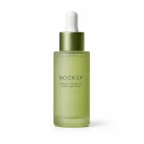
Product binding is strict: the product reference is authoritative for identity, component count, color, silhouette, connections, and natural proportions; if it conflicts with the visual reference, the product reference wins.
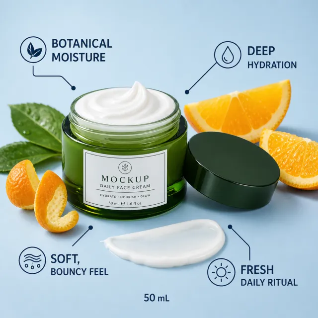
Create one standalone square 1000x1000 Amazon listing image. Use the first reference for visual direction: a fresh blue skincare background with one open green glass face-cream jar, its lid placed beside it, orange slices, green leaves, and bold percentage-style benefit callouts. Use the second reference for exact geometry: one complete green glass face-cream jar open with white cream visible, plus its matching lid beside it, with accurate glass, cap, cream, silhouette, and proportions. Replace all visible copy with English-only invented copy: “BOTANICAL MOISTURE”, “DEEP HYDRATION”, “SOFT, BOUNCY FEEL”, “FRESH DAILY RITUAL”, “50 mL”. Add subtle MOCKUP branding on the existing jar surface. Preserve the blue-and-orange editorial beauty palette, glossy product lighting, and ingredient-inspired layout. Keep the product complete and intact; do not show internal anatomy or an exploded view. No original brand, watermark, filename, contact information, copied claims, extra jars, collage, grid, split-screen, outer white frame, or stretched product.
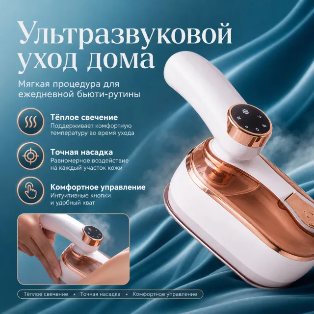
Create one square 1000×1000px Amazon Listing secondary image using the provided white-background product image as the only product reference. Rebuild this distinct layout: enlarge the rose-gold beauty device on the right, place a headline and three vertical feature labels on the left, and add a small hand-use close-up along the bottom. Preserve the source visual logic, palette, hierarchy and information density while creating a new design. Write all visible copy from scratch in Russian: headline “Ультразвуковой уход дома”; subtitle “Мягкая процедура для ежедневной бьюти-рутины”; supporting points “Тёплое свечение · Точная насадка · Комфортное управление”. Fictional parameters may fit the product category. Keep natural proportions and readable text. No original wording, numbers, logos, watermark, contact details, six-grid, independent cards, unrelated template, white border or side bars.
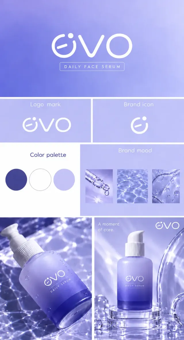
约9:16竖幅精华液品牌展示板,浅冰紫、长春花蓝与白色,细白分隔线。顶部紫蓝柔和渐变,大号白色细圆几何evo,e为内含短斜横的开口圆弧和右上独立圆点,v为圆角尖底,o为完整圆环;下有细线框DAILY FACE SERUM。第二行两格,Logo mark展示同款完整字标,Brand icon展示与完整字标首字母e一致的独立图形:右上开口圆弧、开口处上方独立圆点,以及圆弧内部从左下向右上轻微倾斜的圆头短横;三部分线条粗细协调,短横与外圆弧分离,图形为纯白色。中部左白底Color palette和深紫蓝、白、浅紫三个圆色块;右浅紫Brand mood下有滴管、水纹、透明凝胶三张小图。底部两图,左侧斜放结露磨砂泵瓶,瓶身由浅紫渐变至深蓝紫,白色泵头,白色evo字标和DAILY SERUM随瓶身倾斜,首字母e保留圆弧内部短斜横、开口和独立圆点,印刷贴合玻璃曲面;右侧同款瓶直立于透明圆形亚克力台,瓶身同款evo字标及DAILY SERUM,旁边弯曲玻璃管及水滴,左上A moment of care.,右上小号完整evo字标。焦散水光、玻璃透明度和磨砂触感细腻。
Create ONE independent Amazon listing image. Use a 1:1 square 1000x1000 px canvas with a full-bleed composition, no white border, no side bars, no collage, and no multi-panel layout. Use the visual reference only for composition, camera angle, lighting, color mood, scene, typography hierarchy, and information structure. Do not copy its original wording or graphic assets.
Use the provided white-background product image as the sole product source. Preserve its exact silhouette, geometry, parts, materials, colors, proportions, controls, labels, connectors, and accessory count. Keep the product complete, naturally assembled, and undistorted. Do not replace, merge, stretch, crop, or redesign the product. Do not show cutaway, exploded, anatomical, or internal views. Preserve any approved MOCKUP identity already present on the product image, but do not copy brands or logos from the visual reference.
Rewrite all visible copy in English with fresh, plausible, category-appropriate wording. Do not reuse the visual reference's original brand names, phrases, statistics, certifications, filenames, or source graphics. Avoid unsupported medical, legal, safety, or absolute claims. Do not include Chinese or mixed-language instructions. Do not include execution-mode notes, source names, file paths, reconstruction history, or metadata. Keep all typography legible and inside the canvas.
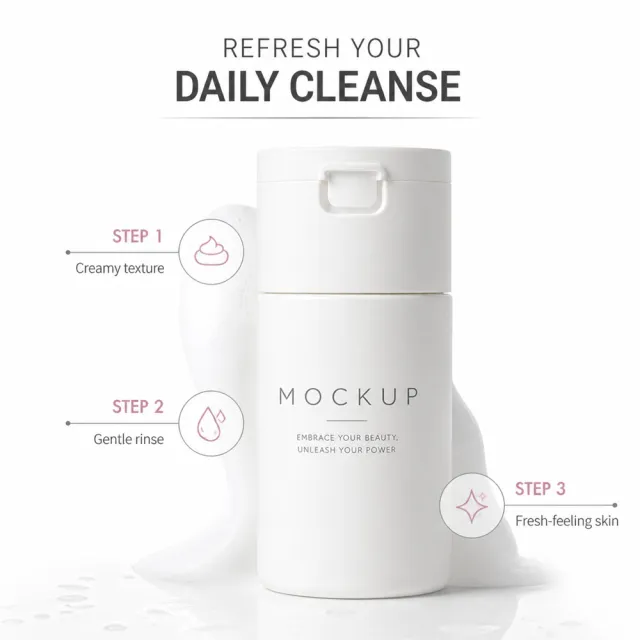
Create a clean white beauty still life centered on the cleanser jar, with a subtle creamy texture or fresh-skin cue. Use fresh copy such as “REFRESH YOUR DAILY CLEANSE”, “Creamy texture”, “Gentle rinse”, and “Fresh-feeling skin”.
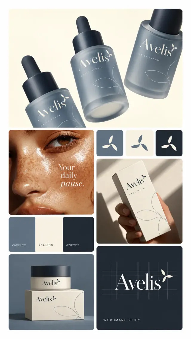
9:16竖幅高端护肤品牌规范拼板,白色窄间距与圆角分区。顶部通栏奶油背景上三瓶磨砂板岩蓝滴管瓶沿对角线排列,左右瓶局部裁切,深蓝滴管盖,象牙白高对比衬线Avelis和DAILY SERUM,字标右上有三片旋转尖椭圆叶形,瓶身细线放大叶纹。下方左列是带自然雀斑和光泽的女性面部特写,叠字Your daily pause.;三色色带标#697A8C、#F4EBDD、#202936;底部蓝底上奶油护肤罐和方盒。右列顶部三枚三叶图标反白方卡,中部手持Avelis FACE WASH奶白纸盒,阳光与窗框阴影强烈;底部深蓝字标网格卡,大号Avelis及叶形,细基线和竖向辅助线,下方WORDMARK STUDY。材质真实、色彩低饱和、字距精致。
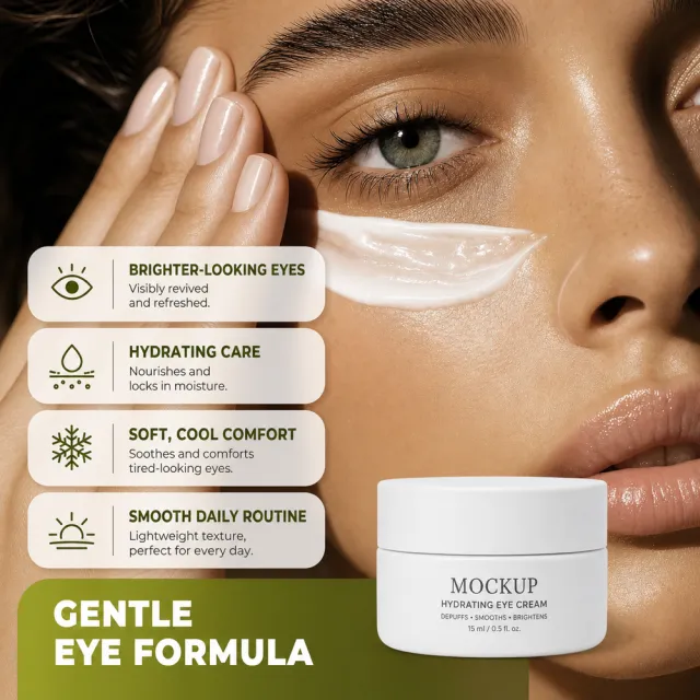
Create one standalone square 1000x1000 Amazon listing image. Use the first reference for visual direction: a close-up beauty portrait with cream applied beneath one eye, rounded benefit cards arranged on the left, a fresh green accent panel, and the product placed at lower right. Use the second reference for exact geometry: one complete white eye-cream jar with its lid, shape, label area, and proportions. Replace all visible copy with English-only invented copy: “BRIGHTER-LOOKING EYES”, “HYDRATING CARE”, “SOFT, COOL COMFORT”, “SMOOTH DAILY ROUTINE”, “GENTLE EYE FORMULA”. Add subtle MOCKUP branding on the existing jar surface. Preserve the clean skincare editorial style, natural skin texture, and green-white palette. No original brand, watermark, filename, contact information, copied claims, extra jars, anatomical cutaway, collage, grid, split-screen, outer white frame, or stretched product.
【画面任务】
生成一张完整的美容编辑主题视觉图。
【画布与画幅】
画幅约为 3:4。以下左右方向均指观看画面的左右,主体与文字在完整画幅内排布。
【主体、场景与配色】
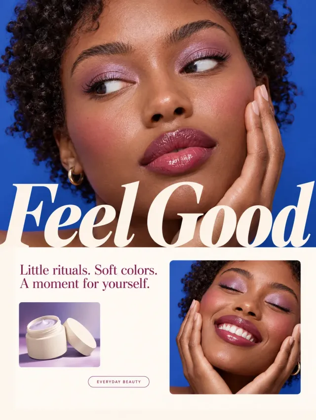
紫色柔光彩妆杂志封面,上半大图为成年黑人女性面部近景,短卷发、闪亮淡紫眼影与莓红唇妆,一手轻贴脸颊,深蓝底衬托肤色。中间巨大奶油白斜体衬线字“Feel Good”。下半米白版面,左侧小字“Little rituals. Soft colors. A moment for yourself.”和无品牌奶油罐静物,右侧同人物闭眼微笑照片。精致护肤光泽、干净编辑布局。
【构图、镜头与前后层次】
大人像约占顶部六成,大白斜体跨在上图底部;下部奶油区左放短文和小罐、右放闭眼笑脸方图,网格边距整齐。
【关键造型与空间关系】
两张为同一人物与同色眼妆,主图手贴脸与下图双手捧脸区分;护肤罐是无品牌小静物不占主画面。
【材质、光线与成像】
采用精致自然摄影与清楚的视觉分层,主体、道具与环境具有独立的前后关系。皮肤、发丝、毛发、服装和器物纹理自然,主光与接触阴影统一,画面色彩干净、细节清楚。
【文案与排版】
文字内容:「Feel Good」;「Little rituals. Soft colors. A moment for yourself.」。中文使用简体,英文大小写及标点准确。主标题、正文、小标签分区排布,主次字号有明显差异,文字边缘清晰,衬线、无衬线、手写、描边与立体效果分别按上文所述绘制。
【成图质量】
画面清晰、结构完整、边缘干净。人体手脚与身体自然连接,手指关节及持物动作合理;多图拼贴中的同一人物具有相同的发型、面貌与服装。纸纹、毛线、毛发和笔触各有细节,透明、反光与阴影具有正确的材质逻辑。不出现无关物件、额外人物、品牌Logo、二维码、平台标记、水印、随机噪点、杂色和马赛克。
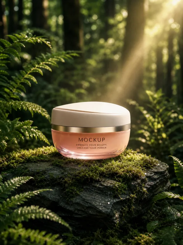
Use case: ads-marketing / product-mockup
Asset type: vertical forest skincare poster, 3:4
Input images: Image 1 is the authoritative product identity reference. Use exactly this jar without redesigning it.
Place the exact jar from Image 1 at the center of a low irregular slate pedestal covered with fresh moss and dew in a shaded woodland. Frame it with ferns and dark trunks, warm sunlight shafts from the upper right, soft mist, and background bokeh.
Preserve the jar exactly: low oval pale-coral glass body, translucent peach lower rim and curved base, narrow brushed-champagne band, softly domed matte-ivory lid with shallow off-center groove, front view, proportions, colors, and label placement. Preserve the text verbatim: "MOCKUP" and "EMBRACE YOUR BEAUTY, UNLEASH YOUR POWER". No other text.
Style: high-end photorealistic skincare advertising with realistic glass, metal, moss, slate, fern, dew, and atmospheric light.
Composition: vertical 3:4, product centered in lower-middle, foliage frames without covering label.
Lighting: warm filtered woodland light, calm natural luxury.
Palette: forest green, moss, slate, pale coral, ivory, champagne.
Constraints: exactly one jar; no poster copy; no extra logo; no watermark; keep the product identical to Image 1.
【Execution Route | Must Not Appear on Screen】
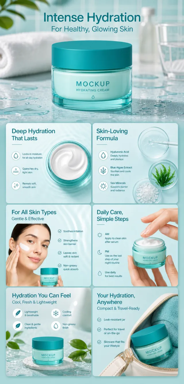
If the image-generation tool can be invoked multiple times: concatenate the sharing rules with A–F separately, and execute six times; each time, generate only one independent 1000×1000 square image, resulting in six sub‑images.
If single‑shot generation is permitted: use a 2:3 vertical canvas measuring 1200×2500, with the top approximately 30% reserved for the product’s main visual integrated into the background, and arrange A/B, C/D, and E/F in a 2‑column × 3‑row grid below. All six cards should be equal in size, with visual proportions close to 1:1. Do not use an outer 1:1 canvas, nor full‑width cards, cross‑column cards, merged cards, borders, frames, or white margins.
【Sharing Rules】
The provided product reference image serves as the sole basis for the product’s appearance, structure, color, quantity, accessories, and relative proportions. Product orientation: light cyan glass moisturizing face cream jar, dark cyan lid, and teal label; hydrating skincare with textures suitable for morning and evening routines. Products, as well as newly generated characters, animals, props, and text, must maintain natural proportions—stretching, flattening, or non‑uniform scaling is prohibited—and the background must extend fully across all four edges. The brand logo must uniformly appear as MOCKUP; remove any original branding, logos, watermarks, contact information, social media handles, platform details, gibberish, or irrelevant content. Copywriting should be concise, clear, and credible, retaining the language of the reference image, without adding unsubstantiated absolute claims or medical promises. A–F are merely control markers and must not be displayed.
【A | Core Selling Point】
Highlight the product’s most important value and its complete main subject; keep the title short and clear.
【B | Structure and Material】
Showcase the product’s key structural elements, materials, or components using close-up shots or simple annotations, adhering to the product’s intended orientation.
【C | Real‑World Use】
Generate natural human/animal figures or everyday scenes to demonstrate realistic usage, ensuring proportions and actions appear believable.
【D | Details and Steps】
Use close‑up views, step‑by‑step instructions, or flowcharts to explain operations, textures, interfaces, storage solutions, or care‑related details.
【E | Lifestyle】
Illustrate how the product seamlessly integrates into daily life scenarios such as home, commuting, outdoor activities, travel, or work.
【F | Sets and Portability】
Accurately depict the product, its accessories, quantities, and storage relationships; do not add any components absent from the reference image.
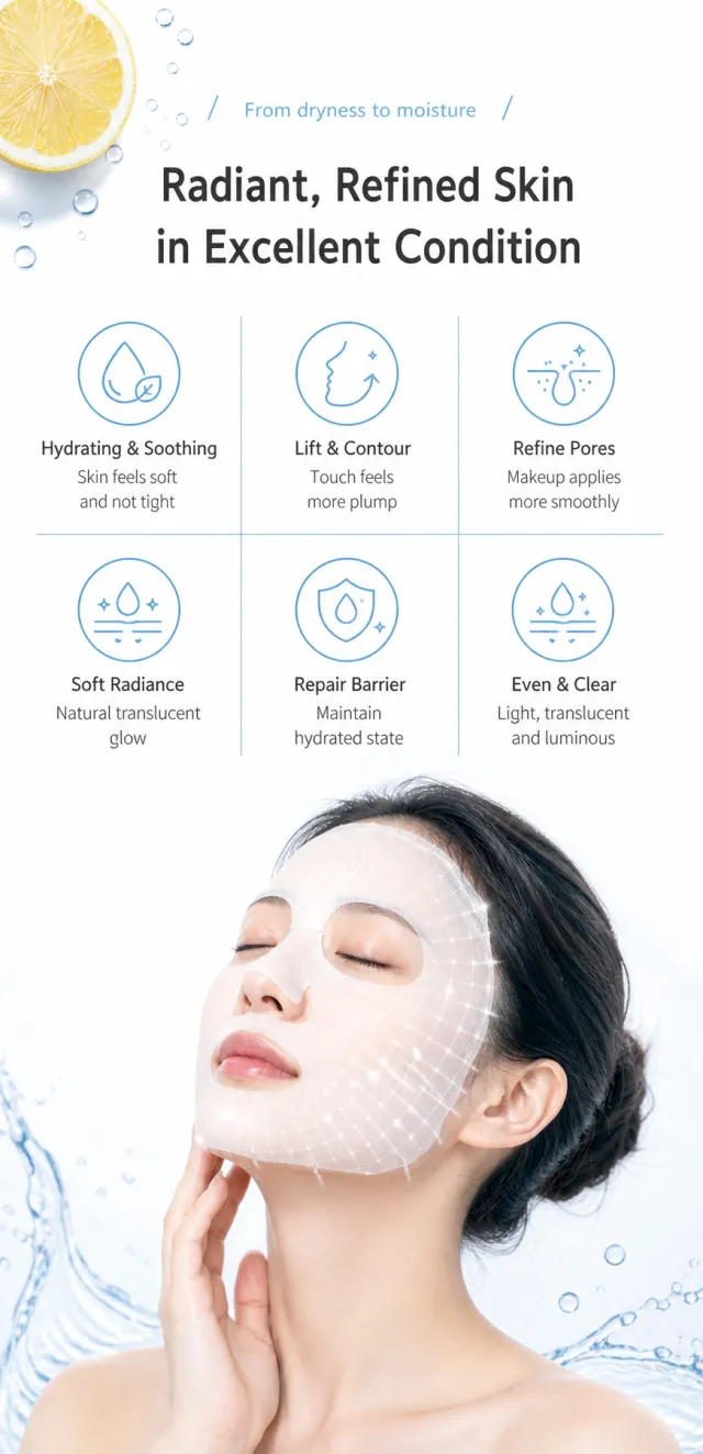
Generate a detailed poster detailing the core selling points of the Hydrating and Brightening Mask, without the packaging product.
It features a clean white background, light blue line art, and a translucent water finish. At the top are two main titles: a small guide and a centered line, with a slice of lemon and a small drop of water added to the upper left; In the middle, six blue linear icons and short sell points are arranged in a 3×2 pattern; At the bottom is a mature Asian woman with closed eyes gently applying a white mask, with restrained semi-transparent mesh light effects on her face.
Copywriting Usage:
From dry to moist
Radiant and delicate, in excellent condition
Moisturizing and soothing, skin soft and not tight
Lifting the contour for a fuller touch
Refined pores for better adherence before makeup
Soft and lustrous with a naturally radiant feel
Repairs the barrier and maintains a hydrated state
Evens and purifies the skin, lightweight, and radiant
Chinese is in Holly Black Chinese Simplified, titles are dark gray, and icons and thin lines are in light blue. Titles, six-panel grids, and three character sections are clearly zoned, with text that does not cover the face or face mask; No obvious text shadows are added.
Icons/Tags: All icons are vector styles with uniform line width, rounded, clear, and without jagged edges.
Output size: '750 x 1550px'
Avoid: brand, packaging box, medical promises, excessive smoothing, heavy makeup, exaggerated glow, garbled Chinese text, watermarks, and information crowding.
Create one continuous 1200-pixel-wide Amazon A+ detail preview on a single vertical canvas. Use exactly 6 stacked modules with natural varied heights, elegant high information density, and no white or near-white pasted separator strips. Preserve the specified composition skeleton, hierarchy, and exact copy while redesigning all people, faces, hands, water textures, fruit arrangements, ingredients, props, icons, and graphics. Do not add any brand beyond neutral MOCKUP, logos, ratings, certifications, official seals, clinical percentages, medical claims, carousel controls, watermarks, debug labels, or extra copy.
PRODUCT IDENTITY — keep one unchanged facial-oil bottle throughout: low compact rounded-square amber glass bottle; thick vertical embossed corner ribs; inset stepped shoulders and screw neck; wide matte cream-white dropper collar; terracotta-orange rounded flattened silicone bulb; transparent straight pipette ending just above the bottle floor; exact minimal cream label “MOCKUP / GLOW FACE OIL / 30 ml”. Keep neck, collar, bulb, pipette and glass proportions consistent. Do not stretch, recolor, replace, or multiply bottles unnecessarily.
GLOBAL VISUAL — premium modern skincare editorial style using amber, cream, terracotta, raspberry and muted leaf green; refined serif headlines with clean sans-serif body type; realistic glass, oil and ingredient textures.
M1 HERO — left title; right exact bottle on a newly designed shallow amber ripple surface with one matching open dropper placed nearby and no second bottle. Exact copy: “GLOW FACE OIL” / “VITAMIN C + TURMERIC” / “A lightweight ritual for soft-looking radiance.”
M2 FORMULA FEEL — top title; left exact product with a newly designed citrus, turmeric and warm-oil still life; right three custom-icon benefits. Exact copy: “LIGHTWEIGHT BY NATURE” / “QUICK-ABSORBING FEEL” / “NON-GREASY FINISH” / “SOFT, COMFORTING GLOW”.
M3 VISUAL PAIR — top title; left two newly designed close-up cheek portraits of the same dark-skinned woman labeled bare skin and after oil; right three large circular descriptive positions with no numbers. Exact copy: “A FINISH THAT LOOKS FRESH” / “BARE SKIN” / “AFTER OIL” / “DEWY FINISH” / “SOFT GLOW” / “COMFORTED FEEL”.
M4 INGREDIENTS — one high-information row of four evenly spaced translucent circular pedestals: citrus cross-section, turmeric powder and root, golden vitamin-E oil droplet, raspberries with seed oil. Exact copy: “KEY INGREDIENTS” / “VITAMIN C DERIVATIVE” / “TURMERIC” / “VITAMIN E” / “RASPBERRY SEED OIL”.
M5 HOW TO USE — left three oversized numbered instructions; right newly designed deep-brown hands holding the opened exact bottle and lifting the matching pipette vertically with one small oil drop. Exact copy: “HOW TO USE” / “1 APPLY 2–3 DROPS TO CLEAN FACE AND NECK.” / “2 PRESS AND MASSAGE UNTIL ABSORBED.” / “3 USE MORNING OR EVENING.”
M6 CLOSING — left large portrait of a newly designed Middle Eastern woman with short natural curls; center exact closed bottle among original citrus and leaves; right closing text. Exact copy: “A SOFT GLOW, DROP BY DROP” / “Finish the routine with lightweight moisture.”
FINAL CONSTRAINTS — show all 6 modules and all exact copy without bottom cropping; keep bottle fingerprints, label, glass ribs, collar, bulb, neck and pipette length consistent; use no source identities or arrangements, clinical/medical claims, percentage badges, white mechanical seams, product stretching, extra brands or random text.
以产品白底图为唯一产品身份参考,生成宽1200px、高约3200px的连续亚马逊A+详情预览。全图保持同一款无品牌日用面霜:磨砂祖母绿玻璃罐、不对称象牙白椭圆盖、细金色颈环、罐身芦荟浮雕与前方卡位式金色小挖勺。整体为乳白、芦荟绿、半透明水感与克制金色,洁净护肤编辑摄影,黑色细粗结合的无衬线标题。
依次包含六个模块:芦荟水感英雄图“ALOE-INSPIRED LIGHT CREAM”“A fresh-feel daily moisturizer”;三格“DESIGNED FOR A SIMPLE ROUTINE”,标签“FROSTED EMERALD JAR / GEL-CREAM TEXTURE / DAILY MOISTURE”;产品水感场景“LIGHTWEIGHT FEEL. CLEAN FINISH.”,标签“SMOOTH TEXTURE / FRESH FEEL / EASY LAYERING”;三步“SCOOP. SMOOTH. SEAL IN.”,标签“USE THE SPATULA / DOT ACROSS SKIN / SMOOTH GENTLY”;早晚多人场景“MORNING OR EVENING”;包装拆分“PACKED WITH INTENTION”,标签“REUSABLE SPATULA / GLASS JAR / SEPARATE COMPONENTS WHERE ACCEPTED / KEEP THE LID CLEAN”。禁止品牌、成分百分比、临床/测试/结果数字、医疗与绝对化功效、无动物实验或可生物降解等认证声明、价格、二维码、购买控件与水印;英文准确且移动端可读。
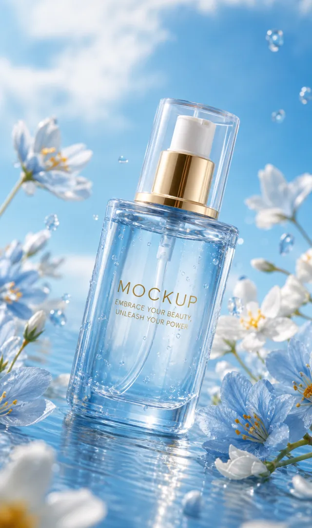
Use the supplied reference image as the sole locked product input. Preserve the product's exact appearance, structure, materials, colors, proportions, logo, label, accessories, and product-set relationship.
Create a 963:1633 photorealistic commercial product poster. Place the single blue spray bottle at a slight angle in shallow rippling water. Surround it with airy white and pale blue flowers, petals, tiny bubbles, and a bright blue sky, using cool clean sunlight and luminous reflections.
Use a polished premium advertising finish with crisp product focus, coherent perspective, realistic materials, controlled depth of field, and physically plausible lighting. Keep all decorative elements physically plausible and subordinate to the product. Keep existing product text legible when present. No poster text, watermark, extra product, unrelated logo, distorted object, changed product appearance, or unnecessary person.
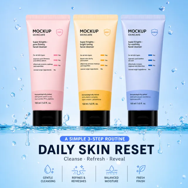
Product binding is strict: the product reference is authoritative for identity, component count, color, silhouette, connections, and natural proportions; if it conflicts with the visual reference, the product reference wins.
All three packages are the same 150 mL master tube mold: identical overall height, body width, shoulder shape, bottom curve, and black cap size; only color and label content may differ. Never depict one tube as physically larger or smaller.
Create one standalone square 1000x1000 Amazon listing image. Use the first reference for visual direction: three skincare cleanser tubes standing over clear water with a soft pastel-blue background, a centered top logo area, color-coded benefit labels, and a bold bottom headline. Use the second reference for exact geometry: the complete set of three tubes, their distinct colors, caps, silhouettes, and proportions. Replace all visible copy with English-only invented copy: “DAILY SKIN RESET”, “GENTLE CLEANSING”, “BALANCED MOISTURE”, “FRESH FINISH”, “A SIMPLE 3-STEP ROUTINE”. Add subtle MOCKUP branding on the existing tube surfaces. Preserve the calm aqua beauty palette and reflective water surface. Keep all three products complete and distinct; do not add extra containers. No original brand, watermark, filename, contact information, copied claims, face, collage, grid, split-screen, outer white frame, cutaway, or stretched products.
【Execution Routing | Do Not Display】
If the image-generation tool can be invoked multiple times: concatenate the sharing rules with A–F separately, execute six times, generating one 1000×1000 square image each time; do not submit all modules at once.
If only one image can be generated per invocation: set the aspect ratio to 2:3 portrait mode on the interface or via API, and avoid using Auto; a recommended size is 1200×1800. Arrange the images in a 2-column × 3-row grid labeled A/B, C/D, and E/F, ensuring all six modules are equal in size and maintain a 1:1 proportion. If the platform enforces a 1:1 ratio, switch to an Agent-based approach or generate each module individually.
【Sharing Rules】
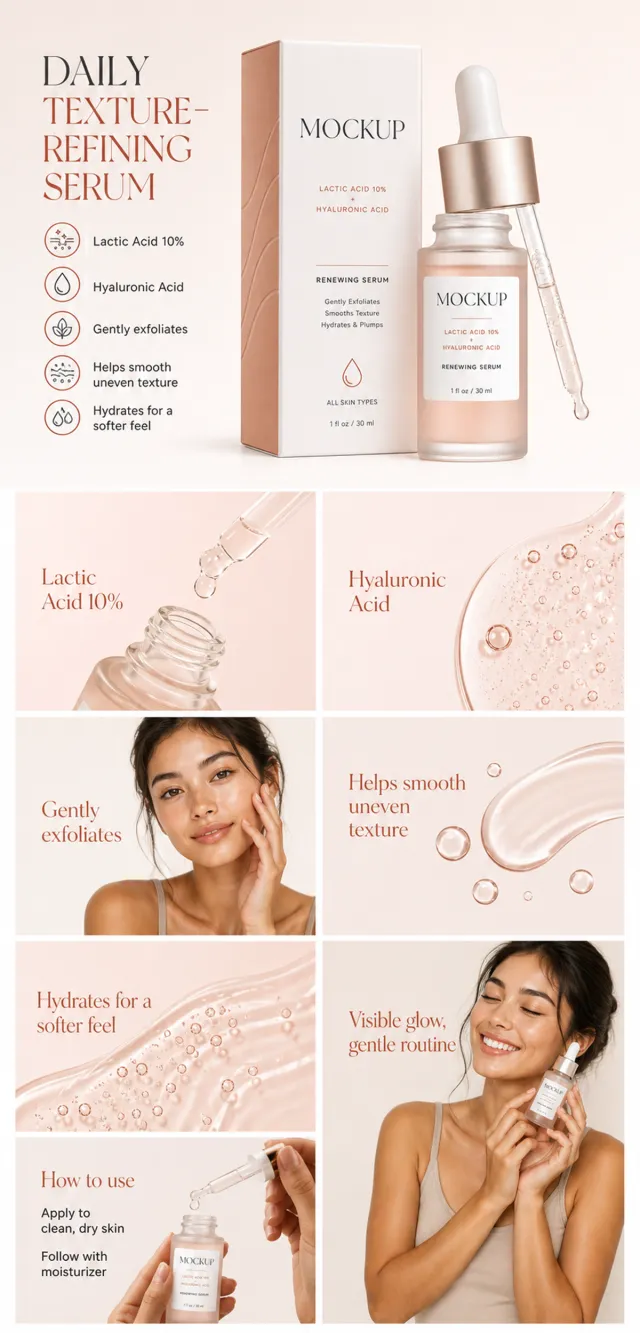
Use the provided product reference image as the sole product basis. Product: lactic acid and hyaluronic acid renewing serum. Copywriting must be in English, with brand placeholders replaced by MOCKUP only. Visuals should follow Premium warm-blush skincare ecommerce photography style, featuring cream, terracotta, and black typography. The product’s appearance, structure, color, quantity, accessories, and relative proportions must match the reference image; product, figures, icons, and props should retain natural proportions. All essential information must remain within the safe zone, with the background extending fully to all four edges. External white borders, vertical borders on left and right, transparent fill-in borders, watermarks, contact details, social media accounts, platform information, original branding, gibberish, irrelevant content, or unverified claims regarding efficacy or specifications are prohibited. Headlines must not be displayed. A–F must not appear.
【A|Theme】Copy: “DAILY TEXTURE-REFINING SERUM”; “Lactic Acid 10%”; focus on conveying the core value through the complete main visual of the product.
【B|Theme】Copy: “Lactic Acid 10%”; design an independent square image around this copy, ensuring it avoids duplicating selling points, compositions, or product angles with other modules.
【C|Theme】Copy: “Hyaluronic Acid”; design an independent square image around this copy, ensuring it avoids duplicating selling points, compositions, or product angles with other modules.
【D|Theme】Copy: “Gently exfoliates”; design an independent square image around this copy, ensuring it avoids duplicating selling points, compositions, or product angles with other modules.
【E|Theme】Copy: “Helps smooth uneven texture”; design an independent square image around this copy, ensuring it avoids duplicating selling points, compositions, or product angles with other modules.
【F|Theme】Copy: “Hydrates for a softer feel”; “Visible glow, gentle routine”; design an independent square image around this copy, ensuring it avoids duplicating selling points, compositions, or product angles with other modules.
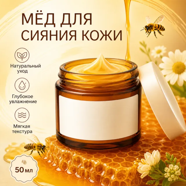
Create one square 1000×1000 Amazon secondary product image using the supplied white-background product reference. Build a honey-gold skincare scene with the amber jar, glowing honey, bees, honeycomb accents, and a clean beauty-benefit layout. Keep the jar naturally proportioned and readable. Visible in-image copy must be Russian and newly written: “МЁД ДЛЯ СИЯНИЯ КОЖИ”, “Натуральный уход”, “Глубокое увлажнение”, “Мягкая текстура”, “50 мл”. No copied brand, logo, watermark, source wording, file/path/history information, execution labels, border, collage, multi-panel layout, or distortion.
【Output Rules | Do Not Display】
Generate only one 1000×1000, 1:1 Amazon Listing secondary image. No collage images, six-grid layouts, multi-card grids, or multiple scenes are allowed.
【Sharing Rules】
Use the provided product reference image as the sole basis for the product. Product: retinol 0.1% face serum. Copywriting must be in English, and brand placeholders should use MOCKUP only. Visuals must follow high-end commercial e-commerce photography standards—sharp imagery, clear hierarchy, and concise, easy-to-read copy. The product’s appearance, structure, color, quantity, accessories, and relative proportions must match the reference image; products, people, icons, and props must maintain natural proportions. All essential information must remain within the safe area, with the background extending fully to all four edges. External white borders, vertical borders on left and right, transparent edge fillers, watermarks, contact details, social media accounts, platform information, original branding, gibberish, irrelevant content, or unverified claims regarding efficacy or specifications are prohibited. Headlines must not appear.
【Image Composition】
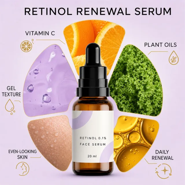
Create a pale-lilac ingredient infographic featuring an amber bottle centered, along with five rounded visual swatches representing lilac gel, citrus, leafy greens, hydrated-looking skin texture, and golden plant oils. Exact copy: "RETINOL RENEWAL SERUM", "VITAMIN C", "PLANT OILS", "GEL TEXTURE", "EVEN-LOOKING SKIN", "DAILY RENEWAL".
Ensure that every product, person, animal, icon, and graphic maintains natural proportions. Keep all headings, labels, numbers, and icons fully visible within the safe areas. Extend the artwork continuously to all four edges.
People and animals: if included, create new non-identifiable subjects appropriate to the usage scenario.
Use the supplied reference image as the sole locked product input. Preserve the product's exact appearance, structure, materials, colors, proportions, logo, label, accessories, and product-set relationship.
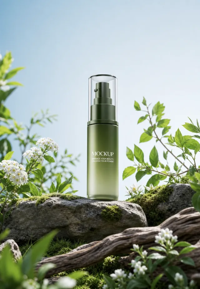
Create a 1043:1508 photorealistic commercial product poster. Place the single green pump serum bottle upright among dark rocks, moss, fresh leaves, and small white flowers in a bright forest clearing. Use a pale blue sky and crisp natural daylight.
Use a polished premium advertising finish with crisp product focus, coherent perspective, realistic materials, controlled depth of field, and physically plausible lighting. Keep all decorative elements physically plausible and subordinate to the product. Keep existing product text legible when present. No poster text, watermark, extra product, unrelated logo, distorted object, changed product appearance, or unnecessary person.
【Execution Routing | Do Not Display】
If the image-generation tool can be invoked multiple times: concatenate the sharing rules with A–F separately, execute six times, generating one 1000×1000 square image each time; do not submit all modules at once.
If only one image can be generated per run: set the interface or API to a 2:3 portrait orientation and disable Auto mode; a recommended size is 1200×1800. Arrange A/B, C/D, and E/F into a 2-column × 3-row grid of six modules, ensuring equal module sizes and maintaining a 1:1 aspect ratio. If the platform enforces a 1:1 ratio, switch to using an Agent or generate each module individually.
【Sharing Rules】
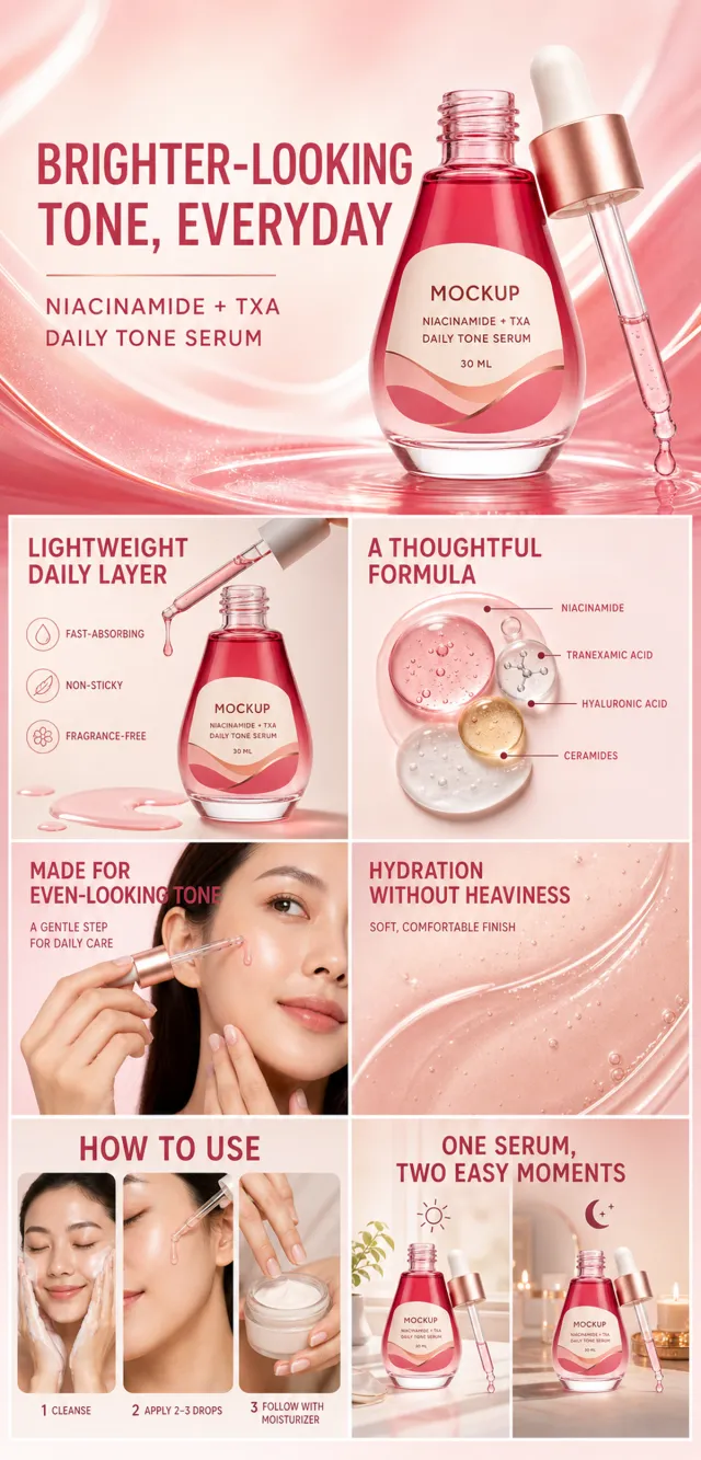
Use the provided product reference image as the sole product basis. Product: niacinamide and TXA facial serum. Copywriting must be in English, with brand placeholders replaced by MOCKUP only. Visuals should follow high-end commercial e-commerce photography standards—sharp imagery, clear hierarchy, and concise, easy-to-read copy. The product’s appearance, structure, color, quantity, accessories, and relative proportions must match the reference image; maintain natural proportions among products, people, icons, and props. All essential information must remain within the safe zone, with the background extending fully across all four edges. Prohibit white borders around the perimeter, vertical borders on the left and right, transparent fill-in borders, watermarks, contact information, social media accounts, platform details, original branding, garbled text, irrelevant content, or unverified claims regarding efficacy or specifications; titles must not appear. A–F must not be displayed.
【A | Theme】Copy: “BRIGHTER-LOOKING TONE, EVERYDAY”; “NIACINAMIDE + TXA DAILY TONE SERUM.” Use the full product main visual to prominently convey the core value.
【B | Theme】Copy: “LIGHTWEIGHT DAILY LAYER.” Design an independent square image centered around this copy, ensuring no overlap in selling points, composition, or product angles with other modules.
【C | Theme】Copy: “FAST-ABSORBING.” Design an independent square image centered around this copy, ensuring no overlap in selling points, composition, or product angles with other modules.
【D | Theme】Copy: “NON-STICKY.” Design an independent square image centered around this copy, ensuring no overlap in selling points, composition, or product angles with other modules.
【E | Theme】Copy: “FRAGRANCE-FREE.” Design an independent square image centered around this copy, ensuring no overlap in selling points, composition, or product angles with other modules.
【F | Theme】Copy: “A THOUGHTFUL FORMULA”; “NIACINAMIDE.” Design an independent square image centered around this copy, ensuring no overlap in selling points, composition, or product angles with other modules.
【Execution Routing | Do Not Display】
If the image-generation tool can be invoked multiple times: concatenate the sharing rules with A–F separately, execute six times, generating one 1000×1000 square image each time; do not submit all modules at once.
If only one image can be generated per run: set the aspect ratio to 2:3 portrait mode in the interface or via API, and avoid using Auto; a recommended size is 1200×1800. Arrange the images into a 2-column × 3-row grid labeled A/B, C/D, and E/F, ensuring all six modules are equal in size and maintain a 1:1 proportion. If the platform enforces a 1:1 ratio, switch to an Agent-based approach or generate each module individually.
【Sharing Rules】
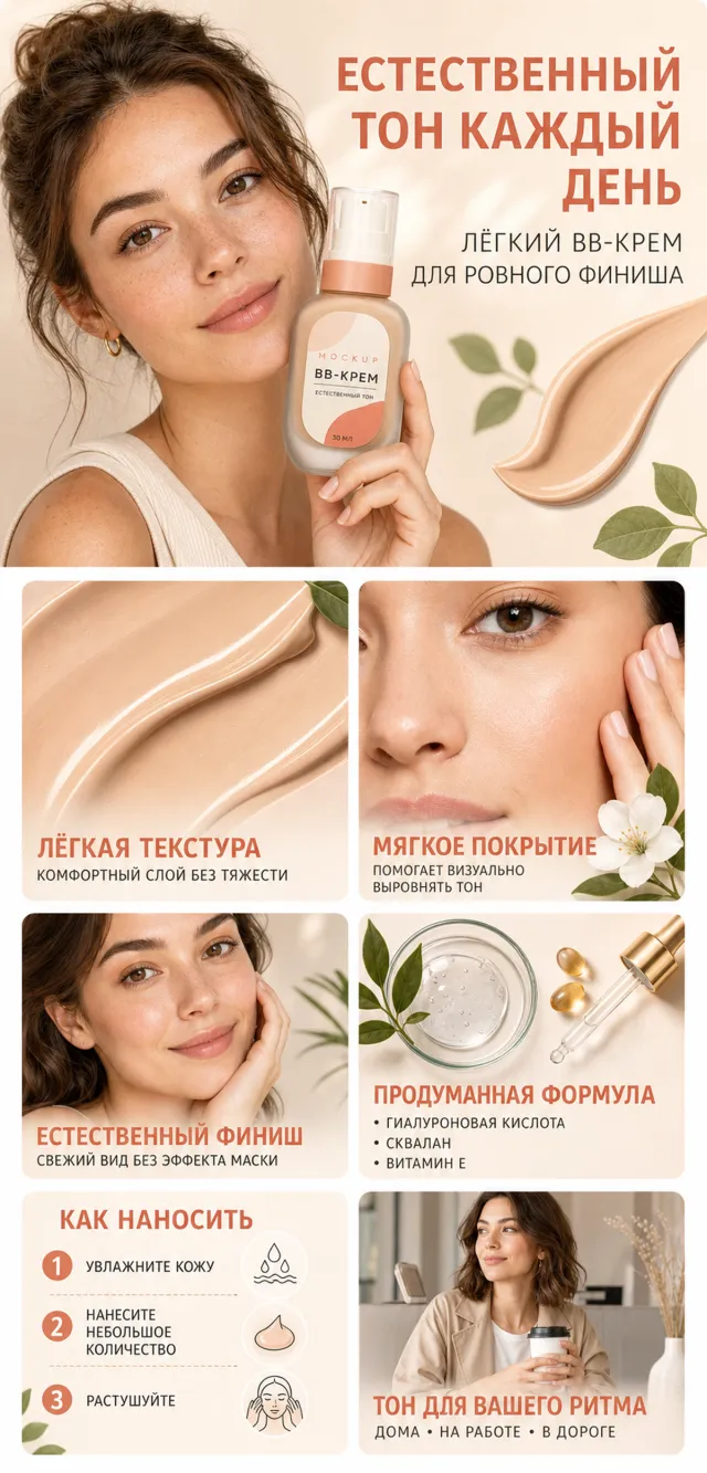
Use the provided product reference image as the sole basis for the product. Product: BB cream. Copywriting should be in Russian, with brand placeholders replaced by MOCKUP only. Visuals must follow high-end commercial e-commerce photography standards—sharp imagery, clear hierarchy, and concise, easy-to-read copy. The product’s appearance, structure, color, quantity, accessories, and relative proportions must match the reference image; products, people, icons, and props should maintain natural proportions. All essential information must remain within the safe zone, with the background extending fully to all four edges. Prohibit white borders around the perimeter, vertical borders on the left and right, transparent fill-in borders, watermarks, contact information, social media accounts, platform details, original branding, gibberish, irrelevant content, or unverified claims regarding efficacy or specifications; control titles must not appear. A–F must not be displayed.
【A | Theme】Copy: “NATURAL TONE EVERY DAY”; “LIGHT BB CREAM FOR A SMOOTH FINISH.” Focus on conveying the core value through the full product visual.
【B | Theme】Copy: “LIGHT TEXTURE.” Design an independent square image centered around this theme, ensuring it avoids duplicating selling points, composition, or product angles used in other modules.
【C | Theme】Copy: “COMFORTABLE LAYER WITHOUT HEAVINESS.” Design an independent square image around this theme, avoiding overlap with other modules in terms of selling points, composition, and product perspective.
【D | Theme】Copy: “SOFT COVERAGE.” Design an independent square image based on this theme, ensuring no repetition of selling points, composition, or product angles with other modules.
【E | Theme】Copy: “VISUALLY UNIFIES SKIN TONE.” Design an independent square image around this theme, avoiding duplication of selling points, composition, or product angles with other modules.
【F | Theme】Copy: “NATURAL FINISH”; “FRESH LOOK WITHOUT MASK EFFECT.” Design an independent square image centered on these themes, ensuring no overlap with other modules in terms of selling points, composition, or product angles.
产品定义:
设计一支便携旋转式润唇膏。唯一外观母体为圆角三角柱雾蓝绿色哑光下壳,正面浅浮雕水滴握持槽,珊瑚杏点纹旋转环,暖白内管与原创云朵+柑橘图形,烟灰半透明圆角保护盖。包装只出现“MOCKUP”“LIP BALM”“PEAR GLOW”“4.2 g”。保护盖与壳体肩部准确扣合;转动点纹环通过中心螺杆令膏杯沿轴线升降,膏体可完全回落后合盖;膏头为圆润圆角三角截面。所有画面保持上述七个指纹及自然宽高比,不得拉伸。
全局画面:
生成固定宽度 1200px、自然高度的完整单画布 A+ 竖图,共 5 个外层模块。奶油色、雾蓝绿、珊瑚杏和深青色为主,精致衬线展示标题搭配清晰无衬线正文。植物投影、珊瑚细曲线与雾蓝绿色有机波浪从上到下连续衔接,不拼接,不使用白色或近白色机械分隔线。
模块 1,高密度首屏,相对高度 1.0:
左侧约 38% 为两行大标题、单行标语、四条竖排图标说明和一行携带短句;中央约 26% 为 2×2 圆角微距窗,依次展示水滴握持槽、云朵柑橘内管、烟灰盖材质、圆润膏头;右侧约 36% 为超大闭盖产品,立在带露珠的暖色石面上,背景是重新设计的梨叶与小白花。
完整文案:
“POCKET-SIZE LIP BALM”
“SMALL. SMOOTH. READY TO GO.”
“SOFT CLOUD PRINT”
“SMOKED CLEAR CAP”
“SMOOTH TWIST COLLAR”
“SCULPTED GRIP BASE”
“A little swipe of everyday moisture.”
禁止减少四个微距窗或四条卖点。
模块 2,五视角展示,相对高度 0.73:
居中标题和副标题下方横排五张窄竖圆角卡,依次为:闭盖手持正面、底部标签、取盖且膏体旋出、手持取下保护盖、圆润膏头顶视。五种状态均保持圆角三角截面和同一产品比例,标签位于各卡底部。
完整文案:
“SEE EVERY SIDE”
“Details that make it easy.”
“FRONT VIEW”
“BASE LABEL”
“TWIST-UP VIEW”
“CAP OFF”
“ROUNDED TOP”
模块 3,四细节卡,相对高度 0.70:
居中衬线标题下方为四张等宽大卡,分别是云朵柑橘图形微距、圆润膏体、烟灰半透明保护盖、点纹旋转环与水滴握持槽;每张卡底部有珊瑚圆形序号、短标题和一行说明。
完整文案:
“DESIGN DETAILS”
“1 ORIGINAL PRINT”
“Cloud-and-citrus artwork.”
“2 ROUNDED BALM”
“A soft shape for an even glide.”
“3 SMOKED CAP”
“Helps keep the tube covered.”
“4 TEXTURED COLLAR”
“Easy to turn and hold.”
模块 4,三携带场景,相对高度 0.69:
奶油色有机标题带配重新绘制的梨叶与白花,下方三张等宽横向场景卡:产品固定在深蓝帆布托特内袋;产品立在浅橡木桌面收纳盘旁;产品放在珊瑚色旅行洗漱包内并配普通线缆与护手霜。产品均以自然比例出现。
完整文案:
“READY FOR EVERYDAY CARRY”
“Compact. Cheerful. Easy to reapply.”
“TOTE POCKET”
“DESK TRAY”
“TRAVEL POUCH”
模块 5,四步使用,相对高度 0.78:
居中标题下方是四张等宽高卡,由三个深青箭头从左到右连接。第一卡手指竖直提起盖子;第二卡手指旋转点纹环使膏体上升;第三卡为新设计的深发南亚女性侧脸局部,轻柔涂抹;第四卡膏体完全旋回并重新合盖。雾蓝绿色波浪穿过四卡底部,配三枚普通线性图标。
完整文案:
“HOW TO USE”
“1 REMOVE THE CAP”
“Lift it straight off.”
“2 TWIST UP”
“Turn the dotted collar.”
“3 GLIDE EVENLY”
“Sweep gently over lips.”
“4 CAP AFTER USE”
“Twist down and cover.”
“MOISTURIZE”
“REAPPLY”
“CARRY”
全局禁止项:
不得改变产品轮廓、截面、配色、盖体、点纹环、浮雕、内管图形、标签和升降逻辑;不得出现熊图、蝴蝶结、原品牌或新造品牌,品牌槽只保留 MOCKUP;不得减少五视角、四细节、三场景或四步骤;不得使用医疗功效、认证、监管信息、价格、折扣、购买按钮、评价、二维码、网址、互动控件、水印、模块编号、像素标记、工程字符、乱码或伪文字;不得白线分段、分段拼接或非等比拉伸产品。
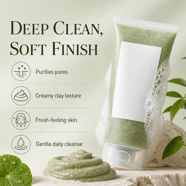
Create one square 1000×1000 Amazon secondary product image using the supplied white-background product reference. Build a green clay-cleanser beauty poster with the tube and creamy clay texture prominent, a face or skin visual, a pore-cleansing diagram, and fresh botanical accents. Keep the tube naturally proportioned. Use only newly written English in-image copy: “DEEP CLEAN, SOFT FINISH”, “Purifies pores”, “Creamy clay texture”, “Fresh-feeling skin”, “Gentle daily cleanse”. No copied brand, logo, watermark, source wording, file/path/history information, execution labels, border, collage, multi-panel layout, or distortion.
生成宽 1200px、自然高度的完整 Amazon A+ 长图,单画布一次生成,共 7 个连续模块。采用珍珠白、腮红与珊瑚渐变、半透明液体丝带、黑色编辑字体和桃红强调;模块通过背景色、亚克力拱形、产品叠压和人物裁切自然衔接,不添加白色或近白色机械分隔线。
唯一产品母体为半透明珊瑚粉宽圆柱化妆棉罐:可见整齐棉片叠层、浅珊瑚低矮圆盖、盖中央小型取握凹槽、正面标签 `MOCKUP`、`NIACINAMIDE 5 + TXA`、`BRIGHTENING TONER PADS`、`60 PADS / 210 ML`。所有开盖、闭盖和倾斜状态保持同一宽高比、盖体和标签位置。
模块 1:左侧 `NIACINAMIDE 5 + TXA TONER PAD`,其中 `TXA TONER PAD` 桃红;文案 `SWIPE, REFRESH & GLOW`、`ONE PAD, A SIMPLE FIRST STEP FOR CLEAR-LOOKING SKIN`。右侧同一罐开盖放大,盖置于后侧,一片弯月棉片搭在罐沿,配原创珊瑚丝带与水滴。
模块 2:珍珠腮红斜向构图。标题 `DAILY TONER PADS FOR FRESH SKIN PREP`,强调 `FRESH SKIN PREP`;副标题 `HYDRATE & REFRESH THE LOOK OF UNDER-EYE AND CHEEK AREAS`。右侧同一罐倾斜,前景一片弯月棉片和圆形液滴。
模块 3:铂金短寸、雀斑、珊瑚耳扣、奶油色不对称上衣的橄榄肤色成年模特,位于原创半透明拱形亚克力影棚,两颊各贴一片弯月棉片。标题 `DOUBLE CARE FOR CLARITY & EVEN-LOOKING TONE`;正文 `GENTLE DAILY PREP FOR A FRESH, HEALTHY-LOOKING GLOW`。三项 `NIACINAMIDE / Helps revive the look of dull skin`、`TRANEXAMIC ACID (TXA) / Supports a more even-looking complexion`、`PINK VITAMIN B12 + PHA / Leaves skin feeling smooth and refreshed`。
模块 4:右轨 `ROUTINE PAIRING`。标题 `PAIR, THEN LAYER`;副标题 `TONER PAD + SERUM FOR A SIMPLE TWO-STEP ROUTINE`;路径 `1 PAD → 2 SERUM → READY FOR MOISTURIZER`。右侧同一罐、小型珊瑚 `MOCKUP` 精华瓶和棉片侧面叠层置于洞石台面。
模块 5:右轨 `DUAL-SIDED PAD`。标题 `TWO TEXTURES, ONE EASY ROUTINE`。两张原创圆形微距:`TEXTURED SIDE / Gently sweeps across skin`、`SMOOTH SIDE / Rests comfortably on targeted areas`,中间一枚翻转箭头。
模块 6:右轨 `DAILY SKIN PREP`。三项 `01 FRESH, HYDRATED FEEL`、`02 SMOOTHER-LOOKING TEXTURE`、`03 BRIGHT, REVIVED APPEARANCE`。右侧同一倾斜罐、一片漂浮棉片和珊瑚液体丝带。
模块 7:右轨 `HOW TO USE`。同一短发模特穿浅灰浴袍,位于黏土与拉丝金属卫浴,微笑手持闭盖罐。步骤 `1 AFTER CLEANSING, SWEEP ONE PAD GENTLY ACROSS FACE`、`2 REST ON AREAS OF CONCERN FOR 10–20 MINUTES IF DESIRED`、`3 REMOVE, THEN PAT IN THE REMAINING ESSENCE`;补充 `USE MORNING OR EVENING`、`Tip: Keep the inner seal closed between uses.`
人物、皮肤特征、服装、空间、道具、纹理、液体路径、UI 和图标均为全新设计。禁止复用既有人物与卫浴场景;禁止改变罐体比例、盖体、标签或棉片形态;禁止原品牌、新品牌、认证、临床/皮肤科声明、前后对比、调查数据、满意度、奖项、价格、评分、二维码、网址、调试字符、交互控件、白色横向分隔带和产品拉伸。
Create ONE independent Amazon listing image. Use a 1:1 square 1000x1000 px canvas with a full-bleed composition, no white border, no side bars, no collage, and no multi-panel layout. Use the visual reference only for composition, camera angle, lighting, color mood, scene, typography hierarchy, and information structure. Do not copy its original wording or graphic assets.
Use the provided white-background product image as the sole product source. Preserve its exact silhouette, geometry, parts, materials, colors, proportions, controls, labels, connectors, and accessory count. Keep the product complete, naturally assembled, and undistorted. Do not replace, merge, stretch, crop, or redesign the product. Do not show cutaway, exploded, anatomical, or internal views. Preserve any approved MOCKUP identity already present on the product image, but do not copy brands or logos from the visual reference.
Rewrite all visible copy in English with fresh, plausible, category-appropriate wording. Do not reuse the visual reference's original brand names, phrases, statistics, certifications, filenames, or source graphics. Avoid unsupported medical, legal, safety, or absolute claims. Do not include Chinese or mixed-language instructions. Do not include execution-mode notes, source names, file paths, reconstruction history, or metadata. Keep all typography legible and inside the canvas.
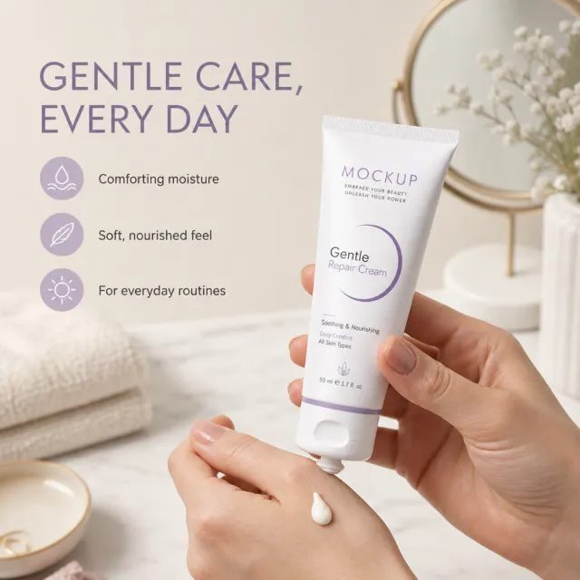
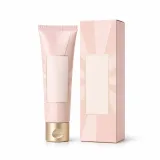
Show the skincare tube in a calm vanity or hand-held care scene with a soft texture cue. Use fresh copy such as “GENTLE CARE, EVERY DAY”, “Comforting texture”, “Light moisture”, and “A simple daily routine”.
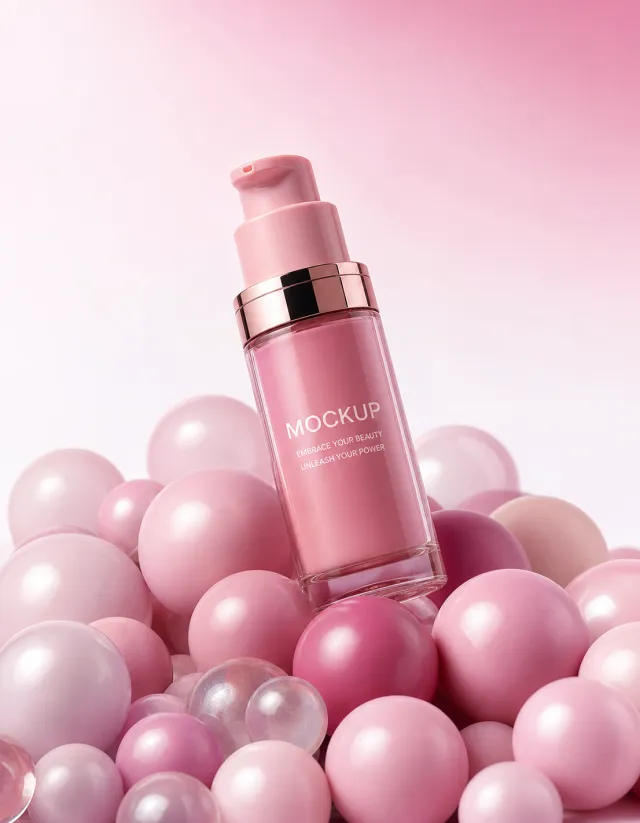
Use the supplied reference image as the sole locked product input. Preserve the product's exact appearance, structure, materials, colors, proportions, logo, label, accessories, and product-set relationship.
Create a 7:9 photorealistic commercial product poster. Tilt the single pink pump serum bottle above a dense cluster of glossy pink spheres in several sizes. Use a seamless blush-to-pink gradient, soft reflections, and clean playful studio lighting.
Use a polished premium advertising finish with crisp product focus, coherent perspective, realistic materials, controlled depth of field, and physically plausible lighting. Keep all decorative elements physically plausible and subordinate to the product. Keep existing product text legible when present. No poster text, watermark, extra product, unrelated logo, distorted object, changed product appearance, or unnecessary person.
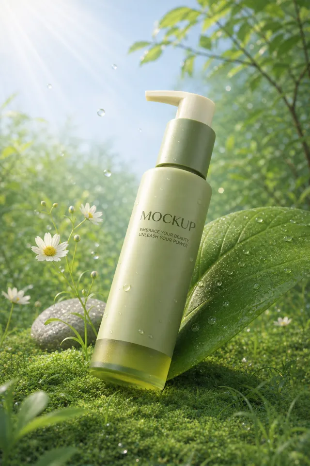
Use the supplied reference image as the sole locked product input. Preserve the product's exact appearance, structure, materials, colors, proportions, logo, label, accessories, and product-set relationship.
Create a 2:3 photorealistic commercial product poster. Lean the single green pump bottle against an oversized fresh leaf on a mossy forest floor. Add small daisies, smooth stones, sunbeams, floating droplets, and lush green atmospheric depth.
Use a polished premium advertising finish with crisp product focus, coherent perspective, realistic materials, controlled depth of field, and physically plausible lighting. Keep all decorative elements physically plausible and subordinate to the product. Keep existing product text legible when present. No poster text, watermark, extra product, unrelated logo, distorted object, changed product appearance, or unnecessary person.
Use the supplied reference image as the sole locked product input. Preserve the product's exact appearance, structure, materials, colors, proportions, logo, label, accessories, and product-set relationship.
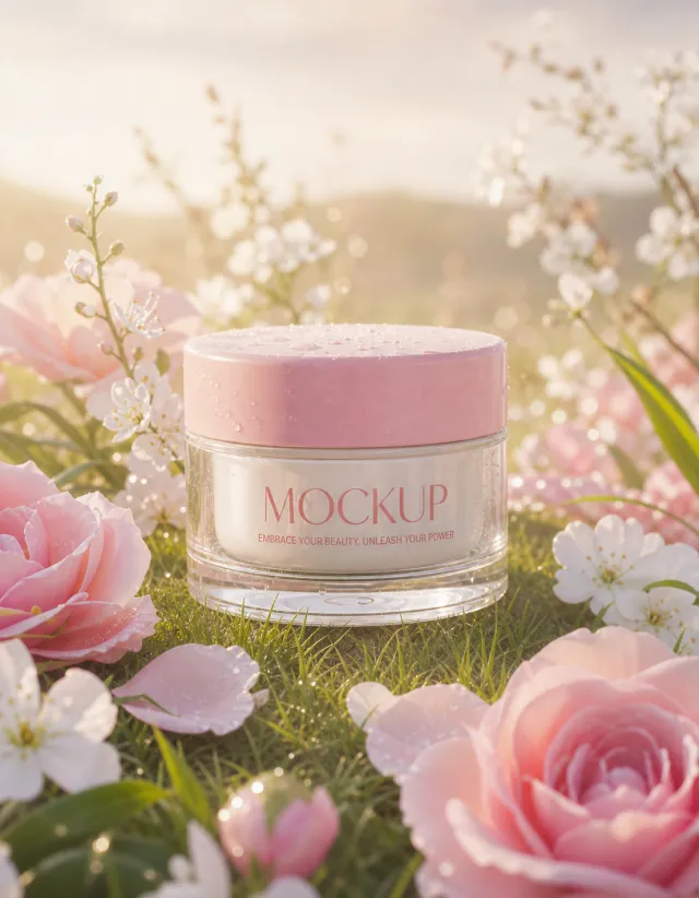
Create a 1107:1421 photorealistic commercial product poster. Place the single pink cream jar upright in a romantic garden clearing among pink roses, white flowers, grass, and delicate stems. Use soft golden backlight, a pale blush atmosphere, gentle bokeh, and a dreamy high-end beauty finish.
Use a polished premium advertising finish with crisp product focus, coherent perspective, realistic materials, controlled depth of field, and physically plausible lighting. Keep all decorative elements physically plausible and subordinate to the product. Keep existing product text legible when present. No poster text, watermark, extra product, unrelated logo, distorted object, changed product appearance, or unnecessary person.
【Execution Routing | Do Not Display】
If the image-generation tool can be invoked multiple times: concatenate the sharing rules with A–F separately, execute six times, generating one 1000×1000 square image each time; do not submit all modules at once.
If only one image can be generated per invocation: set the interface or API to a 2:3 portrait orientation and disable Auto mode; a recommended size is 1200×1800. Arrange images in a 2-column × 3-row grid labeled A/B, C/D, and E/F, ensuring all six modules are equal in size and maintain a 1:1 aspect ratio. If the platform enforces a 1:1 ratio, switch to using an Agent or generate each module individually.
【Sharing Rules】
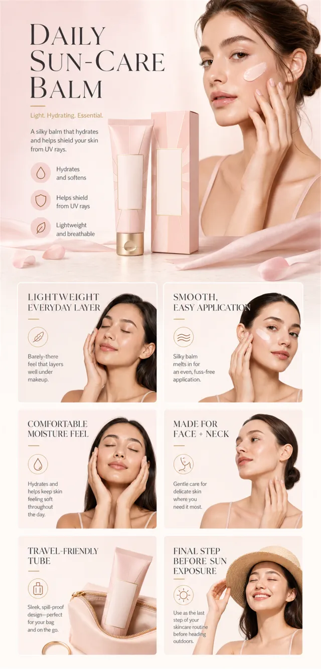
The provided product reference image serves as the sole basis for the product. Product: English blush-pink facial sun-care balm tube and carton. Copywriting must preserve the source image's main language, and brand placeholders should use only MOCKUP. Visuals should incorporate blush, cream, and champagne gold tones. The product’s appearance, structure, color, quantity, accessories, and relative proportions must match the reference image; product, figures, icons, and props should maintain natural proportions. All essential information must remain within the safe zone, with the background extending fully across all four edges. External white borders, vertical borders on left and right, transparent fill-in borders, watermarks, contact details, social media accounts, platform information, original branding, gibberish, irrelevant content, or unverified claims regarding efficacy or specifications are prohibited. Headlines must not be displayed. A–F must not appear.
【A | Theme】Copy: “DAILY SUN-CARE BALM”; “LIGHTWEIGHT EVERYDAY LAYER.” Focus on conveying core value through the complete primary visual of the product.
【B | Theme】Copy: “SMOOTH, EASY APPLICATION.” Design an independent square image around this copy, avoiding overlapping selling points, compositions, and product angles with other modules.
【C | Theme】Copy: “COMFORTABLE MOISTURE FEEL.” Design an independent square image around this copy, avoiding overlapping selling points, compositions, and product angles with other modules.
【D | Theme】Copy: “MADE FOR FACE + NECK.” Design an independent square image around this copy, avoiding overlapping selling points, compositions, and product angles with other modules.
【E | Theme】Copy: “TRAVEL-FRIENDLY TUBE.” Design an independent square image around this copy, avoiding overlapping selling points, compositions, and product angles with other modules.
【F | Theme】Copy: “FINAL STEP BEFORE SUN EXPOSURE.” Design an independent square image around this copy, avoiding overlapping selling points, compositions, and product angles with other modules.
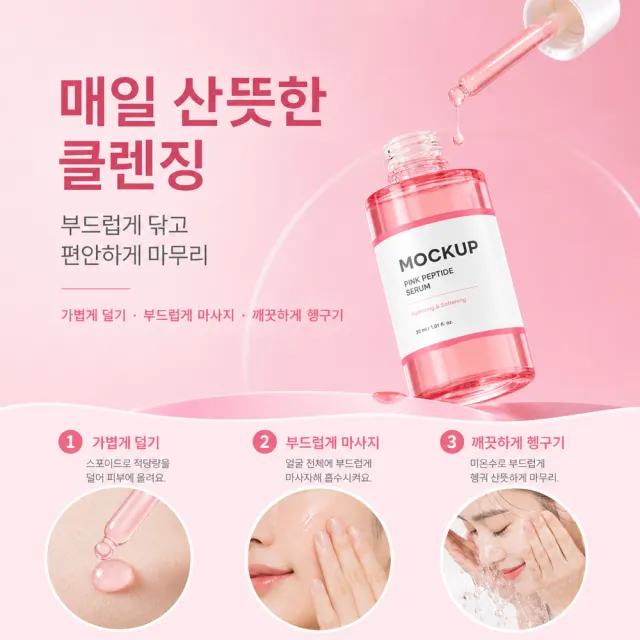
Create one square 1000×1000px Amazon Listing secondary image using the provided white-background product image as the only product reference for shape, parts, materials, colors and natural proportions. Rebuild this distinct pink instructional step poster: show the product and a usage action in the upper area, a horizontal three-step sequence below, and circular inset images with short labels forming a clear tutorial flow. Use a polished commercial style with the same visual logic, palette, typography hierarchy, graphic language and information density as the supplied design direction, while creating a new design. Write all visible copy from scratch in Korean; use only this copy: headline “매일 산뜻한 클렌징”; subtitle “부드럽게 닦고 편안하게 마무리”; supporting points “가볍게 덜기 · 부드럽게 마사지 · 깨끗하게 헹구기”. Parameters may be fictional but must fit the product category. Keep all objects naturally proportioned and all information readable. No original wording, original numbers, brand logos, watermark, contact details, six-grid, six independent cards, unrelated template layout, white border or side bars.
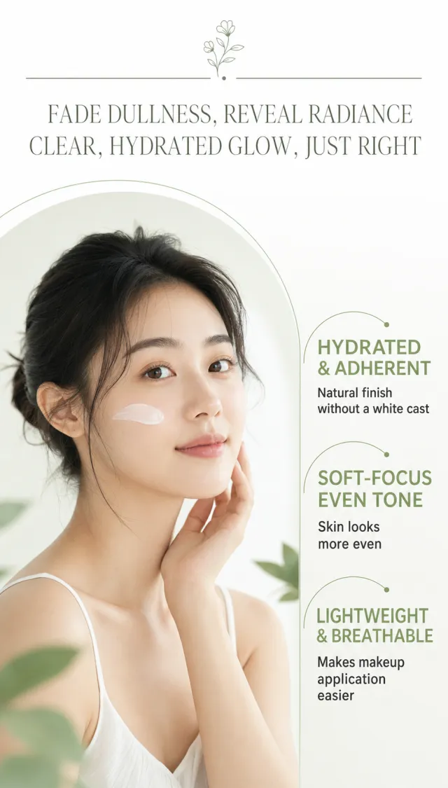
Generate a detailed poster for the use scenario of the Moisturizing Tone-Free Cream, without any packaging products.
The image features a fresh skincare style of white and sage green. At the top are fine English auxiliary words, horizontal dividers, and two centered main titles; The center is wrapped in a light green large arch that encloses a bust portrait of an adult Asian woman, with a natural light-colored cream on her cheeks; On the right, three large short sell points are arranged vertically, making the entire chart light and transparent.
Copywriting Usage:
Drive away darkness, let it shine naturally
Clear and moisturizing, just right for a healthy complexion
Moisturizing and smooth, naturally without artificial whitening
Soft focus evenly brightens skin tone to appear more even
Light and lightweight, no dullness—more comfortable to apply makeup afterwards
The title is in elegant Songti, and the main text is in Holly, Chinese Simplified; The main text is dark gray-green, and the emphasis is moss green. The right side selling point text does not enter the character's face area; No obvious text shadows are added.
Icons/Tags: Keep only the small floral line art and fine arcs at the top, without adding complex icons.
Output size: '750 x 1320px'
Avoid: brand, product packaging, exaggerated percentage, medical jargon, watermarks, overly fair skin tone, heavy base makeup, overly dense text.
Create ONE independent Amazon listing image. Use a 1:1 square 1000x1000 px canvas with a full-bleed composition, no white border, no side bars, no collage, and no multi-panel layout. Use the visual reference only for composition, camera angle, lighting, color mood, scene, typography hierarchy, and information structure. Do not copy its original wording or graphic assets.
Use the provided white-background product image as the sole product source. Preserve its exact silhouette, geometry, parts, materials, colors, proportions, controls, labels, connectors, and accessory count. Keep the product complete, naturally assembled, and undistorted. Do not replace, merge, stretch, crop, or redesign the product. Do not show cutaway, exploded, anatomical, or internal views. Preserve any approved MOCKUP identity already present on the product image, but do not copy brands or logos from the visual reference.
Rewrite all visible copy in English with fresh, plausible, category-appropriate wording. Do not reuse the visual reference's original brand names, phrases, statistics, certifications, filenames, or source graphics. Avoid unsupported medical, legal, safety, or absolute claims. Do not include Chinese or mixed-language instructions. Do not include execution-mode notes, source names, file paths, reconstruction history, or metadata. Keep all typography legible and inside the canvas.
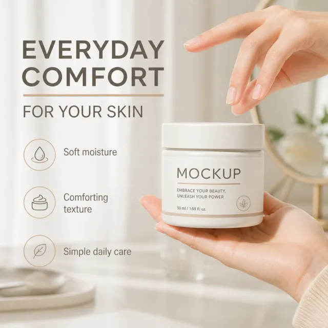
Show the cream jar in a calm vanity scene, naturally held in a hand or presented beside a soft skin-care setting. Use fresh copy such as “EVERYDAY COMFORT FOR YOUR SKIN”, “Soft moisture”, “Comforting texture”, and “Simple daily care”.
【Execution Route | Must Not Appear on Screen】
If the image-generation tool can be invoked multiple times: concatenate the sharing rules with A–F separately, and execute six times; each time generating only one independent 1000×1000 square image, resulting in six sub-images.
If single‑shot generation is permitted: use a 2:3 vertical canvas measuring 1200×2500, with the top approximately 30% reserved for the product’s main visual integrated into the background, and arrange A/B, C/D, and E/F in two columns by three rows to form a six‑grid layout; all six cards should be equal in size and maintain an aspect ratio close to 1:1. Do not use a 1:1 outer canvas, nor full‑width cards, cross‑column cards, merged cards, borders, frames, or white margins.
【Sharing Rules】
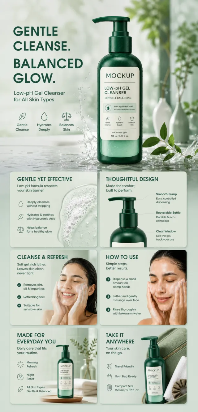
The provided product reference image serves as the sole basis for the product’s appearance, structure, color, quantity, accessories, and relative proportions. Product direction: green facial cleansing products with a refreshing label; gentle cleansing, foaming action, usage steps, plant‑inspired design, and morning/evening care. Products, as well as newly generated characters, animals, props, and text, must retain natural proportions—stretching, flattening, or non‑uniform scaling is prohibited—and the background must extend fully across all four edges. The brand must uniformly use MOCKUP; remove any original branding, logos, watermarks, contact information, social media accounts, platform details, gibberish, or irrelevant content. Copywriting should be concise, clear, and credible, maintaining the language of the reference image, without adding unsubstantiated absolute claims or medical promises. A–F are merely control markers and must not appear on screen.
【A | Core Selling Point】
Highlight the product’s most important value and its complete main subject; keep the title short and clear.
【B | Structure & Materials】
Showcase the product’s key structure, materials, or components using close-up shots or simple annotations, adhering to the product’s designated direction.
【C | Real‑World Use】
Generate natural human/animal figures or everyday scenes to demonstrate authentic usage, ensuring proportions and actions are believable.
【D | Details & Steps】
Use close-ups, step-by-step illustrations, or flowcharts to explain operations, textures, interfaces, storage solutions, or care instructions.
【E | Lifestyle】
Depict how the product naturally integrates into family life, commuting, outdoor activities, travel, or work settings.
【F | Sets & Portability】
Accurately present the product, its accessories, quantities, and storage relationships; do not add any elements absent from the reference image.
【Execution Routing | Do Not Display】
If the image-generation tool can be invoked multiple times: concatenate the sharing rules with A–F separately, execute six times, generating one 1000×1000 square image each time; do not submit all modules at once.
If only one image can be generated per run: set the interface or API to a 2:3 portrait orientation and disable Auto mode; a recommended size is 1200×1800. Arrange the images in a 2-column × 3-row grid corresponding to A/B, C/D, and E/F, ensuring all six modules are equal in size and maintain a 1:1 aspect ratio. If the platform enforces a 1:1 ratio, switch to using an Agent or generate each module individually.
【Sharing Rules】
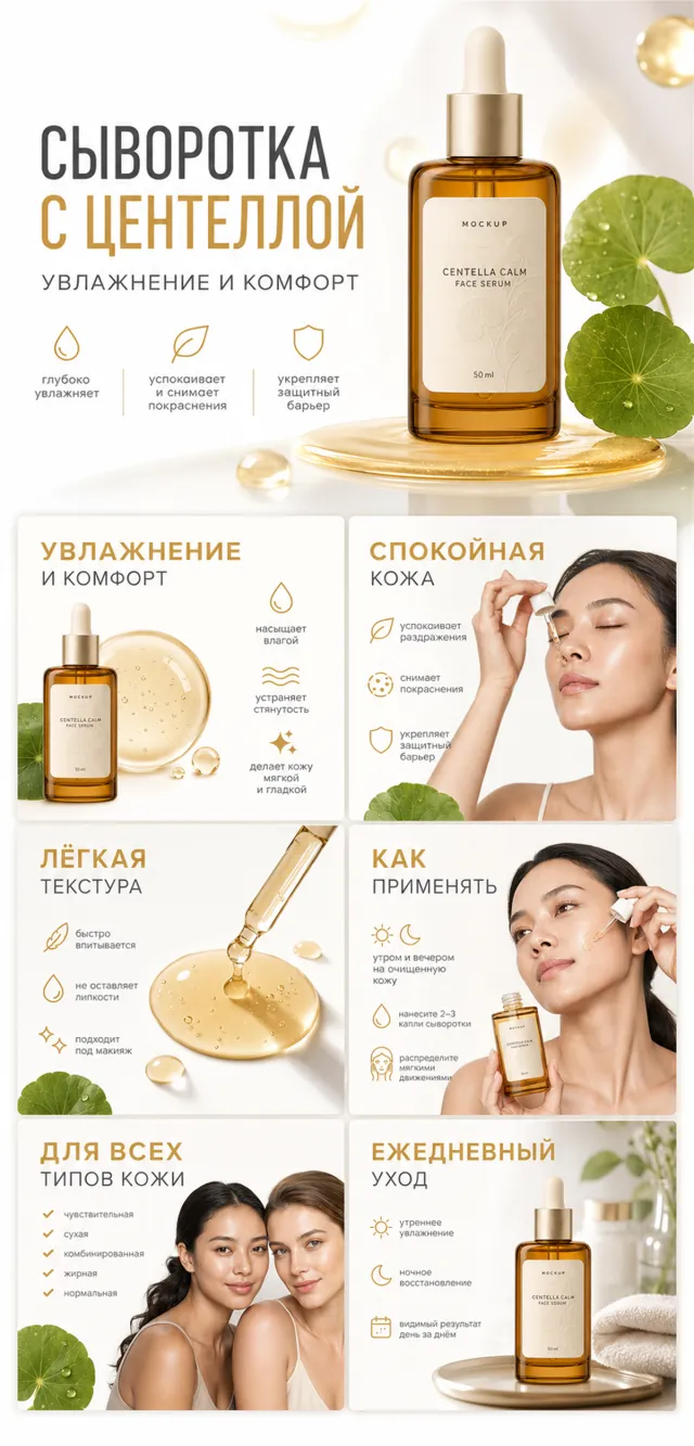
The provided product reference image serves as the sole basis for the product. Product: Centella Calming Face Serum. Copywriting should be in Russian, with brand placeholders replaced by MOCKUP only. Visuals must follow high-end commercial e‑commerce photography standards—sharp imagery, clear hierarchy, and concise, easy-to-read copy. The product’s appearance, structure, color, quantity, accessories, and relative proportions must match the reference image; products, people, icons, and props should maintain natural proportions. All essential information must remain within the safe zone, with the background extending fully across all four edges. External white borders, vertical borders on left and right, transparent fill-in borders, watermarks, contact details, social media accounts, platform information, original branding, gibberish, irrelevant content, or unverified claims regarding efficacy or specifications are prohibited. Headlines must not be displayed. A–F must not appear.
【A | Theme】Copy: “CENTELLA SERUM”; “MOISTURIZATION AND COMFORT”—focus on conveying the core value through the complete primary visual of the product.
【B | Theme】Copy: “CALM SKIN”—design an independent square image around this theme, ensuring no overlap in selling points, composition, or product angles with other modules.
【C | Theme】Copy: “LIGHT TEXTURE”—design an independent square image around this theme, avoiding repetition of selling points, composition, and product angles compared to other modules.
【D | Theme】Copy: “HOW TO USE”—design an independent square image around this theme, ensuring no overlap in selling points, composition, or product angles with other modules.
【E | Theme】Copy: “FOR ALL SKIN TYPES”—design an independent square image around this theme, avoiding repetition of selling points, composition, and product angles with other modules.
【F | Theme】Copy: “DAILY CARE”—design an independent square image around this theme, avoiding repetition of selling points, composition, and product angles with other modules.
【Output Guidelines | Must Not Appear in the Image】
Generate only one final 1000×1000, 1:1 Amazon Listing secondary image. Do not use collage, six‑panel grids, storyboards, multi‑card grids, split‑top/bottom layouts, or second images.
【Sharing Guidelines】
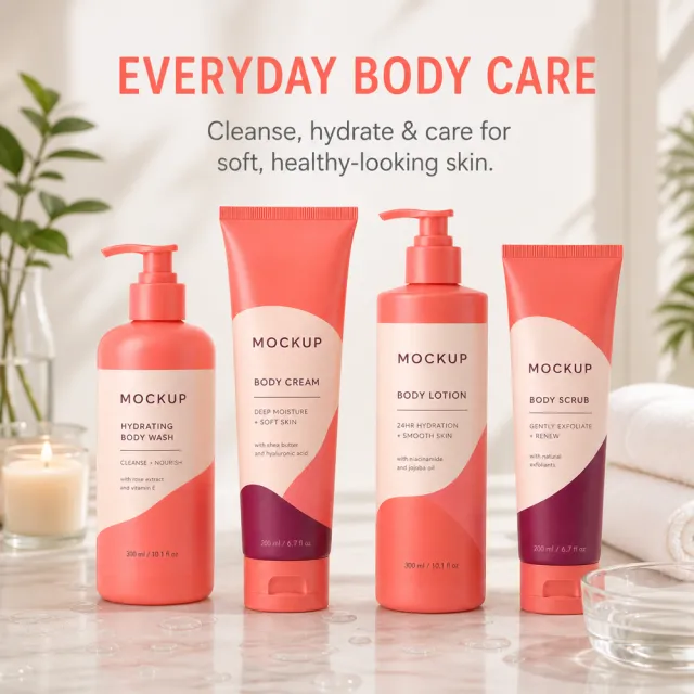
Use the provided product reference image as the sole basis for depicting the product’s appearance, structure, color, quantity, accessories, and relative proportions. Product orientation: Coral Red Body Care Four-Piece Set; a bright bathroom lifestyle emphasizing cleanliness, hydration, and care. The product must be presented in its entirety, with all subjects, props, and text maintaining natural proportions—no stretching, flattening, cropping, or independent non‑proportional scaling is allowed. The background should extend fully to all four edges. Use MOCKUP consistently across all branding; remove any original brand elements, logos, watermarks, contact information, social media handles, platform details, gibberish, or irrelevant content. Copywriting should be concise, clear, and credible, retaining the language of the reference image and refraining from adding unverified absolute claims or medical promises. Generate new, natural human or animal figures—do not replicate characters from the original image.
【Image Composition】
Create a single, complete, single‑scene product secondary image: place the product at the visual center, integrate it with a natural lifestyle scene that aligns with the product’s intended theme, preserve all product information and maintain safe margins, ensure harmonious blending between background and subject, and avoid white borders, vertical sidebars, outer frames, or collage boundaries.
【Execution Routing | Do Not Display】
If the image-generation tool can be invoked multiple times: concatenate the sharing rules with A–F separately, execute six times, generating one 1000×1000 square image each time; do not submit all modules at once.
If only one image can be generated per invocation: set the interface or API to a 2:3 portrait orientation and disable Auto mode; a recommended size is 1200×1800. Arrange the images in a 2-column × 3-row grid corresponding to A/B, C/D, and E/F, ensuring all six modules are equal in size and maintain a 1:1 aspect ratio. If the platform enforces a 1:1 ratio, switch to using an Agent or generate each module individually.
【Sharing Rules】
The provided product reference image serves as the sole basis for the product. Product: rose botanical facial serum. Copywriting must be in English, with brand placeholders replaced by MOCKUP only. Visuals should follow premium commercial e-commerce photography standards and stable graphic design principles. The product’s appearance, structure, color, quantity, accessories, and relative proportions must match the reference image; products, people, icons, and props should maintain natural proportions. All essential information must remain within the safe zone, with the background extending fully to all four edges. External white borders, vertical borders on left and right, transparent fill-in borders, watermarks, contact details, social media accounts, platform information, original branding, gibberish, irrelevant content, or unverified claims regarding efficacy or specifications are prohibited. Headlines must not be displayed. A–F must not appear.
【A | Core Selling Point】Write concise English copy focusing on this theme, using the full product main visual to highlight core value.
【B | Usage Instructions】Provide brief English copy addressing this theme, illustrating the usage process, combinations, or key operations.
【C | Applicable Scenarios】Present short English copy centered on this theme, showcasing realistic, credible, and product-relevant usage scenarios.
【D | Functional Details】Offer succinct English copy highlighting this theme, using close-up shots, cross-sections, or icons to explain structural and functional details.
【E | Daily Maintenance】Craft brief English copy addressing this theme, demonstrating methods for use, cleaning, storage, or maintenance.
【F | Specification List】Compose concise English copy covering this theme, listing materials, specifications, packaging details, or providing credible comparisons—without fabricating parameters.
Create a premium frosted-lilac skincare jar and one continuous 1200px-wide Amazon A+ page. The formal product image is exactly one closed jar on pure white, one front three-quarter view, one configuration and one color: low round frosted-lilac glass, transparent thick base, satin silver lid, slim periwinkle ring and label “MOCKUP / PEPTIDE NECK CREAM / DAILY MOISTURE CARE”. No second view, open lid, smear, ingredients, scene, extra objects or stretching.
Build 5 substantial A+ modules in luminous powder blue and lilac with glassy droplets, soft scientific bubbles, white cards and deep-violet modern typography. Modules touch through continuous color fields without white separator bands.
M1 Hero: adult woman close-up on the right two-thirds, hand naturally at jawline and neck. Left headline “A DAILY RITUAL FOR NECK + JAWLINE”; body “Copper peptide and moisture-focused care in a lightweight cream.” Three staggered cards: “MORNING — APPLY TO CLEAN SKIN”, “EVENING — MASSAGE UPWARD”, “CONSISTENT CARE — KEEP THE ROUTINE SIMPLE”. Bottom fields “HYDRATE”, “SOFTEN”, “COMFORT”, “SMOOTH-LOOKING FINISH”.
M2 Ingredient split: left lifestyle portrait holding the exact jar, heading “MOISTURE THAT FEELS LIGHT”. Right scientific panel with large “GHK-Cu” bubble and stylized skin-surface cross-section. Heading “WHAT IS COPPER PEPTIDE?”; body “A familiar cosmetic peptide paired with daily moisture support.”
M3 Inclusive care: oversized lavender left title card “AGE-SMART NECK CARE”. Three equal portrait cards of diverse adults applying cream. Labels and captions: “EARLY ROUTINE — Add focused moisture.”, “EVERYDAY SUPPORT — Keep the ritual consistent.”, “COMFORT OVER TIME — Maintain a soft, cared-for feel.”
M4 How to use: left rounded instruction card with circular images and text “STEP 1 — SCOOP A SMALL AMOUNT”, “STEP 2 — APPLY TO NECK AND JAWLINE”, “STEP 3 — MASSAGE WITH UPWARD MOTIONS”. Right headline “HOW TO USE”, subline “Use morning or evening as part of your normal skincare routine.” and oversized pearly cream swipe.
M5 Closing: deep periwinkle gradient. Left headline “LIGHTWEIGHT CARE, EVERY DAY” with six items “PEPTIDE-FOCUSED FORMULA”, “DAILY MOISTURE”, “SOFT CREAM TEXTURE”, “SMOOTH APPLICATION”, “MORNING OR EVENING”, “COMFORTABLE FINISH”. Large exact jar on a pedestal at right with translucent droplets.
Keep cosmetic routine language only. No timelines, percentages, before/after claims, lifting or firming promises, biological repair, collagen/elastin claims, treatment, age reversal, original or invented brands, certifications, authority, random text, prices, reviews, carousel/play controls, watermark, product stretching or white separator lines.
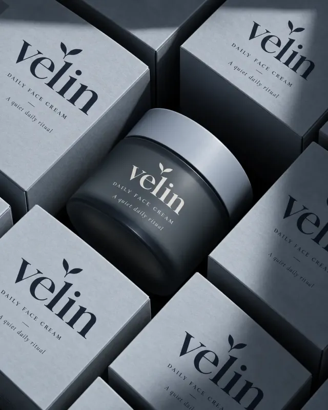
竖幅4:5高端护肤品静物摄影,紧密俯视构图。画面中央斜放一只烟熏蓝灰色磨砂玻璃广口面霜罐,圆形宽盖为浅蓝灰哑光材质,罐体底部微微透光。四周用多只蓝灰色方形纸盒密集包围、错落倾斜,边缘均被画框裁切,形成几何缝隙和厚重暗影。盒子表面有细腻未涂布纸张纤维。盒面午夜蓝高对比细衬线小写字velin,字标上方一个简洁双叶嫩芽符号,下方细字DAILY FACE CREAM、短横线以及斜体A quiet daily ritual;罐体使用同一排版的象牙白印字。定向柔光从左上照来,强调纸盒棱边、玻璃弧面与低饱和冷灰色层次,奢雅克制,无其他道具。
Use the supplied reference image as the sole locked product input. Preserve the product's exact appearance, structure, materials, colors, proportions, logo, label, accessories, and product-set relationship.
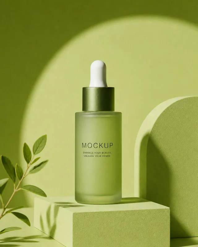
Create a 561:701 photorealistic commercial product poster. Place the single green dropper bottle upright on a square olive pedestal. Build a monochrome sage set with a large arched wall, leafy branches, strong circular sunlight, and crisp botanical shadows.
Use a polished premium advertising finish with crisp product focus, coherent perspective, realistic materials, controlled depth of field, and physically plausible lighting. Keep all decorative elements physically plausible and subordinate to the product. Keep existing product text legible when present. No poster text, watermark, extra product, unrelated logo, distorted object, changed product appearance, or unnecessary person.