Product Poster Creative Inspiration

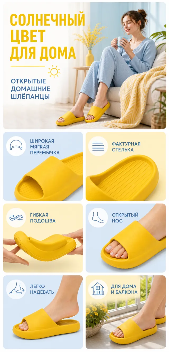
【Execution Routing | Do Not Display】 If the image-generation tool can be invoked multiple times: concatenate the sharing rules with A–F separately, execute six times, generating one 1000×1000 square image each time; do not submit all modules at once. If only one image can be generated per run: set the interface or API to a 2:3 portrait orientation and disable Auto mode; a recommended size is 1200×1800. Arrange images in a 2-column × 3-row grid labeled A/B, C/D, and E/F, ensuring all six modules are equal in size and maintain a 1:1 aspect ratio. If the platform enforces a 1:1 ratio, switch to using an Agent or generate each module individually. 【Sharing Rules】 Use the provided product reference image as the sole basis for the product. Product: yellow open-toe house slippers. Copywriting should be in Russian, with brand placeholders replaced by MOCKUP only. Visuals must follow high-end commercial e‑commerce photography standards—sharp imagery, clear hierarchy, and concise, easy-to-read copy. The product’s appearance, structure, color, quantity, accessories, and relative proportions must match the reference image; products, people, icons, and props should maintain natural proportions. All essential information must remain within the safe zone, with the background extending fully to all four edges. Prohibit white borders around the perimeter, vertical borders on the left and right, transparent fill-in borders, watermarks, contact details, social media accounts, platform information, original branding, garbled text, irrelevant content, or unverified claims regarding efficacy or specifications; titles must not be displayed. A–F must not appear. 【A | Theme】Copy: “SUNNY COLOR FOR HOME”; “OPEN-TOE HOUSE SLIPPERS”; focus on conveying the core value through the complete main visual of the product. 【B | Theme】Copy: “WIDE SOFT STRAP”; design an independent square image centered around this theme, ensuring it avoids duplicating selling points, composition, or product angles with other modules. 【C | Theme】Copy: “TEXTURED INSOLE”; design an independent square image around this theme, avoiding overlap in selling points, composition, and product angles with other modules. 【D | Theme】Copy: “FLEXIBLE SOLE”; design an independent square image based on this theme, ensuring no repetition of selling points, composition, or product angles with other modules. 【E | Theme】Copy: “OPEN TOE”; design an independent square image around this theme, avoiding duplication of selling points, composition, or product angles with other modules. 【F | Theme】Copy: “EASY TO PUT ON”; “FOR HOME AND BALCONY”; design an independent square image centered on these themes, ensuring no overlap in selling points, composition, or product angles with other modules.
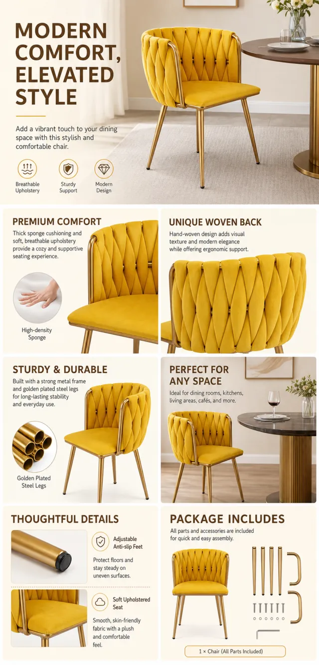
【Execution Route | Do Not Display】 If the image-generation tool can be invoked multiple times: concatenate the sharing rules with A–F separately, execute six times, generating only one 1000×1000 square image each time. If only a single image can be generated at a time: first set the interface/API to a 2:3 portrait orientation (do not use Auto), then arrange A/B, C/D, and E/F into a 2-column × 3-row grid; ensure all six cells are equal in size and maintain a visual aspect ratio of 1:1. The outer canvas must not be 1:1. 【Sharing Rules】 The provided product reference image serves as the sole basis for the product. The product is a mustard upholstered dining chair. Strictly adhere to the reference image’s shape, structure, color, quantity, accessories, texture, and relative proportions; do not fabricate any components, specifications, or functions that are not shown. Use high-quality Amazon commercial photography and clear English infographics; color schemes should match the product, lighting should be realistic, and layout should be simple. Maintain natural proportions among the product, figures, hands, icons, and props—no stretching, flattening, or independent scaling is allowed. Titles, products, and labels must remain entirely within the safe zone, with the background extending fully to all four edges. Only use MOCKUP for branding. No white borders, vertical sidebars, transparent fill‑ins, watermarks, contact information, social media accounts, original brand logos, platform identifiers, garbled text, distorted body parts, or unverified copywriting are permitted. A–F are solely control markers and must not be displayed. 【A | Product Overview】Title: “PRODUCT OVERVIEW.” The hero composition fully showcases the product along with the accessories included in the reference image; accompanied by three brief English icon-based selling points, stating only information that is visible or verifiable. 【B | Materials & Design】Title: “MATERIAL & DESIGN.” Present materials, structure, surface finishes, or styling through an overall view of the product combined with 2–3 close-up details; ensure clear annotations without fabricating material names. 【C | Functional Focus】Title: “FUNCTION IN FOCUS.” Demonstrate key functions within realistic usage scenarios; maintain natural proportions among figures, hands, and the product, with actions appearing genuine and information easily understandable at a glance. 【D | Detail Close-Ups】Title: “DETAILS UP CLOSE.” Highlight 2–4 critical structural or operational areas using magnified details and short captions; do not alter the product’s structure. 【E | Everyday Use】Title: “MADE FOR REAL LIFE.” Showcase usage, portability, storage, or maintenance scenarios consistent with the product; retain only one clear theme and avoid redundancy with C. 【F | Packing List】Title: “WHAT’S INCLUDED.” Lay out or neatly arrange the actual products and accessories featured in the reference image, ensuring accurate quantities and relative sizes; if the list cannot be confirmed, instead display visible specifications, dimensional relationships, or usage steps without inventing numbers.

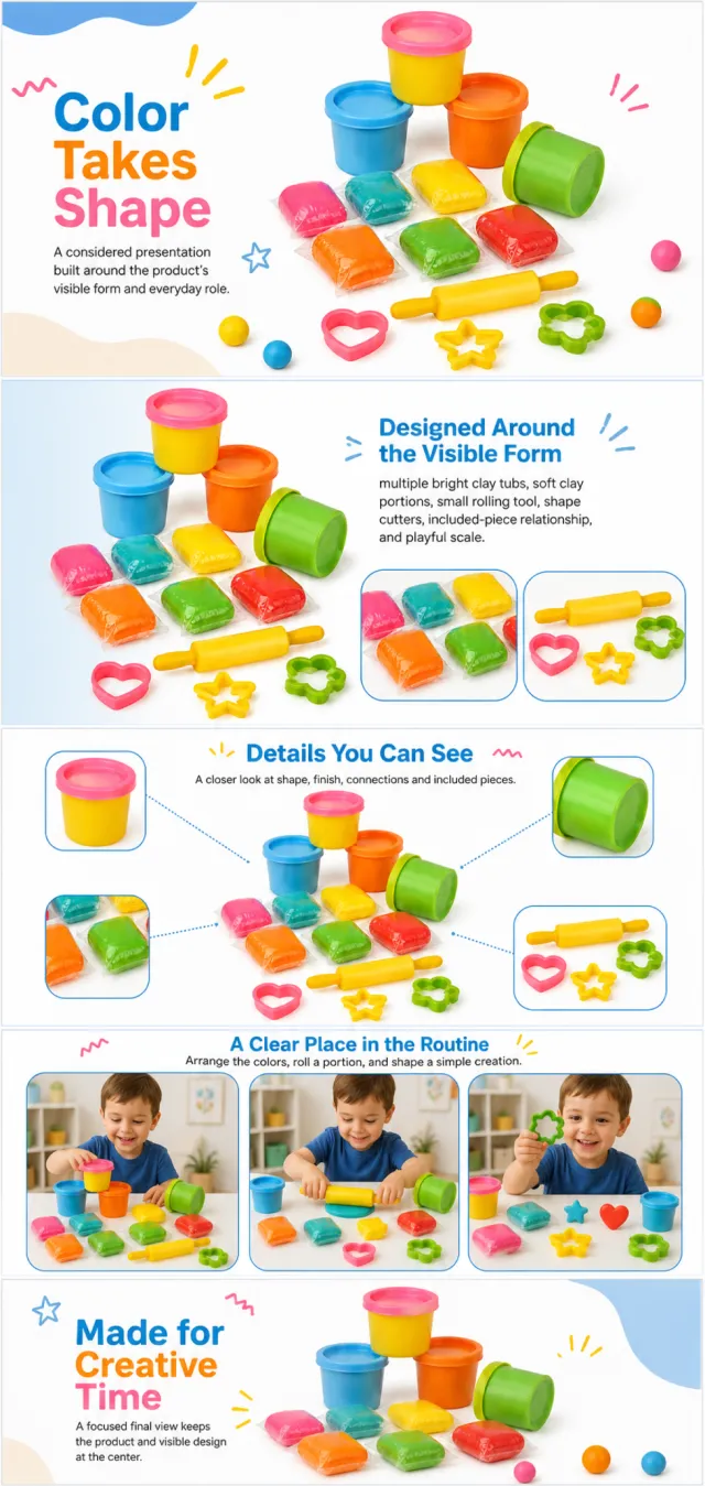
Using the supplied reference image as the sole product reference, create an Amazon A+ design preview for a colorful modeling-clay activity set. Preserve exact geometry, proportions, colors, construction, quantity, accessories, and scale. Visible details: multiple bright clay tubs, soft clay portions, small rolling tool, shape cutters, included-piece relationship, and playful scale. Do not invent hidden parts or claims. Visual system: warm white, sky blue, orange, yellow, green, pink, and red. Composition motifs: handwritten-style accent marks, rounded photo frames, colorful clay dots, and playful tool arrangements. Alternate a wide banner, asymmetric overview, centered detail graphic, three-scene sequence, and wide closing scene. Use readable sans-serif type and mobile-safe margins. Build this official A+ module order. Keep every module independently complete; never split copy or product details. MODULE 1 — Image with text overlay — introduction Exact headline: “Color Takes Shape” Exact supporting copy: “A considered presentation built around the product’s visible form and everyday role.” Layout: wide image-led hero; dominant complete product and large safe headline area. MODULE 2 — Single image with side text — product overview Exact headline: “Designed Around the Visible Form” Exact supporting copy: “multiple bright clay tubs, soft clay portions, small rolling tool, shape cutters, included-piece relationship, and playful scale.” Layout: large three-quarter product, side text field, and two detail crops. MODULE 3 — Four-image and text — visible evidence Exact headline: “Details You Can See” Exact supporting copy: “A closer look at shape, finish, connections and included pieces.” Layout: centered product with four rounded macro callouts; show only visible facts. MODULE 4 — Multiple image and text — routine or use setting Exact headline: “A Clear Place in the Routine” Exact supporting copy: “Arrange the colors, roll a portion, and shape a simple creation.” Layout: three framed scenes with consistent product design and newly generated people or animals only when relevant. MODULE 5 — Full-width image with text overlay — closing Exact headline: “Made for Creative Time” Exact supporting copy: “A focused final view keeps the product and visible design at the center.” Layout: wide editorial scene, strong silhouette, restrained props, safe text area. Create one vertical A+ preview at 1200px width with content-driven height, clear module boundaries, and varied compositions for independent export. Render only the exact copy above. Do not add logos, prices, promotions, QR codes, URLs, contacts, competitors, testimonials, ratings, guarantees, unverified claims, certifications, fake UI, watermarks, pseudo-text, or unrelated labels. Keep all elements natural and mobile-safe.

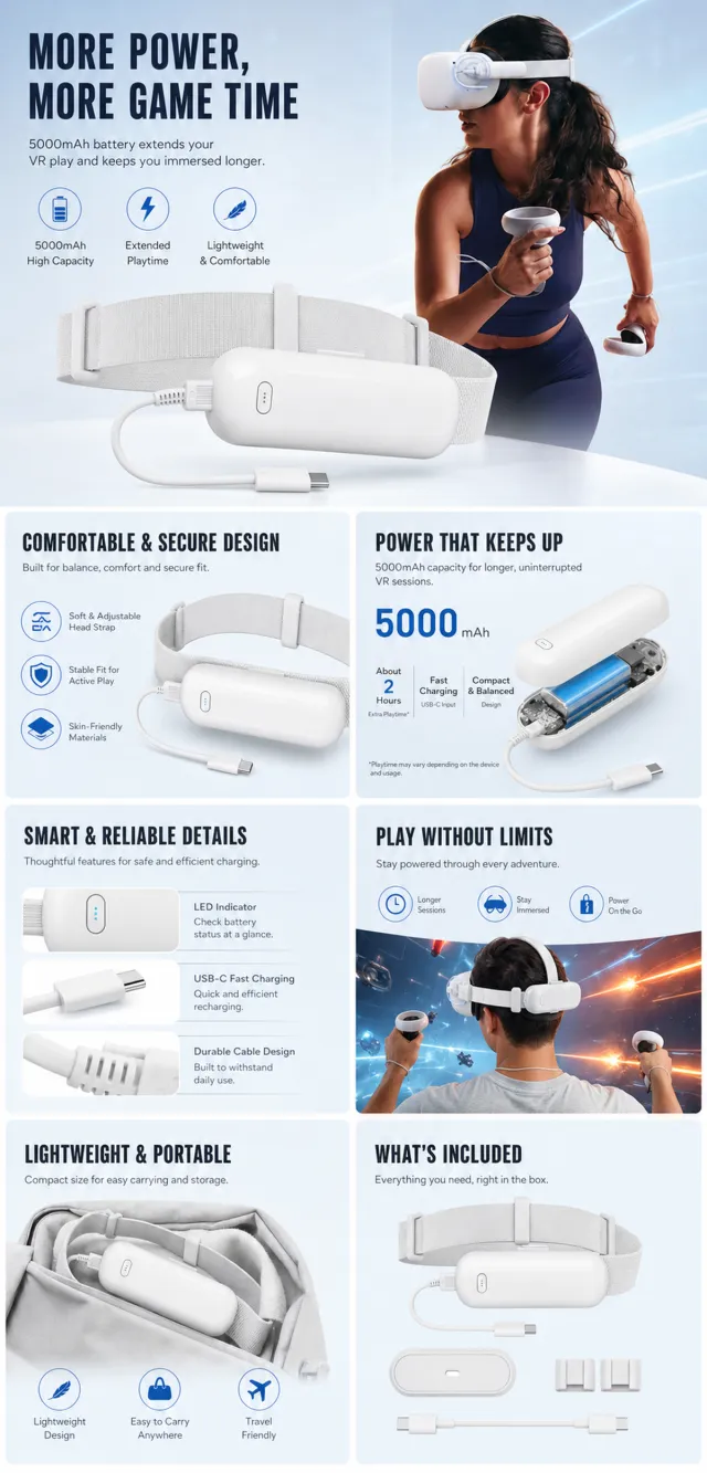
【Execution Route | Do Not Display】 If the image-generation tool can be invoked multiple times: concatenate the sharing rules with A–F separately, execute six times, generating only one 1000×1000 square image per run. If only a single image can be generated at a time: first set the interface/API to a 2:3 portrait orientation (do not use Auto), then arrange A/B, C/D, and E/F into a 2-column × 3-row grid; ensure all six cells are equal in size and maintain a visual aspect ratio of 1:1. The outer canvas must not be 1:1. 【Sharing Rules】 The provided product reference image serves as the sole basis for the product. The product is a VR headset battery pack. Strictly adhere to the reference image’s shape, structure, color, quantity, accessories, texture, and relative proportions; do not fabricate any unseen components, specifications, or functionalities. Use high-quality Amazon commercial photography and clear English infographics, with colors derived from the product itself, realistic lighting, and a clean layout. Maintain natural proportions for the product, figures, hands, icons, and props—no stretching, flattening, or independent scaling is allowed. Titles, products, and labels must remain fully within the safe area, while the background extends across the entire frame to all four edges. Only use MOCKUP for branding. No external white borders, vertical sidebars, transparent fill-in borders, watermarks, contact information, social media accounts, original brand logos, platform identifiers, garbled text, distorted body parts, or unverified copywriting are permitted. A–F are solely control markers and must not be displayed. 【A | Product Overview】Title: “PRODUCT OVERVIEW.” The hero composition should fully showcase the product along with the accessories depicted in the reference image, accompanied by three brief English icon-based selling points that highlight only visible or verifiable information. 【B | Materials & Design】Title: “MATERIAL & DESIGN.” Present materials, structure, surface finishes, or styling through an overall view of the product combined with 2–3 close-up details; ensure clear annotations without inventing material names. 【C | Function in Focus】Title: “FUNCTION IN FOCUS.” Demonstrate key functions within realistic usage scenarios; maintain natural proportions among characters, hands, and the product, with authentic gestures and easily understandable information. 【D | Details Up Close】Title: “DETAILS UP CLOSE.” Highlight 2–4 critical structural or operational areas using magnified details and short labels; do not alter the product’s structure. 【E | Everyday Use】Title: “MADE FOR REAL LIFE.” Depict usage, carrying, storage, or maintenance scenarios consistent with the product; retain only one clear theme and avoid duplication with C. 【F | Packaging Contents】Title: “WHAT’S INCLUDED.” Lay out or neatly arrange the actual products and accessories shown in the reference image, ensuring accurate quantities and relative sizes; if the list cannot be confirmed, instead display visible specifications, dimensional relationships, or usage steps without fabricating numbers.

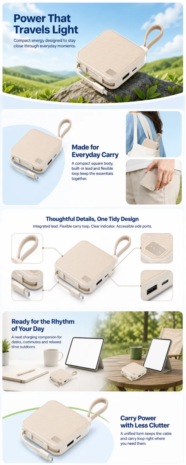
Using the supplied reference image as the sole product reference, create a complete Amazon A+ design preview. Preserve its exact geometry, proportions, warm sand-and-ivory color, visible construction, single-unit quantity, integrated lead, carry loop, side ports, indicator panel, and relative scale. Do not invent hidden parts or claims. Use sky blue, white, leaf green, and warm sand with soft daylight, rounded-square frames, curved white transitions, detail crops, and image-integrated bold sans-serif typography. Alternate full-width lifestyle banners, asymmetric product compositions, and compact callouts. Maintain mobile-safe margins. Build this official A+ module order. Keep each module independently complete. Decorative sky, curves, green accents, and soft light may repeat across edges; never split copy or product details. MODULE 1 — Image with text overlay — value introduction Exact headline: “Power That Travels Light” Exact supporting copy: “Compact energy designed to stay close through everyday moments.” Layout: wide blue-sky and green-hillside banner; large foreground product, headline in the upper safe area, curved white transition below. MODULE 2 — Single image with side text — portability Exact headline: “Made for Everyday Carry” Exact supporting copy: “A compact square body, built-in lead and flexible loop keep the essentials together.” Layout: three-quarter product on an airy white-and-blue field; include two cropped carry moments without brands or phone UI. MODULE 3 — Four-image and text — visible details Exact headline: “Thoughtful Details, One Tidy Design” Exact supporting copy: “Integrated lead. Flexible carry loop. Clear indicator. Accessible side ports.” Layout: centered product with four rounded close-up callouts and fine connector lines; use only visible facts. MODULE 4 — Full-width image with text overlay — use setting Exact headline: “Ready for the Rhythm of Your Day” Exact supporting copy: “A neat charging companion for desks, commutes and relaxed time outdoors.” Layout: wide scene transitioning from a bright desk to an outdoor table; keep the product dominant and screens blank. MODULE 5 — Single image highlight — closing summary Exact headline: “Carry Power with Less Clutter” Exact supporting copy: “A unified form keeps the cable and carry loop right where you need them.” Layout: hero product on white with pale blue shadows and a restrained green arc; strong silhouette and generous safe area. Create one continuous vertical A+ preview at 1200px width with content-driven height. Use clear module boundaries and varied compositions for later independent export. Render only the exact copy above. Do not add logos, prices, promotions, QR codes, URLs, contacts, testimonials, awards, competitors, warranties, certifications, capacities, charging speeds, fake UI, watermarks, pseudo-text, or unrelated labels. Keep all elements natural and mobile-safe.

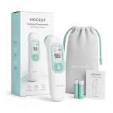
【Execution Routing | Do Not Display】 If the image-generation tool can be invoked multiple times: concatenate the sharing rules with A–F separately, execute six times, generating one 1000×1000 square image each time; do not submit all modules at once. If only one image can be generated per run: set the interface or API to a 2:3 portrait orientation and avoid using Auto mode; a recommended size is 1200×1800. Arrange A/B, C/D, and E/F into a 2-column × 3-row grid of six modules, ensuring equal module sizes and maintaining a 1:1 aspect ratio. If the platform enforces a 1:1 ratio, switch to an Agent-based approach or generate each module individually. 【Sharing Rules】 The provided product reference image serves as the sole product basis. Product: baby care thermometer kit. Copywriting must be in English, with brand placeholders replaced by MOCKUP only. Visuals should follow premium commercial e-commerce photography standards and maintain stable graphic design. The product’s appearance, structure, color, quantity, accessories, and relative proportions must match the reference image; products, people, icons, and props should retain natural proportions. All essential information must remain within the safe zone, with the background extending fully across all four edges. External white borders, vertical sidebars, transparent fill-in areas, watermarks, contact details, social media accounts, platform information, original branding, gibberish, irrelevant content, or unverified claims regarding efficacy or specifications are prohibited. Headlines must not be displayed. A–F must not appear. 【A | Core Selling Point】Write concise English copy focusing on this theme, using the full product main visual to highlight core value. 【B | Usage Instructions】Provide brief English copy addressing this theme, illustrating the usage process, combinations, or key operations. 【C | Applicable Scenarios】Present short English copy centered on this theme, showcasing realistic, credible, and product-relevant usage scenarios. 【D | Functional Details】Offer succinct English copy highlighting structural and functional details through close-up shots, cross-sections, or icons. 【E | Daily Maintenance】Craft brief English copy explaining how to use, clean, store, or maintain the product. 【F | Specification List】Compose concise English copy covering materials, specifications, packaging details, or credible comparisons—avoid fabricating parameters.

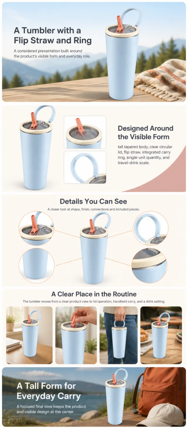
Using the supplied reference image as the sole product reference, create an Amazon A+ design preview for an insulated travel tumbler. Preserve exact geometry, proportions, colors, construction, quantity, accessories, and scale. Visible details: tall tapered body, clear circular lid, flip straw, integrated carry ring, single-unit quantity, and travel-drink scale. Do not invent hidden parts or claims. Visual system: warm ivory, pale blue, dusty rose, charcoal, and soft orange. Composition motifs: outdoor banners, cross-section graphics, rounded handling scenes, and circular lid close-ups. Alternate a wide banner, asymmetric overview, centered detail graphic, three-scene sequence, and wide closing scene. Use readable sans-serif type and mobile-safe margins. Build this official A+ module order. Keep every module independently complete; never split copy or product details. MODULE 1 — Image with text overlay — introduction Exact headline: “A Tumbler with a Flip Straw and Ring” Exact supporting copy: “A considered presentation built around the product’s visible form and everyday role.” Layout: wide image-led hero; dominant complete product and large safe headline area. MODULE 2 — Single image with side text — product overview Exact headline: “Designed Around the Visible Form” Exact supporting copy: “tall tapered body, clear circular lid, flip straw, integrated carry ring, single-unit quantity, and travel-drink scale.” Layout: large three-quarter product, side text field, and two detail crops. MODULE 3 — Four-image and text — visible evidence Exact headline: “Details You Can See” Exact supporting copy: “A closer look at shape, finish, connections and included pieces.” Layout: centered product with four rounded macro callouts; show only visible facts. MODULE 4 — Multiple image and text — routine or use setting Exact headline: “A Clear Place in the Routine” Exact supporting copy: “The tumbler moves from a clear product view to lid operation, handheld carry, and a drink setting.” Layout: three framed scenes with consistent product design and newly generated people or animals only when relevant. MODULE 5 — Full-width image with text overlay — closing Exact headline: “A Tall Form for Everyday Carry” Exact supporting copy: “A focused final view keeps the product and visible design at the center.” Layout: wide editorial scene, strong silhouette, restrained props, safe text area. Create one vertical A+ preview at 1200px width with content-driven height, clear module boundaries, and varied compositions for independent export. Render only the exact copy above. Do not add logos, prices, promotions, QR codes, URLs, contacts, competitors, testimonials, ratings, guarantees, unverified claims, certifications, fake UI, watermarks, pseudo-text, or unrelated labels. Keep all elements natural and mobile-safe.

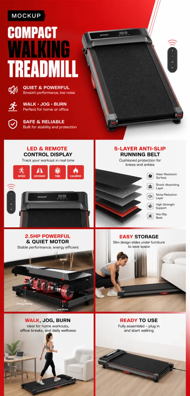
【Execution Routing | Do Not Display】 If the image-generation tool can be invoked multiple times: concatenate the sharing rules with A–F separately, execute six times, generating one 1000×1000 square image each time; do not submit all modules at once. If only one image can be generated per invocation: set the aspect ratio to 2:3 portrait mode in the interface or via API, and avoid using Auto; a recommended size is 1200×1800. Arrange the modules into a 2-column × 3-row grid labeled A/B, C/D, and E/F, ensuring all six modules are equal in size and maintain a 1:1 proportion. If the platform enforces a 1:1 ratio, switch to an Agent-based approach or generate each module individually. 【Sharing Rules】 The provided product reference image serves as the sole basis for the product. Product: under-desk walking treadmill. Copywriting must be in English, with brand placeholders replaced by MOCKUP only. Visuals should follow premium commercial e-commerce photography standards and stable graphic design principles. The product’s appearance, structure, color, quantity, accessories, and relative proportions must match the reference image; product, people, icons, and props should maintain natural proportions. All essential information must remain within the safe zone, with the background extending fully to all four edges. External white borders, vertical borders on left and right, transparent fill-in borders, watermarks, contact details, social media accounts, platform information, original branding, gibberish, irrelevant content, or unverified claims regarding efficacy or specifications are prohibited. Headlines must not be displayed. A–F must not appear. 【A | Core Selling Point】Write concise English copy that highlights this theme, focusing on the core value through the full product visual. 【B | Usage Instructions】Provide brief English copy that explains the topic, illustrating the usage process, combinations, or key operations. 【C | Applicable Scenarios】Present short English copy that depicts realistic, credible, and product-relevant usage scenarios. 【D | Functional Details】Offer succinct English copy that uses close-up shots, cross-sections, or icons to clarify structural and functional details. 【E | Daily Maintenance】Craft brief English copy that outlines methods for use, cleaning, storage, or maintenance. 【F | Specification List】Compose concise English copy that lists materials, dimensions, packaging details, or provides credible comparisons—without fabricating parameters.

【Execution Route | Do Not Display】 If the image-generation tool can be invoked multiple times: concatenate the sharing rules with A–F separately, execute six times, generating only one 1000×1000 square image per run. If only a single image can be generated at a time: first set the interface/API to a 2:3 portrait orientation (do not use Auto), then arrange A/B, C/D, and E/F into a 2-column × 3-row grid; ensure all six cells are equal in size and maintain a visual aspect ratio of 1:1. The outer canvas must not be 1:1. 【Sharing Rules】 The provided product reference image serves as the sole basis for the product. The product is a convertible well jet pump. Strictly adhere to the reference image’s shape, structure, color, quantity, accessories, textures, and relative proportions; do not fabricate any unseen components, specifications, or functions. Use high-quality Amazon commercial photography and clear English infographics, with colors derived from the product itself, realistic lighting, and a clean layout. Maintain natural proportions for the product, figures, hands, icons, and props—no stretching, flattening, or independent scaling is allowed. Headlines, products, and labels must remain fully within the safe zone, while the background extends seamlessly across all four edges. Only use MOCKUP for branding. No white borders, vertical sidebars, transparent fill-in areas, watermarks, contact information, social media accounts, original brand logos, platform identifiers, garbled text, distorted body parts, or unverified copywriting are permitted. A–F are solely control markers and must not be displayed. 【A | Product Overview】Title: “PRODUCT OVERVIEW.” The hero composition fully showcases the product along with the accessories depicted in the reference image, accompanied by three brief English icon-based selling points that highlight only visible or verifiable information. 【B | Materials & Design】Title: “MATERIAL & DESIGN.” Present materials, structure, surface finishes, or styling through an overall view of the product combined with 2–3 close-up details; ensure clear labeling without inventing material names. 【C | Function in Focus】Title: “FUNCTION IN FOCUS.” Demonstrate key functions within realistic usage scenarios; maintain natural proportions among figures, hands, and the product, with authentic actions and easily understandable information. 【D | Details Up Close】Title: “DETAILS UP CLOSE.” Highlight 2–4 critical structural or operational areas using magnified details and short captions; do not alter the product’s structure. 【E | Everyday Use】Title: “MADE FOR REAL LIFE.” Depict usage, carrying, storage, or maintenance scenarios that align with the product; retain only one clear theme and avoid duplication with C. 【F | Packaging Contents】Title: “WHAT’S INCLUDED.” Lay out or neatly arrange the actual products and accessories shown in the reference image, ensuring accurate quantities and relative sizes; if the list cannot be confirmed, instead display visible specifications, dimensional relationships, or usage steps without fabricating numbers.

【Execution Routing | Do Not Display】 If the image-generation tool can be invoked multiple times: concatenate the sharing rules with A–F separately, execute six times, generating one 1000×1000 square image each time; do not submit all modules at once. If only one image can be generated per run: set the interface or API to a 2:3 portrait orientation and disable Auto mode; a recommended size is 1200×1800. Arrange A/B, C/D, and E/F into a 2-column × 3-row grid of six modules, ensuring equal module sizes and maintaining a 1:1 aspect ratio. If the platform enforces a 1:1 ratio, switch to using an Agent or generate each module individually. 【Sharing Rules】 The provided product reference image serves as the sole basis for the product. Product: waterproof quilted mattress protector. Copywriting should be in Dutch, with brand placeholders limited to MOCKUP. Visuals should incorporate white, sage, pale gray, and mist blue. The product’s appearance, structure, color, quantity, accessories, and relative proportions must match the reference image; product, figures, icons, and props should maintain natural proportions. All essential information must remain within the safe zone, with the background extending fully to all four edges. External white borders, vertical borders on left and right, transparent fill-in borders, watermarks, contact details, social media accounts, platform information, original branding, gibberish, irrelevant content, or unverified claims regarding efficacy or specifications are prohibited; titles must not appear. A–F must not be displayed. 【A | Theme】Copy: “Koel & Beschermd Slapen” (Cool & Protected Sleep); focus on conveying the core value through the complete main visual of the product. 【B | Theme】Copy: “Ademend comfort” (Breathable Comfort); design an independent square image around this theme, avoiding overlapping selling points, compositions, and product angles with other modules. 【C | Theme】Copy: “Zachte quiltlaag” (Soft Quilt Layer); design an independent square image around this theme, avoiding overlapping selling points, compositions, and product angles with other modules. 【D | Theme】Copy: “Waterdichte kern” (Waterproof Core); design an independent square image around this theme, avoiding overlapping selling points, compositions, and product angles with other modules. 【E | Theme】Copy: “Elastische hoeken” (Elastic Corners); design an independent square image around this theme, avoiding overlapping selling points, compositions, and product angles with other modules. 【F | Theme】Copy: “Stil materiaal” (Silent Material) and “Machinewasbaar” (Machine Washable); design independent square images around these themes, avoiding overlapping selling points, compositions, and product angles with other modules.
Based on the reference image, generate a high‑fidelity e‑commerce product detail page rendering showcasing the hard‑core texture of an aluminum‑magnesium travel suitcase. A bright silver, vertically striped suitcase is positioned at a three‑quarter upward angle in the center of an orange‑red industrial‑style background. The design retains the metal vertical‑grain body, pull handle, side carry handle, four wheels, and rigid corner protectors, while refining the wheel assembly, lock mechanism, and edge details. No brand names, logos, slogans, or decorative text appear on the product surface. On either side of the composition, black metallic robotic arms paired with thick chains create a sense of tension, while orange floor lighting illuminates the suitcase from below. At the top, an oversized, bold, experimental‑type white English headline reads “TRAVEL MODE.” In the middle, large white Chinese text declares “Hardcore Travel” and “Explore Without Limits.” At the bottom, three columns of white bullet points highlight key selling points: “More Peace of Mind on the Go,” “High‑Strength Metal Body,” and “Durable & Impact‑Resistant,” each accompanied by a brief explanatory line. On the right, a small set of offset English supporting text and white circular markers adds visual flair without introducing meaningless micro‑text. The overall composition evokes a trendy industrial‑style poster, with robust, dynamic typography that keeps information clear and unobscured by the suitcase, while faithfully rendering metallic details. Output dimensions: 750 x 1334px. Avoid: real brands, model numbers, footnotes, garbled characters, watermarks, overlapping text, text overflow, subject occlusion, abnormal subject proportions, duplicate products, low‑resolution icons, and excessive negative space.

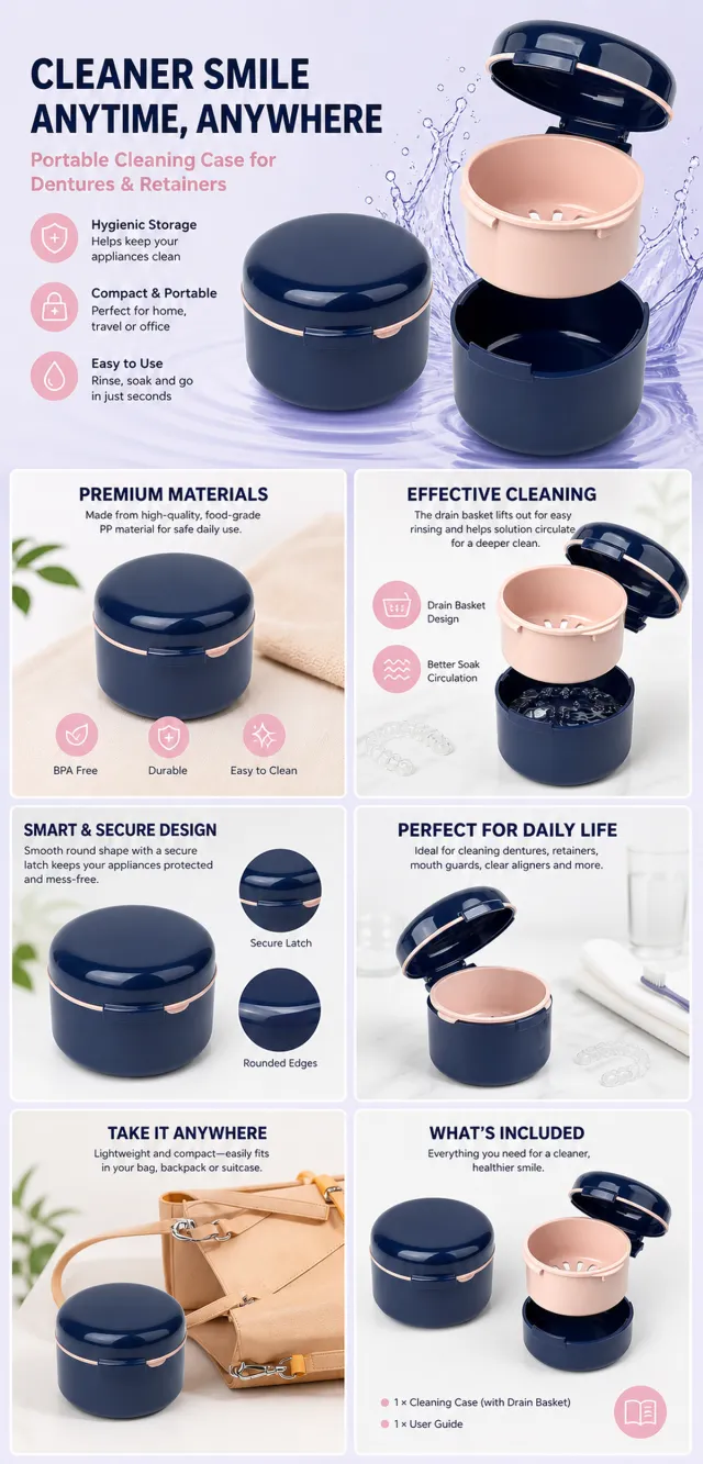
【Execution Route | Do Not Display】 If the image-generation tool can be invoked multiple times: concatenate the sharing rules with A–F separately, execute six times, generating only one 1000×1000 square image per run. If only a single image can be generated at a time: first set the interface/API to a 2:3 portrait orientation (do not use Auto), then arrange A/B, C/D, and E/F into a 2-column × 3-row grid; ensure all six cells are equal in size and maintain a visual aspect ratio of 1:1. The outer canvas must not be 1:1. 【Sharing Rules】 The provided product reference image serves as the sole basis for the product. The product is a portable denture and retainer cleaning case. Strictly adhere to the reference image’s shape, structure, color, quantity, accessories, texture, and relative proportions; do not invent or fabricate any components, specifications, or functions that are not shown. Use high-quality Amazon commercial photography and clear English infographics, with colors derived from the product itself, realistic lighting, and a clean layout. Maintain natural proportions for the product, figures, hands, icons, and props; stretching, flattening, or independently scaling these elements is prohibited. Headlines, products, and labels must remain entirely within the safe zone, while the background should extend fully across all four edges. Only use MOCKUP for branding. Avoid peripheral white borders, vertical sidebars, transparent fill-in areas, watermarks, contact information, social media accounts, original brand logos, platform identifiers, garbled text, distorted body parts, or unverified copywriting. A–F are solely control markers and must not be displayed. 【A | Product Overview】Title: “PRODUCT OVERVIEW.” The hero composition fully showcases the product along with the accessories depicted in the reference image, accompanied by three brief English icon-based selling points—only stating information that is visible or verifiable. 【B | Materials & Design】Title: “MATERIAL & DESIGN.” Present materials, structure, surface finishes, or styling through an overall view of the product combined with 2–3 close-up details; ensure clear annotations without fabricating material names. 【C | Function in Focus】Title: “FUNCTION IN FOCUS.” Demonstrate key functions within realistic usage scenarios; maintain natural proportions among figures, hands, and the product, with actions appearing genuine and information easily understandable at a glance. 【D | Details Up Close】Title: “DETAILS UP CLOSE.” Highlight 2–4 critical structural or operational areas using magnified details and short captions; do not alter the product’s structure. 【E | Everyday Use】Title: “MADE FOR REAL LIFE.” Showcase usage, portability, storage, or maintenance scenarios consistent with the product; retain only one clear theme and avoid redundancy with C. 【F | Packaging Contents】Title: “WHAT’S INCLUDED.” Lay out or neatly arrange the actual products and accessories featured in the reference image, ensuring accurate quantities and relative sizes; if the contents cannot be confirmed, instead display visible specifications, dimensional relationships, or usage steps, refraining from fabricating numbers.

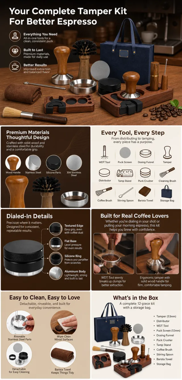
【Execution Route | Do Not Display】 If the image-generation tool can be invoked multiple times: concatenate the sharing rules with A–F separately, execute six times, generating only one 1000×1000 square image each time. If only a single image can be generated at a time: first set the interface/API to a 2:3 portrait orientation (do not use Auto), then arrange A/B, C/D, and E/F into a 2-column × 3-row grid; ensure all six cells are equal in size and maintain a visual aspect ratio of 1:1. The outer canvas must not be 1:1. 【Sharing Rules】 The provided product reference image serves as the sole basis for the product. The product is an espresso tamper accessory kit. Strictly adhere to the reference image’s shape, structure, color, quantity, included accessories, texture, and relative proportions; do not fabricate any unseen components, specifications, or functions. Use high-quality Amazon commercial photography and clear English infographics, with colors derived from the product itself, realistic lighting, and a clean layout. Maintain natural proportions for the product, figures, hands, icons, and props—no stretching, flattening, or independent scaling is allowed. Titles, products, and labels must remain entirely within the safe zone, while the background extends fully across all four edges. Only use MOCKUP for branding. No white borders, vertical sidebars, transparent fill‑ins, watermarks, contact information, social media accounts, original brand logos, platform identifiers, garbled text, distorted body parts, or unverified copywriting are permitted. A–F are solely control markers and must not be displayed. 【A | Product Overview】Title: “PRODUCT OVERVIEW.” The hero composition fully showcases the product along with the accessories depicted in the reference image, accompanied by three brief English icon-based selling points that highlight only visible or verifiable information. 【B | Materials & Design】Title: “MATERIAL & DESIGN.” Present materials, structure, surface finishes, or styling through a full‑view shot of the product combined with 2–3 close-up details; ensure clear labeling without inventing material names. 【C | Function in Focus】Title: “FUNCTION IN FOCUS.” Demonstrate key functions within realistic usage scenarios; maintain natural proportions among characters, hands, and the product, with authentic gestures and easily understandable information. 【D | Details Up Close】Title: “DETAILS UP CLOSE.” Highlight 2–4 critical structural or operational areas using magnified details and short captions; do not alter the product’s underlying structure. 【E | Everyday Use】Title: “MADE FOR REAL LIFE.” Depict scenes of actual use, carrying, storage, or maintenance that align with the product; retain only one clear theme and avoid duplication with C. 【F | Packaging Contents】Title: “WHAT’S INCLUDED.” Lay out or neatly arrange the actual products and accessories shown in the reference image, ensuring accurate quantities and relative sizes; if the contents cannot be confirmed, instead display visible specifications, dimensional relationships, or usage steps without fabricating numbers.

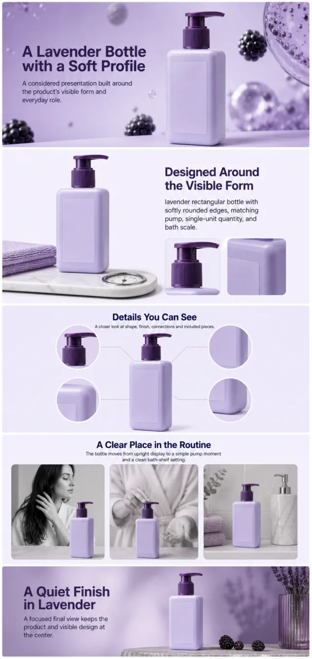
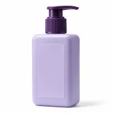
Using the supplied reference image as the sole product reference, create an Amazon A+ design preview for a pump-bottle hair cleanser. Preserve exact geometry, proportions, colors, construction, quantity, accessories, and scale. Visible details: lavender rectangular bottle with softly rounded edges, matching pump, single-unit quantity, and bath scale. Do not invent hidden parts or claims. Visual system: moonlit lavender, blackberry purple, pale lilac, black, and white. Composition motifs: floating berry forms, liquid-bubble macros, monochrome hair scenes, and spacious lavender panels. Alternate a wide banner, asymmetric overview, centered detail graphic, three-scene sequence, and wide closing scene. Use readable sans-serif type and mobile-safe margins. Build this official A+ module order. Keep every module independently complete; never split copy or product details. MODULE 1 — Image with text overlay — introduction Exact headline: “A Lavender Bottle with a Soft Profile” Exact supporting copy: “A considered presentation built around the product’s visible form and everyday role.” Layout: wide image-led hero; dominant complete product and large safe headline area. MODULE 2 — Single image with side text — product overview Exact headline: “Designed Around the Visible Form” Exact supporting copy: “lavender rectangular bottle with softly rounded edges, matching pump, single-unit quantity, and bath scale.” Layout: large three-quarter product, side text field, and two detail crops. MODULE 3 — Four-image and text — visible evidence Exact headline: “Details You Can See” Exact supporting copy: “A closer look at shape, finish, connections and included pieces.” Layout: centered product with four rounded macro callouts; show only visible facts. MODULE 4 — Multiple image and text — routine or use setting Exact headline: “A Clear Place in the Routine” Exact supporting copy: “The bottle moves from upright display to a simple pump moment and a clean bath-shelf setting.” Layout: three framed scenes with consistent product design and newly generated people or animals only when relevant. MODULE 5 — Full-width image with text overlay — closing Exact headline: “A Quiet Finish in Lavender” Exact supporting copy: “A focused final view keeps the product and visible design at the center.” Layout: wide editorial scene, strong silhouette, restrained props, safe text area. Create one vertical A+ preview at 1200px width with content-driven height, clear module boundaries, and varied compositions for independent export. Render only the exact copy above. Do not add logos, prices, promotions, QR codes, URLs, contacts, competitors, testimonials, ratings, guarantees, unverified claims, certifications, fake UI, watermarks, pseudo-text, or unrelated labels. Keep all elements natural and mobile-safe.

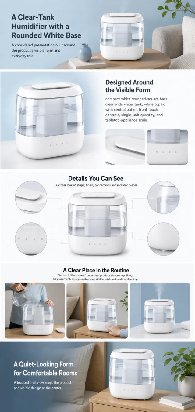
Using the supplied reference image as the sole product reference, create an Amazon A+ design preview for a top-fill room humidifier. Preserve exact geometry, proportions, colors, construction, quantity, accessories, and scale. Visible details: compact white rounded-square base, clear wide water tank, white top lid with central outlet, front touch controls, single-unit quantity, and tabletop-appliance scale. Do not invent hidden parts or claims. Visual system: clean white, clear aqua, soft blue, charcoal, and pale gray. Composition motifs: wide lifestyle banners, modular feature cards, water-and-mist close-ups, and calm room scenes. Alternate a wide banner, asymmetric overview, centered detail graphic, three-scene sequence, and wide closing scene. Use readable sans-serif type and mobile-safe margins. Use this five-module order. Keep each module complete. MODULE 1 — Image with text overlay — introduction Exact headline: “A Clear-Tank Humidifier with a Rounded White Base” Exact supporting copy: “A considered presentation built around the product’s visible form and everyday role.” Layout: wide image-led hero; dominant complete product and large safe headline area. MODULE 2 — Single image with side text — product overview Exact headline: “Designed Around the Visible Form” Exact supporting copy: “compact white rounded-square base, clear wide water tank, white top lid with central outlet, front touch controls, single-unit quantity, and tabletop-appliance scale.” Layout: large three-quarter product, side text field, and two detail crops. MODULE 3 — Four-image and text — visible evidence Exact headline: “Details You Can See” Exact supporting copy: “A closer look at shape, finish, connections and included pieces.” Layout: centered product with four rounded macro callouts; show only visible facts. MODULE 4 — Multiple image and text — routine or use setting Exact headline: “A Clear Place in the Routine” Exact supporting copy: “The humidifier moves from a clear product view to top filling, lid placement, simple control use, visible mist, and routine cleaning.” Layout: three framed scenes with consistent product design and newly generated people or animals only when relevant. MODULE 5 — Full-width image with text overlay — closing Exact headline: “A Quiet-Looking Form for Comfortable Rooms” Exact supporting copy: “A focused final view keeps the product and visible design at the center.” Layout: wide editorial scene, strong silhouette, restrained props, safe text area. Create one vertical A+ preview at 1200px width with content-driven height, clear module boundaries, and varied compositions for independent export. Render only the exact copy above. Do not add logos, prices, promotions, QR codes, URLs, contacts, competitors, testimonials, ratings, guarantees, unverified claims, certifications, fake UI, watermarks, pseudo-text, or unrelated labels. Keep all elements natural and mobile-safe.

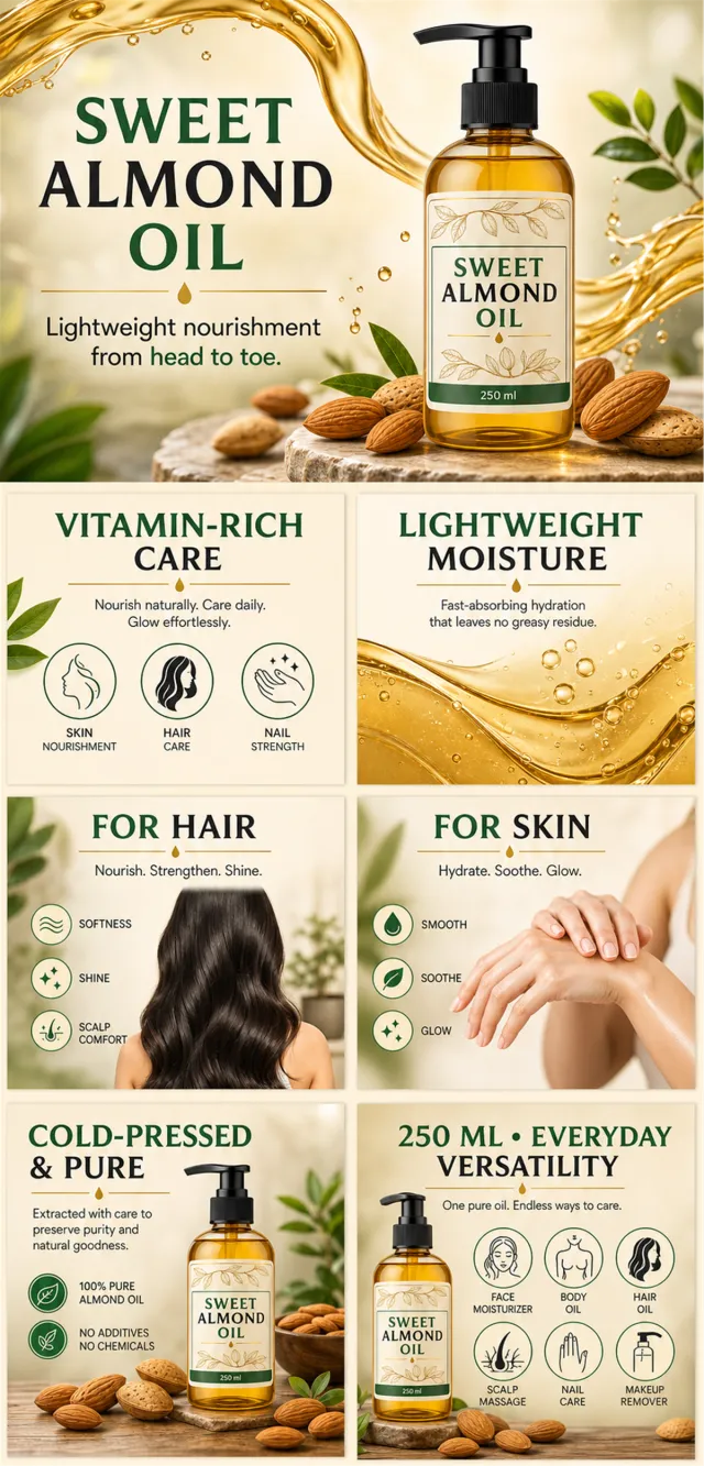
【Execution Routing | Do Not Display】 If the image-generation tool can be invoked multiple times: concatenate the sharing rules with A–F separately, execute six times, generating one 1000×1000 square image each time; do not submit all modules at once. If only one image can be generated per invocation: set the interface or API to a 2:3 portrait orientation and disable Auto mode; a recommended size is 1200×1800. Arrange A/B, C/D, and E/F into a 2-column × 3-row grid of six modules, ensuring equal module sizes and maintaining a 1:1 aspect ratio. If the platform enforces a 1:1 ratio, switch to using an Agent or generate images module by module. 【Sharing Rules】 Use the provided product reference image as the sole product basis. Product: sweet almond multipurpose oil. Copywriting should be in English, with brand placeholders limited to MOCKUP. Visuals must follow high-end commercial e-commerce photography standards—sharp imagery, clear hierarchy, and concise, easy-to-read copy. The product’s appearance, structure, color, quantity, accessories, and relative proportions must match the reference image; products, people, icons, and props should maintain natural proportions. All essential information must remain within the safe zone, with the background extending fully across all four edges. Prohibit white borders around the perimeter, vertical borders on the left and right, transparent fill-in borders, watermarks, contact information, social media accounts, platform details, original branding, gibberish, irrelevant content, or unverified claims regarding efficacy or specifications; titles must not be displayed. A–F must not appear. 【A | Theme】Copy: “SWEET ALMOND OIL”; “VITAMIN-RICH CARE”; focus on conveying core value through the complete primary visual of the product. 【B | Theme】Copy: “LIGHTWEIGHT MOISTURE”; design an independent square image centered around this theme, avoiding overlapping selling points, compositions, and product angles with other modules. 【C | Theme】Copy: “FOR HAIR”; design an independent square image around this theme, avoiding repeated selling points, compositions, and product angles with other modules. 【D | Theme】Copy: “FOR SKIN”; design an independent square image around this theme, avoiding repeated selling points, compositions, and product angles with other modules. 【E | Theme】Copy: “COLD-PRESSED & PURE”; design an independent square image around this theme, avoiding repeated selling points, compositions, and product angles with other modules. 【F | Theme】Copy: “250 ML • EVERYDAY VERSATILITY”; “SOFTNESS • SHINE • SCALP COMFORT”; design an independent square image around these themes, avoiding repeated selling points, compositions, and product angles with other modules.
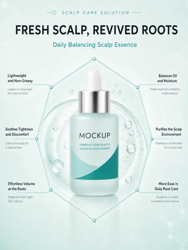
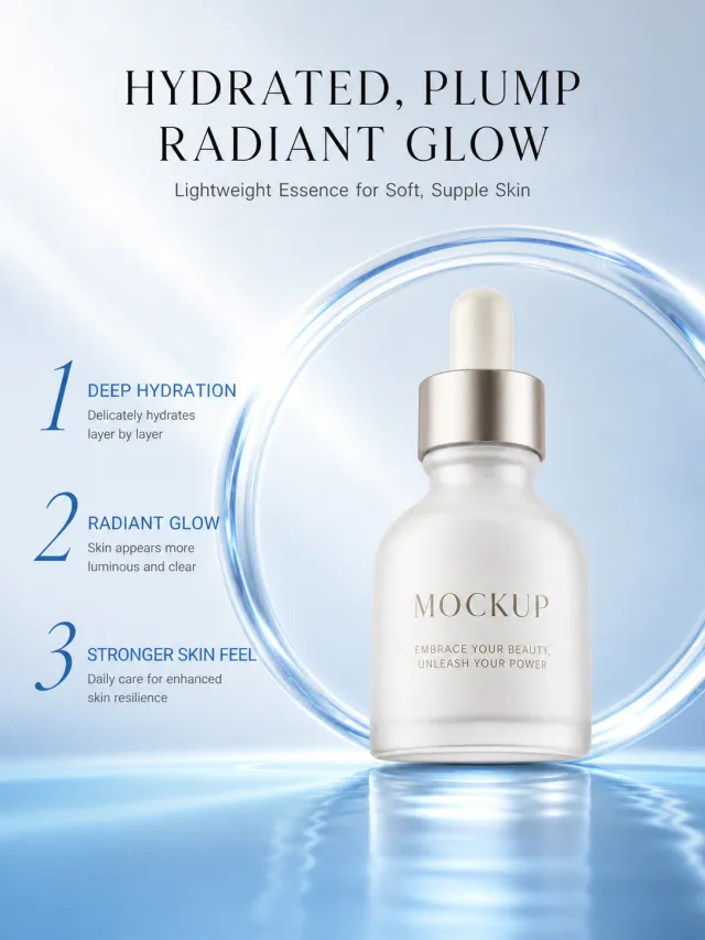
Based on the provided white-background product images, generate a detailed e-commerce page poster for Scalp Qingheng Essence. Product Features: Maintains a misty light blue glass dropper bottle, silver shoulder with white dropper tip; The main body already has a MOCKUP and slogan, preserved intact, without adding any minor parameters or clinical markers. Layout replica: Extremely light mint green tech background, with a minimalist English auxiliary logo and a large title at the top; In the middle, the product bottle is placed at the center of a hexagonal wire frame, with transparent condensation and microbubbles inside; Six thin lines connect to three sets of short selling points on each side, with the bottom kept clean and blank. Font and text layout: Titles should be in modern sans-serif bold, with numbers or keywords highlighted in bright cyan; Each group's selling point title is medium text with black text, and auxiliary notes are small gray text; The hexagonal wireframe is fine cyan, and the left-right text is symmetrically aligned. Copywriting Usage: Refreshes scalp and revitalizes hair roots Daily Qingheng Care Essence Light and non-sticky Maintain the balance of oil and water Relieves tightness and discomfort Cleanses the scalp environment Hair roots are light and voluminous Daily root protection is more relaxed Graphic elements: hexagons, nodes, and condensation bubbles all feature a lightweight tech transparent texture, with thin and smooth lines. Avoid in: original brand, certification percentage, medical commitments, footnotes, duplicate products, watermarks, text pressing down on the dropper bottle.

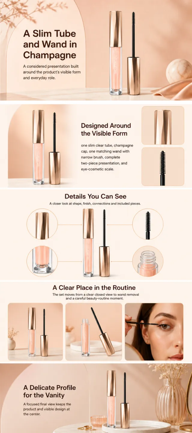
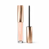
Using the supplied reference image as the sole product reference, create an Amazon A+ design preview for a lash-cosmetic tube and wand set. Preserve exact geometry, proportions, colors, construction, quantity, accessories, and scale. Visible details: one slim clear tube, champagne cap, one matching wand with narrow brush, complete two-piece presentation, and eye-cosmetic scale. Do not invent hidden parts or claims. Visual system: warm peach, champagne gold, cream, and cocoa brown. Composition motifs: soft beauty portraits, arched beige panels, circular brush details, and airy cosmetic still lifes. Alternate a wide banner, asymmetric overview, centered detail graphic, three-scene sequence, and wide closing scene. Use readable sans-serif type and mobile-safe margins. Build this official A+ module order. Keep every module independently complete; never split copy or product details. MODULE 1 — Image with text overlay — introduction Exact headline: “A Slim Tube and Wand in Champagne” Exact supporting copy: “A considered presentation built around the product’s visible form and everyday role.” Layout: wide image-led hero; dominant complete product and large safe headline area. MODULE 2 — Single image with side text — product overview Exact headline: “Designed Around the Visible Form” Exact supporting copy: “one slim clear tube, champagne cap, one matching wand with narrow brush, complete two-piece presentation, and eye-cosmetic scale.” Layout: large three-quarter product, side text field, and two detail crops. MODULE 3 — Four-image and text — visible evidence Exact headline: “Details You Can See” Exact supporting copy: “A closer look at shape, finish, connections and included pieces.” Layout: centered product with four rounded macro callouts; show only visible facts. MODULE 4 — Multiple image and text — routine or use setting Exact headline: “A Clear Place in the Routine” Exact supporting copy: “The set moves from a clear closed view to wand removal and a careful beauty-routine moment.” Layout: three framed scenes with consistent product design and newly generated people or animals only when relevant. MODULE 5 — Full-width image with text overlay — closing Exact headline: “A Delicate Profile for the Vanity” Exact supporting copy: “A focused final view keeps the product and visible design at the center.” Layout: wide editorial scene, strong silhouette, restrained props, safe text area. Create one vertical A+ preview at 1200px width with content-driven height, clear module boundaries, and varied compositions for independent export. Render only the exact copy above. Do not add logos, prices, promotions, QR codes, URLs, contacts, competitors, testimonials, ratings, guarantees, unverified claims, certifications, fake UI, watermarks, pseudo-text, or unrelated labels. Keep all elements natural and mobile-safe.

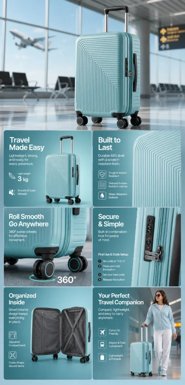
【Execution Route | Must Not Appear on Screen】 If the image-generation tool can be invoked multiple times: concatenate the sharing rules with A–F separately, and execute six times; each time generating only one independent 1000×1000 square image, resulting in six sub-images. If only single‑shot generation is allowed: use a 2:3 vertical canvas of 1200×2500 pixels, with approximately 30% at the top reserved for the product’s main visual integrated into the background, and arrange the remaining area into a 2‑column × 3‑row grid labeled A/B, C/D, and E/F. All six cards should be equal in size, with an aspect ratio close to 1:1. Do not use a 1:1 outer canvas, nor full‑width cards, cross‑column cards, merged cards, borders, frames, or white margins. 【Sharing Rules】 The provided product reference image serves as the sole basis for the product’s appearance, structure, color, quantity, accessories, and relative proportions. Product orientation: light blue textured suitcase, trolley handle, swivel wheels, and internal compartmentalization; airport settings, storage solutions, and smooth mobility. The product itself, along with any newly generated characters, animals, props, or text, must maintain natural proportions—stretching, flattening, or non‑uniform scaling is prohibited—and the background must extend fully across all four edges. Branding must uniformly follow the MOCKUP style; remove original branding, logos, watermarks, contact information, social media handles, platform details, gibberish, and irrelevant content. Copywriting should be concise, clear, and credible, retaining the language of the reference image, without adding unsupported absolute claims or medical promises. A–F are merely control markers and must not appear on screen. 【A | Core Selling Point】 Highlight the product’s most important value and its primary subject; keep the headline short and clear. 【B | Structure & Materials】 Showcase key structural elements, materials, or components using close-up shots or simple annotations, adhering to the product’s intended direction. 【C | Real‑World Use】 Generate natural human/animal figures or everyday scenes to demonstrate realistic usage, ensuring proportions and actions appear believable. 【D | Details & Steps】 Use close-ups, step-by-step illustrations, or flowcharts to explain operations, textures, interfaces, storage solutions, or maintenance details. 【E | Lifestyle】 Depict how the product seamlessly integrates into daily life scenarios such as home, commuting, outdoor activities, travel, or work. 【F | Sets & Carrying】 Accurately depict the product, its accessories, quantities, and storage relationships; do not add any components absent from the reference image.

【Output Rules | Do Not Display】 Generate only one 1000×1000, 1:1 Amazon Listing secondary image. No collages, six-grid layouts, multi-card grids, or multiple images are allowed. 【Sharing Rules】 Use the provided product reference image as the sole basis for the product. Product: lunch box set. Copywriting must be in English, and brand placeholders should use MOCKUP only. Visuals should follow high-end commercial e-commerce photography standards—clear imagery, distinct layering, and concise, easy-to-read copy. The product’s appearance, structure, color, quantity, accessories, and relative proportions must match the reference image; products, people, icons, and props should maintain natural proportions. All essential information must remain within the safe area, with the background extending fully to all four edges. External white borders, vertical borders on left and right, transparent fill-in borders, watermarks, contact information, social media accounts, platform details, original brands, gibberish, irrelevant information, or unverified claims regarding efficacy or specifications are prohibited. Titles must not be displayed. 【Image Composition】 Create a cream-and-navy feature image titled “LUNCH, PACKED WITH STYLE.” Ensure the redesigned product maintains visual consistency and natural proportions. Keep the source language (English) for visible copy. Remove original trademarks, platform branding, template titles, watermarks, contact details, social media accounts, and comparative claims. Do not fabricate certifications, materials, capacities, medical benefits, nutritional claims, performance figures, or any other unsupported specifications. Keep all critical content within the safe areas, and use MOCKUP exclusively as the brand placeholder.

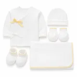
Using the supplied reference image as the sole product reference, create an Amazon A+ design preview for a five-piece newborn cotton gift set. Preserve exact geometry, proportions, colors, construction, quantity, accessories, and scale. Visible details: one white wrap-front top, one white cap, one pair of white mittens, one pair of white booties, and one folded white blanket with small warm-yellow accents, complete five-piece quantity, and newborn scale. Do not invent hidden parts or claims. Visual system: cotton white, pale mint, warm yellow, soft gray, and natural beige. Composition motifs: airy cotton textures, rounded nursery cards, flat-lay arrangements, and calm parent-and-baby scenes. Alternate a wide banner, asymmetric overview, centered detail graphic, three-scene sequence, and wide closing scene. Use readable sans-serif type and mobile-safe margins. Use this five-module order. Keep each module complete. MODULE 1 — Image with text overlay — introduction Exact headline: “A Five-Piece Cotton Set in Soft White” Exact supporting copy: “A considered presentation built around the product’s visible form and everyday role.” Layout: wide hero with complete product and safe headline area. MODULE 2 — Single image with side text — product overview Exact headline: “Designed Around the Visible Form” Exact supporting copy: “one white wrap-front top, one white cap, one pair of white mittens, one pair of white booties, and one folded white blanket with small warm-yellow accents, complete five-piece quantity, and newborn scale.” Layout: large three-quarter product, side text field, and two detail crops. MODULE 3 — Four-image and text — visible evidence Exact headline: “Details You Can See” Exact supporting copy: “A closer look at shape, finish, connections and included pieces.” Layout: centered product with four rounded macro callouts; show only visible facts. MODULE 4 — Multiple image and text — routine or use setting Exact headline: “A Clear Place in the Routine” Exact supporting copy: “The set moves from a clear complete flat lay to dressing, blanket wrapping, folding, and gift-ready storage.” Layout: three framed scenes with consistent product design and newly generated people or animals only when relevant. MODULE 5 — Full-width image with text overlay — closing Exact headline: “A Coordinated Welcome Set for the Nursery” Exact supporting copy: “A focused final view keeps the product and visible design at the center.” Layout: wide editorial scene, strong silhouette, restrained props, safe text area. Create one vertical A+ preview at 1200px width with content-driven height, clear module boundaries, and varied compositions for independent export. Render only the exact copy above. Do not add logos, prices, promotions, QR codes, URLs, contacts, competitors, testimonials, ratings, guarantees, unverified claims, certifications, fake UI, watermarks, pseudo-text, or unrelated labels. Keep all elements natural and mobile-safe.

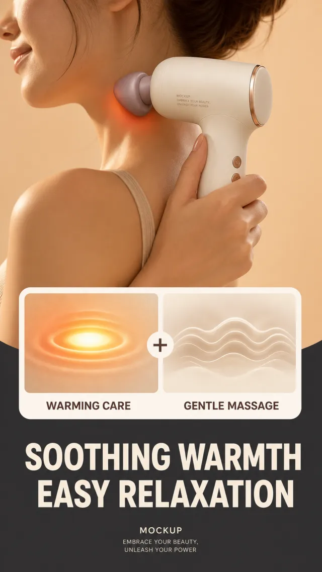
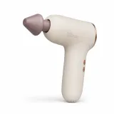
Based on the provided white-background product images, generate a detail page poster for the thermal massage gun. The upper half closes up the shoulders and neck of a woman against a warm apricot background, holding an ivory white massage gun close to the neck, with restrained orange-red warm-sensitive halos in the contact area; In the middle, stack a white rounded double-zone instruction card: the left side shows warm compress light, the right side shows massage ripples, separated by a "+" in the middle; The bottom is a deep charcoal gray information zone. Copywriting: Large headline at the bottom "Warmth Soothing / Relaxed and Relaxed"; Dual SIM labels: "Warm Care" and "Gentle Massage." The product retains an ivory white rounded body, a soft purple cone-shaped massage head, and a fine metal ring, allowing for variable buttons and head details. The original brand information was replaced only with "MOCKUP" and "EMBRACE YOUR BEAUTY, UNLEASH YOUR POWER." The font is a modern thick black sans-serif line, with a large and centered bottom title, and a medium thickness for the reference card label. Avoid medical promises, real temperatures, original brands, parameters, watermarks, and dense small print.

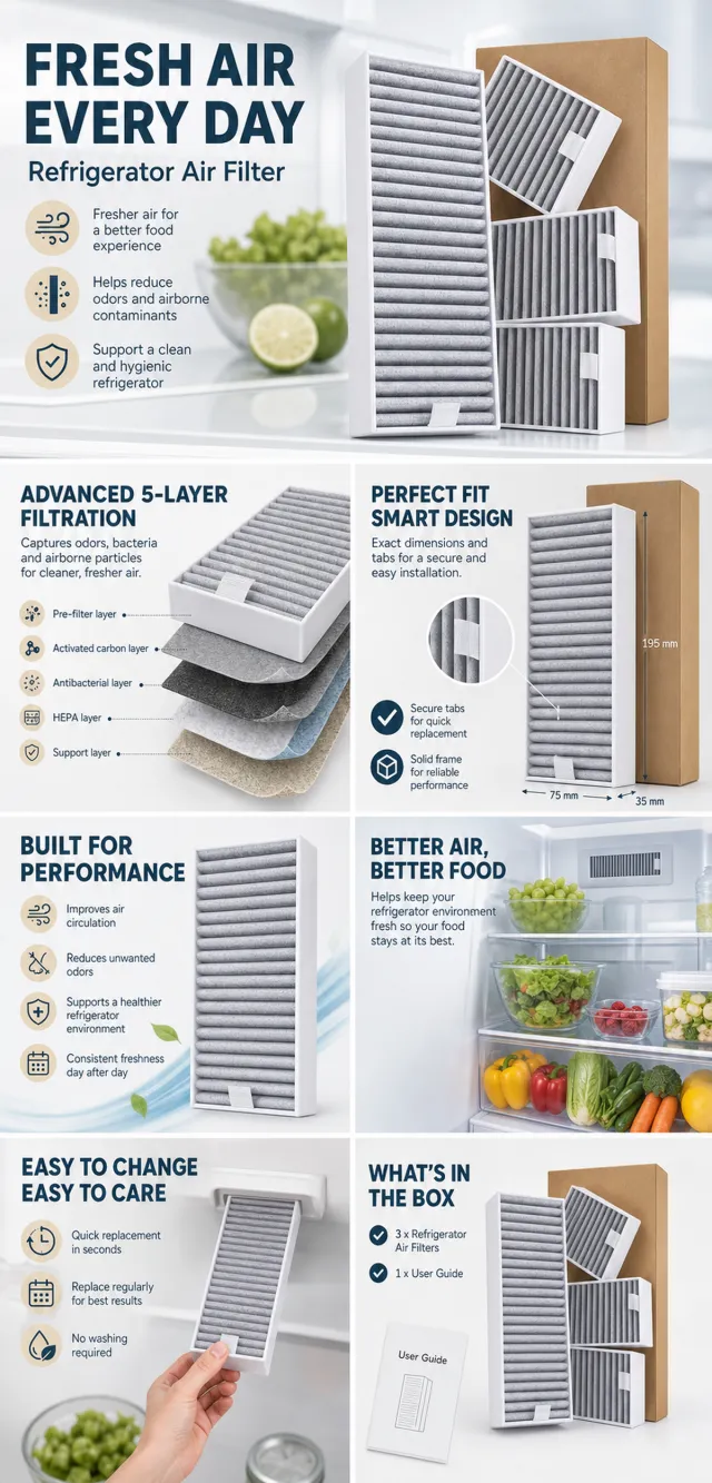
【Execution Route | Do Not Display】 If the image-generation tool can be invoked multiple times: concatenate the sharing rules with A–F separately, execute six times, generating only one 1000×1000 square image each time. If only a single image can be generated at a time: first set the interface/API to a 2:3 portrait orientation (do not use Auto), then arrange A/B, C/D, and E/F into a 2-column × 3-row grid; ensure all six cells are equal in size and maintain a visual aspect ratio of 1:1. The outer canvas must not be 1:1. 【Sharing Rules】 The provided product reference image serves as the sole basis for the product. The product is a refrigerator air filter. Strictly adhere to the reference image’s shape, structure, color, quantity, accessories, texture, and relative proportions; do not fabricate any unseen components, specifications, or functions. Use high-quality Amazon commercial photography and clear English infographics, with colors derived from the product itself, realistic lighting, and a clean layout. Maintain natural proportions for the product, figures, hands, icons, and props—no stretching, flattening, or independent scaling is allowed. Titles, products, and labels must remain fully within the safe zone, and the background should extend across the entire frame on all four sides. Only use MOCKUP for branding. No white borders, vertical edges on either side, transparent fill-in areas, watermarks, contact information, social media accounts, original brand logos, platform identifiers, garbled text, distorted body parts, or unverified copywriting are permitted. A–F are solely control markers and must not be displayed. 【A | Product Overview】Title: “PRODUCT OVERVIEW.” The hero composition fully showcases the product along with the accessories depicted in the reference image, accompanied by three brief English icon-based selling points that highlight only visible or verifiable information. 【B | Materials & Design】Title: “MATERIAL & DESIGN.” Present materials, structure, surface finishes, or styling through an overall view of the product combined with 2–3 close-up details; ensure clear labeling without inventing material names. 【C | Function in Focus】Title: “FUNCTION IN FOCUS.” Demonstrate key functions within realistic usage scenarios; maintain natural proportions among people, hands, and the product, with authentic actions and easily understandable information. 【D | Details Up Close】Title: “DETAILS UP CLOSE.” Highlight 2–4 critical structural or operational areas using magnified details and short captions; do not alter the product’s structure. 【E | Everyday Use】Title: “MADE FOR REAL LIFE.” Showcase usage, portability, storage, or maintenance scenarios consistent with the product; retain only one clear theme and avoid duplication with C. 【F | Packaging Contents】Title: “WHAT’S INCLUDED.” Lay out or neatly arrange the actual products and accessories shown in the reference image, ensuring accurate quantities and relative sizes; if the list cannot be confirmed, instead display visible specifications, dimensional relationships, or usage steps without fabricating numbers.

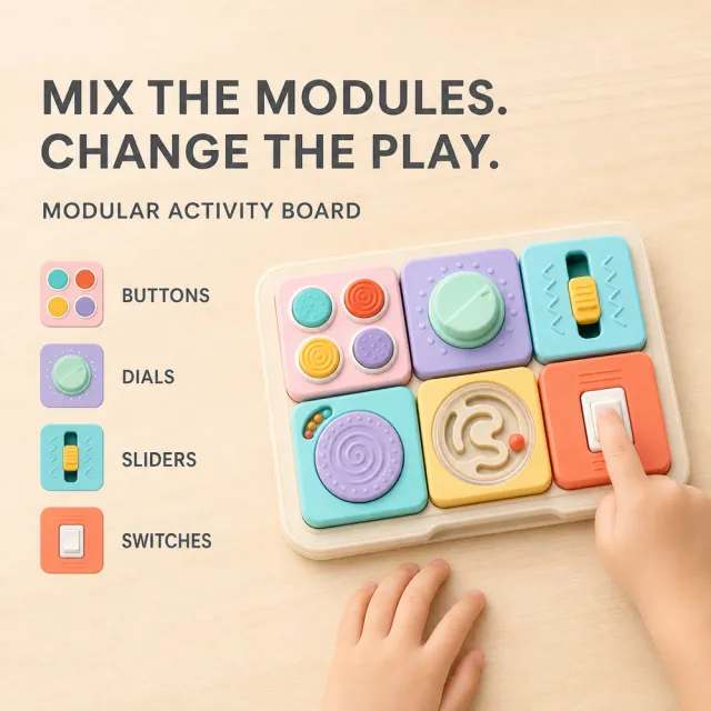
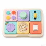
【Output Rules | Do Not Display】 Generate only one 1000×1000, 1:1 Amazon Listing secondary image. No collage images, six-grid layouts, multi-card grids, or multiple scenes are allowed. 【Sharing Rules】 Use the provided product reference image as the sole basis for the product. Product: modular pastel activity board toy. Copywriting must be in English, and brand placeholders should use MOCKUP only. Visuals must follow high-end commercial e-commerce photography standards—sharp imagery, clear hierarchy, and concise, easy-to-read copy. The product’s appearance, structure, colors, quantity, accessories, and relative proportions must match the reference image; products, people, icons, and props must maintain natural proportions. All essential information must remain within the safe area, with the background extending fully to all four edges. Prohibit white borders around the image, vertical borders on the left and right, transparent fill-in borders, watermarks, contact information, social media accounts, platform details, original brand logos, gibberish, irrelevant content, or unverified claims regarding efficacy or specifications. Titles must not be displayed. 【Image Composition】 Create a premium square 1000×1000 listing image featuring the clean modular pastel activity board toy. If necessary, use entirely new scenes and fresh people or animals, ensuring natural anatomy and accurate product proportions. Exact copy separated by vertical bars: MIX THE MODULES. CHANGE THE PLAY. | MODULAR ACTIVITY BOARD | BUTTONS | DIALS | SLIDERS | SWITCHES. Keep MOCKUP legible and ensure all text remains within the safe margins. Do not include medical, safety, performance, certification, material origin, warranty, or other unverified claims.

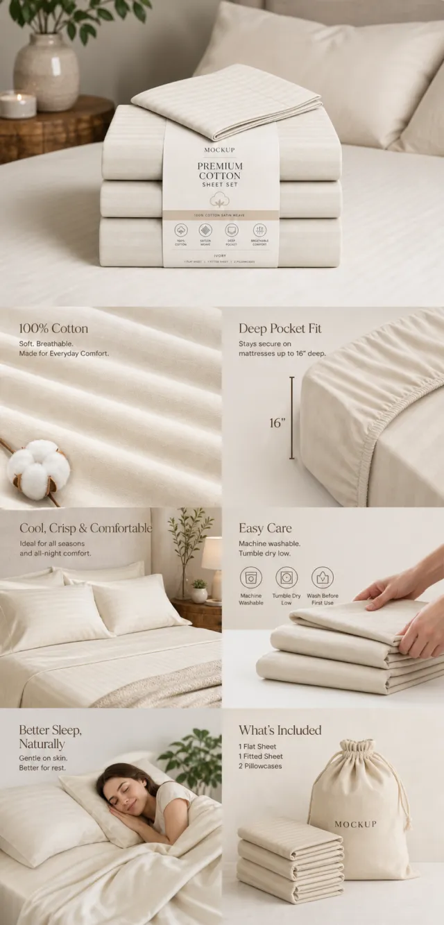
【Execution Route | Must Not Appear on Screen】 If the image-generation tool can be invoked multiple times: concatenate the sharing rules with A–F separately and execute six times; each time, generate only one independent 1000×1000 square image, resulting in six sub-images. If single‑shot generation is permitted: use a 2:3 vertical canvas measuring 1200×2500, with the top approximately 30% reserved for the product’s main visual integrated into the background, and arrange the remaining area into a 2‑column × 3‑row grid labeled A/B, C/D, and E/F. All six cards should be equal in size, with visual proportions close to 1:1. Do not use an outer 1:1 canvas, nor full‑width cards, cross‑column cards, merged cards, borders, frames, or white margins. 【Sharing Rules】 The provided product reference image serves as the sole basis for the product’s appearance, structure, color, quantity, accessories, and relative proportions. Product orientation: cream‑colored pure cotton bed sheet sets, foldable sheets and pillowcases, and fabric straps; bedroom setting, soft texture, appropriate dimensions, and care instructions. The product itself, along with any newly generated characters, animals, props, or text, must maintain natural proportions—stretching, flattening, or non‑uniform scaling is prohibited—and the background must extend fully across all four edges. Branding must uniformly follow the MOCKUP style; remove original branding, logos, watermarks, contact information, social media accounts, platform details, gibberish, and irrelevant content. Copywriting should be concise, clear, and credible, maintaining the language of the reference image, without adding unsubstantiated absolute claims or medical promises. A–F are merely control markers and must not appear on screen. 【A | Core Selling Point】 Highlight the product’s most important value and its primary subject; keep the headline short and clear. 【B | Structure & Material】 Showcase key structural elements, materials, or components using close‑up shots or simple annotations, adhering to the product’s intended direction. 【C | Real‑World Use】 Generate natural scenes featuring people, animals, or everyday life to demonstrate realistic usage, ensuring proportions and actions appear believable. 【D | Details & Steps】 Use close‑ups, step‑by‑step illustrations, or flowcharts to explain operations, textures, interfaces, storage solutions, or maintenance details. 【E | Lifestyle】 Demonstrate how the product seamlessly integrates into daily life scenarios such as home, commuting, outdoor activities, travel, or work. 【F | Sets & Carrying】 Accurately depict the product, its accessories, quantities, and storage relationships; do not add any components absent from the reference image.

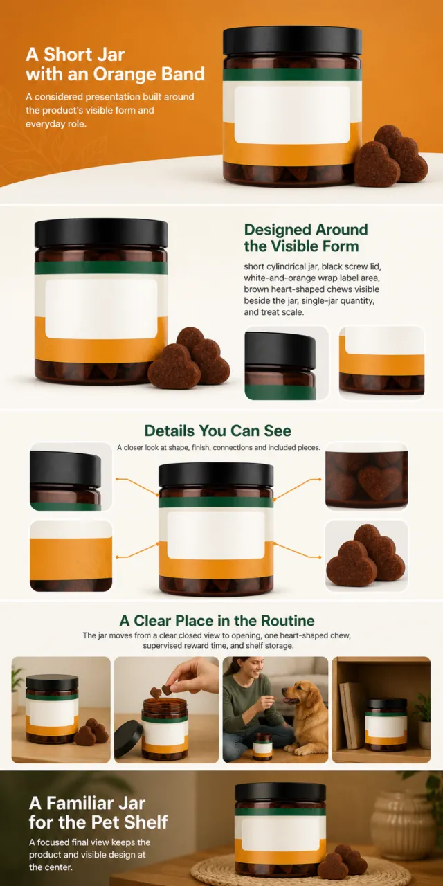
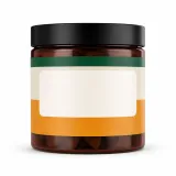
Using the supplied reference image as the sole product reference, create an Amazon A+ design preview for a jar of soft dog chews. Preserve exact geometry, proportions, colors, construction, quantity, accessories, and scale. Visible details: short cylindrical jar, black screw lid, white-and-orange wrap label area, brown heart-shaped chews visible beside the jar, single-jar quantity, and treat scale. Do not invent hidden parts or claims. Visual system: warm orange, white, forest green, black, and soft beige. Composition motifs: rounded orange panels, familiar ingredient still lifes, paw-shaped chew arrangements, and friendly pet scenes. Alternate a wide banner, asymmetric overview, centered detail graphic, three-scene sequence, and wide closing scene. Use readable sans-serif type and mobile-safe margins. Build this official A+ module order. Keep every module independently complete; never split copy or product details. MODULE 1 — Image with text overlay — introduction Exact headline: “A Short Jar with an Orange Band” Exact supporting copy: “A considered presentation built around the product’s visible form and everyday role.” Layout: wide image-led hero; dominant complete product and large safe headline area. MODULE 2 — Single image with side text — product overview Exact headline: “Designed Around the Visible Form” Exact supporting copy: “short cylindrical jar, black screw lid, white-and-orange wrap label area, brown heart-shaped chews visible beside the jar, single-jar quantity, and treat scale.” Layout: large three-quarter product, side text field, and two detail crops. MODULE 3 — Four-image and text — visible evidence Exact headline: “Details You Can See” Exact supporting copy: “A closer look at shape, finish, connections and included pieces.” Layout: centered product with four rounded macro callouts; show only visible facts. MODULE 4 — Multiple image and text — routine or use setting Exact headline: “A Clear Place in the Routine” Exact supporting copy: “The jar moves from a clear closed view to opening, one heart-shaped chew, supervised reward time, and shelf storage.” Layout: three framed scenes with consistent product design and newly generated people or animals only when relevant. MODULE 5 — Full-width image with text overlay — closing Exact headline: “A Familiar Jar for the Pet Shelf” Exact supporting copy: “A focused final view keeps the product and visible design at the center.” Layout: wide editorial scene, strong silhouette, restrained props, safe text area. Create one vertical A+ preview at 1200px width with content-driven height, clear module boundaries, and varied compositions for independent export. Render only the exact copy above. Do not add logos, prices, promotions, QR codes, URLs, contacts, competitors, testimonials, ratings, guarantees, unverified claims, certifications, fake UI, watermarks, pseudo-text, or unrelated labels. Keep all elements natural and mobile-safe.

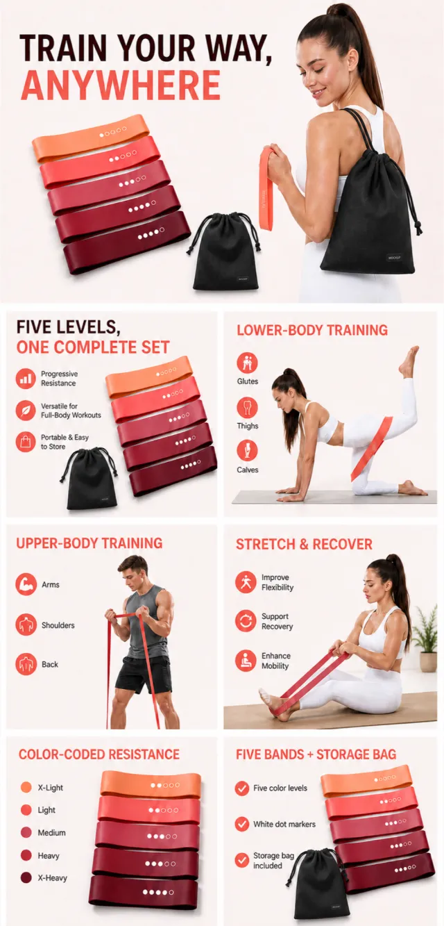
【Execution Route | Must Not Appear on Screen】 If the image-generation tool can be invoked multiple times: concatenate the sharing rules with A–F separately, and execute six times; each time, generate only one 1000×1000 square image. If only a single image can be generated at a time: first set the interface/API to a 2:3 portrait orientation and disable Auto; then arrange images in a 2-column × 3-row grid labeled A/B, C/D, and E/F. All six cells must be equal in size, with a visual aspect ratio of 1:1. Do not use an outer canvas with a 1:1 ratio. 【Sharing Rules】 The provided product reference image serves as the sole basis for the product’s appearance, structure, color, quantity, accessories, and relative proportions. The product consists of five circular resistance bands transitioning from coral orange to wine red, each marked with white dot intensity indicators, and includes a black drawstring storage bag. The visual design employs a soft pink-and-white background paired with coral, berry red, and wine red hues, alongside modern English fitness infographics and bright, natural human photography. Products, people, animals, text, icons, and props must maintain their natural proportions; stretching or independent scaling is prohibited. All essential information must remain within the safe zone, while the background extends fully across all four edges. Only MOCKUP may be used for branding. Remove any peripheral white borders, vertical sidebars, numbered corner labels, watermarks, contact information, social media accounts, original brand logos, platform details, gibberish, distorted limbs, and irrelevant content. People and animals must be recreated from scratch. Copy should be concise, readable, and trustworthy; A–F are solely control markers and must not appear on screen. 【A | Core Set】Title: “FIVE LEVELS, ONE COMPLETE SET.” Five resistance bands are neatly arranged from light to dark, with a newly generated female athlete naturally holding them. 【B | Lower-Body Training】Title: “LOWER-BODY TRAINING.” Scenes depict hip and leg exercises, with band placement and body postures aligned with proper exercise mechanics. 【C | Upper-Body Training】Title: “UPPER-BODY TRAINING.” Three sub-scenes focus on arms, shoulders, and back, with each band maintaining its natural width throughout. 【D | Stretching & Recovery】Title: “STRETCH & RECOVER.” Gentle stretching and post‑workout recovery scenes, presented in a light, airy style without making medical claims. 【E | Resistance Identification】Title: “COLOR-CODED RESISTANCE.” Five colors correspond to 1–5 white dots, with no unverified pound ratings displayed. 【F | Set List】Title: “FIVE BANDS + STORAGE BAG.” Five circular bands and a black storage bag are laid out flat, accurately reflecting their quantity and dimensions.

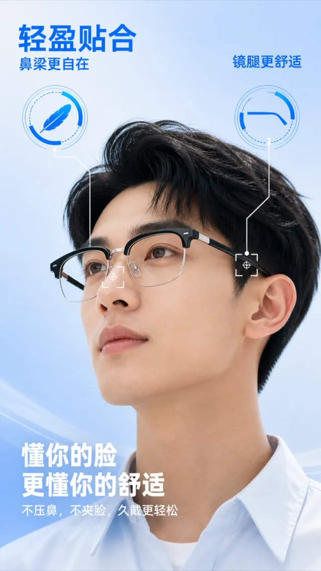
Based on the reference image, generate a render for an e‑commerce product detail page showcasing lightweight optical eyewear. On a light sky-blue gradient background, an adult model wears semi‑rimless black optical glasses from a side‑upward angle, emphasizing the nose pads, temples, hinges, and the close fit between the frame and the face. The glasses retain a semi‑rimless design with clear lenses, slender metal nose pads, and flexible temples; edge and hinge details have been subtly refined. The product surface bears no brand logos, slogans, or decorative text. The bridge of the nose and ear area are marked with ultra‑thin white positioning frames and crosshair lines indicating pressure‑bearing contact points. In the upper left corner, bold bright blue Chinese text reads “Lightweight & Close Fit,” with the smaller subtitle below: “More Comfort on the Bridge.” In the upper right, “More Comfortable Temples” is displayed, each accompanied by a large, blue, data‑inspired icon—without specific percentage values. At the bottom, aligned to the left in bold white Chinese, two lines read “Understands Your Face” and “Even More Comfort.” Below these, the body copy states: “No pressure on the nose, no pinching on the cheeks—longer wear feels easier.” The typography is modern and crisp, while the blue informational markers paired with the model’s portrait create a clean, tech‑savvy aesthetic. Text does not obscure the face or the glasses. Output dimensions: 750 x 1334px. Avoid: real brands, model numbers, footnotes, garbled characters, watermarks, overlapping text, text overflow, obstruction of people or main subjects, abnormal subject proportions, duplicate products, low‑resolution icons, and excessive negative space.

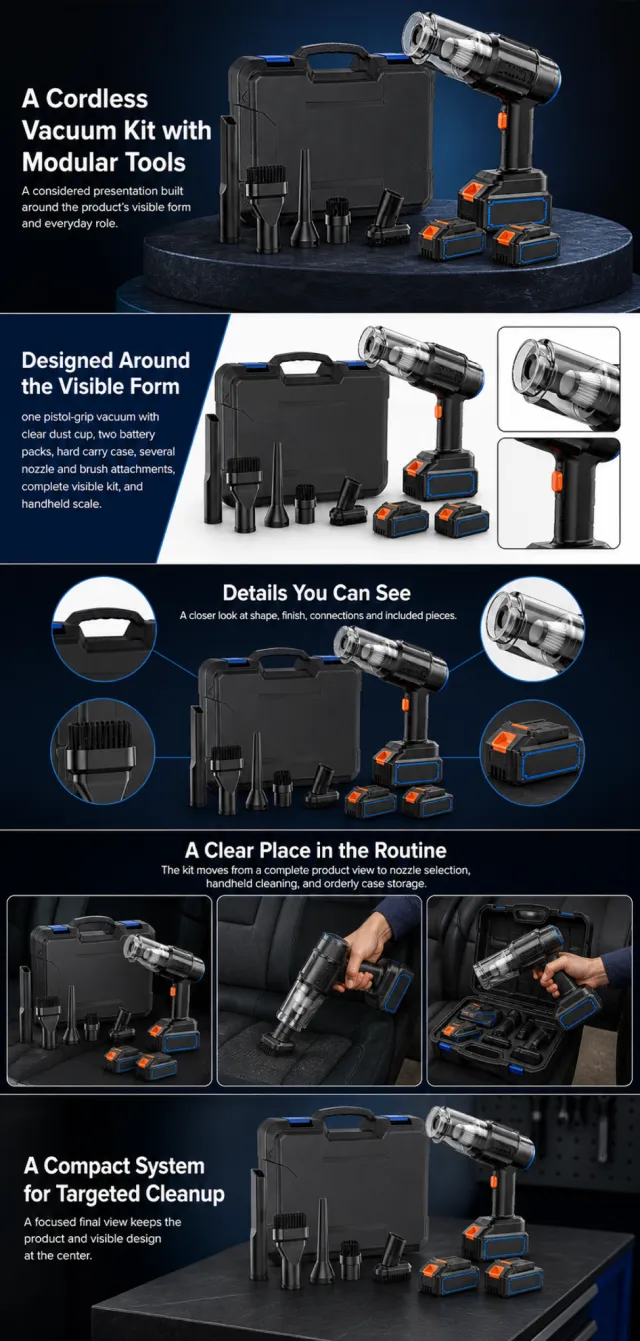
Using the supplied reference image as the sole product reference, create an Amazon A+ design preview for a cordless handheld vacuum kit. Preserve exact geometry, proportions, colors, construction, quantity, accessories, and scale. Visible details: one pistol-grip vacuum with clear dust cup, two battery packs, hard carry case, several nozzle and brush attachments, complete visible kit, and handheld scale. Do not invent hidden parts or claims. Visual system: midnight navy, charcoal, black, electric blue, and orange accents. Composition motifs: dark pedestal displays, attachment lineups, transparent dust-cup views, and car-interior scenes. Alternate a wide banner, asymmetric overview, centered detail graphic, three-scene sequence, and wide closing scene. Use readable sans-serif type and mobile-safe margins. Build this official A+ module order. Keep every module independently complete; never split copy or product details. MODULE 1 — Image with text overlay — introduction Exact headline: “A Cordless Vacuum Kit with Modular Tools” Exact supporting copy: “A considered presentation built around the product’s visible form and everyday role.” Layout: wide image-led hero; dominant complete product and large safe headline area. MODULE 2 — Single image with side text — product overview Exact headline: “Designed Around the Visible Form” Exact supporting copy: “one pistol-grip vacuum with clear dust cup, two battery packs, hard carry case, several nozzle and brush attachments, complete visible kit, and handheld scale.” Layout: large three-quarter product, side text field, and two detail crops. MODULE 3 — Four-image and text — visible evidence Exact headline: “Details You Can See” Exact supporting copy: “A closer look at shape, finish, connections and included pieces.” Layout: centered product with four rounded macro callouts; show only visible facts. MODULE 4 — Multiple image and text — routine or use setting Exact headline: “A Clear Place in the Routine” Exact supporting copy: “The kit moves from a complete product view to nozzle selection, handheld cleaning, and orderly case storage.” Layout: three framed scenes with consistent product design and newly generated people or animals only when relevant. MODULE 5 — Full-width image with text overlay — closing Exact headline: “A Compact System for Targeted Cleanup” Exact supporting copy: “A focused final view keeps the product and visible design at the center.” Layout: wide editorial scene, strong silhouette, restrained props, safe text area. Create one vertical A+ preview at 1200px width with content-driven height, clear module boundaries, and varied compositions for independent export. Render only the exact copy above. Do not add logos, prices, promotions, QR codes, URLs, contacts, competitors, testimonials, ratings, guarantees, unverified claims, certifications, fake UI, watermarks, pseudo-text, or unrelated labels. Keep all elements natural and mobile-safe.

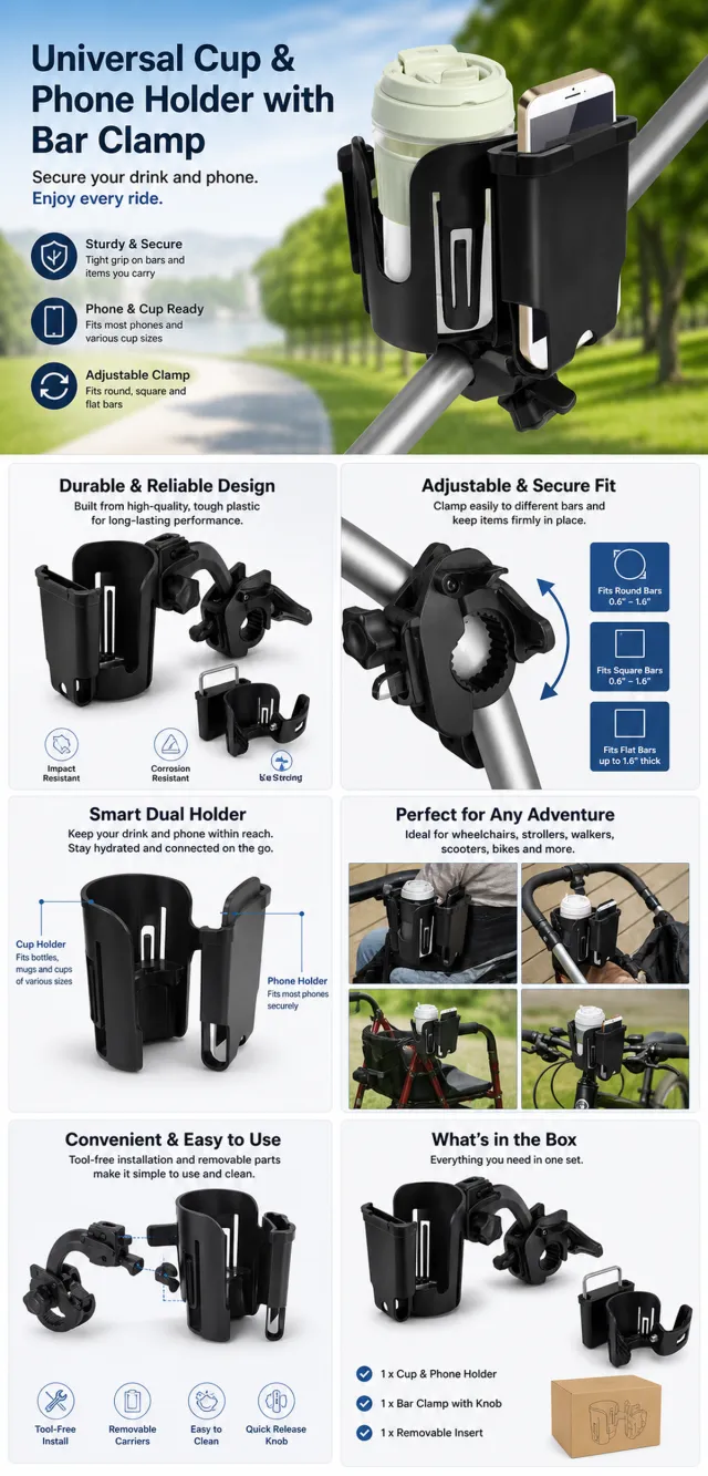
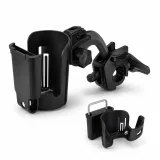
【Execution Route | Do Not Display】 If the image-generation tool can be invoked multiple times: concatenate the sharing rules with A–F separately, execute six times, generating only one 1000×1000 square image each time. If only a single image can be generated at a time: first set the interface/API to a 2:3 portrait orientation (do not use Auto), then arrange A/B, C/D, and E/F into a 2-column × 3-row grid; ensure all six cells are equal in size and maintain a visual aspect ratio of 1:1. The outer canvas must not be 1:1. 【Sharing Rules】 The provided product reference image serves as the sole basis for the product. The product is a universal cup and phone holder with a bar clamp. Strictly adhere to the reference image’s shape, structure, color, quantity, accessories, texture, and relative proportions; do not fabricate any unseen components, specifications, or functions. Use high-quality Amazon commercial photography and clear English infographics, with colors derived from the product itself, realistic lighting, and a clean layout. Maintain natural proportions for the product, figures, hands, icons, and props—no stretching, flattening, or independent scaling is allowed. Titles, products, and labels must remain entirely within the safe area, while the background extends fully across all four edges. Only use MOCKUP for branding. No white borders, vertical sidebars, transparent fill‑ins, watermarks, contact information, social media accounts, original brand logos, platform identifiers, garbled text, distorted body parts, or unverified copywriting are permitted. A–F are solely control markers and must not be displayed. 【A | Product Overview】Title: “PRODUCT OVERVIEW.” The hero composition should fully showcase the product along with the accessories included in the reference image, accompanied by three brief English icon‑based selling points that highlight only visible or verifiable information. 【B | Materials & Design】Title: “MATERIAL & DESIGN.” Present materials, structure, surface finishes, or styling through an overall view of the product combined with 2–3 close-up details; ensure clear labeling without inventing material names. 【C | Function in Focus】Title: “FUNCTION IN FOCUS.” Demonstrate key functions within realistic usage scenarios; maintain natural proportions among figures, hands, and the product, with authentic actions and easily understandable information. 【D | Details Up Close】Title: “DETAILS UP CLOSE.” Highlight 2–4 critical structural or operational areas using magnified details and short captions; do not alter the product’s structure. 【E | Everyday Use】Title: “MADE FOR REAL LIFE.” Depict usage, carrying, storage, or maintenance scenarios consistent with the product; focus on a single clear theme and avoid duplication with C. 【F | Packaging Contents】Title: “WHAT’S INCLUDED.” Lay out or neatly arrange the actual products and accessories shown in the reference image, ensuring accurate quantities and relative sizes; if the contents cannot be confirmed, instead display visible specifications, dimensional relationships, or usage steps, without fabricating numbers.

Views
2K
Sales
5
Revenue
$71

Using the supplied reference image as the sole product reference, create an Amazon A+ design preview for a twelve-pack coffee-filter set. Preserve exact geometry, proportions, colors, construction, quantity, accessories, and scale. Visible details: twelve small gray felted charcoal filter pods, rounded rectangular shape, complete twelve-unit quantity, and coffee-machine scale. Do not invent hidden parts or claims. Visual system: white, soft gray, coffee brown, warm gold, and black. Composition motifs: hand-drawn brush edges, filter-fiber macros, insertion steps, and bright coffee-station scenes. Alternate a wide banner, asymmetric overview, centered detail graphic, three-scene sequence, and wide closing scene. Use readable sans-serif type and mobile-safe margins. Build this official A+ module order. Keep every module independently complete; never split copy or product details. MODULE 1 — Image with text overlay — introduction Exact headline: “A Twelve-Filter Set in Soft Gray” Exact supporting copy: “A considered presentation built around the product’s visible form and everyday role.” Layout: wide image-led hero; dominant complete product and large safe headline area. MODULE 2 — Single image with side text — product overview Exact headline: “Designed Around the Visible Form” Exact supporting copy: “twelve small gray felted charcoal filter pods, rounded rectangular shape, complete twelve-unit quantity, and coffee-machine scale.” Layout: large three-quarter product, side text field, and two detail crops. MODULE 3 — Four-image and text — visible evidence Exact headline: “Details You Can See” Exact supporting copy: “A closer look at shape, finish, connections and included pieces.” Layout: centered product with four rounded macro callouts; show only visible facts. MODULE 4 — Multiple image and text — routine or use setting Exact headline: “A Clear Place in the Routine” Exact supporting copy: “The filters move from a clear quantity lineup to holder placement, soaking, rinsing, and orderly storage.” Layout: three framed scenes with consistent product design and newly generated people or animals only when relevant. MODULE 5 — Full-width image with text overlay — closing Exact headline: “A Compact Refill Set for the Coffee Station” Exact supporting copy: “A focused final view keeps the product and visible design at the center.” Layout: wide editorial scene, strong silhouette, restrained props, safe text area. Create one vertical A+ preview at 1200px width with content-driven height, clear module boundaries, and varied compositions for independent export. Render only the exact copy above. Do not add logos, prices, promotions, QR codes, URLs, contacts, competitors, testimonials, ratings, guarantees, unverified claims, certifications, fake UI, watermarks, pseudo-text, or unrelated labels. Keep all elements natural and mobile-safe.

Based on the provided white-background product images, generate a detailed e-commerce poster for the Hydrating Brightening Essence. Product Features: Maintains the matte white dropper essence bottle, silver shoulder design, and minimalist curved bottle body; The main body includes a MOCKUP and slogan, fully preserved, without adding numbers, specifications, or other text. Layout replica: A tech skincare background ranging from ice white to deep sea blue, with a centered heading at the top, a transparent glass ring wrapping around the product below, and a blue reflective countertop at the bottom. On the left, from top to bottom, there are three groups of large selling points numbered 1, 2, and 3, aligned with the numbering and title, with fine text within two lines. Font and text layout: Main title uses slim, high-contrast serif Chinese in black; Numbering uses a large blue slanted serif line; The selling point is that the title is blue medium weight, the main text is dark gray in small text, the left sidebar width does not exceed 36% of the screen, and the product is placed in the center on the right. Copywriting Usage: Moist and full, bright and glossy Lightweight Essence Provides skin with a soft and moisturized feel 1. Deep hydration and hydration: Delicate water sensation with layered absorption 2. Radiant radiance: Skin appears more translucent 3. Strengthens skin resilience Daily care with enhanced support Graphic elements: glass rings, soft blue light, and reflections on the water surface keep things simple, without unnecessary icons. Avoid original brands, exaggerated efficacy data, footnotes, watermarks, excessive mirror reflections, and text covering the product.

Using the supplied reference image as the sole product reference, create an Amazon A+ design preview for a cylindrical cosmetic serum bottle. Preserve exact geometry, proportions, colors, construction, quantity, accessories, and scale. Visible details: tall white cylindrical bottle, deep olive lower body, silver cap, vertical label panel, single-unit quantity, and cosmetic scale. Do not invent hidden parts or claims. Visual system: warm ivory, olive green, soft sage, black, and clear glass accents. Composition motifs: rounded white panels, avocado-inspired organic shapes, liquid-drop macros, and clean botanical still lifes. Alternate a wide banner, asymmetric overview, centered detail graphic, three-scene sequence, and wide closing scene. Use readable sans-serif type and mobile-safe margins. Build this official A+ module order. Keep every module independently complete; never split copy or product details. MODULE 1 — Image with text overlay — introduction Exact headline: “A Serum Bottle with Botanical Character” Exact supporting copy: “A considered presentation built around the product’s visible form and everyday role.” Layout: wide image-led hero; dominant complete product and large safe headline area. MODULE 2 — Single image with side text — product overview Exact headline: “Designed Around the Visible Form” Exact supporting copy: “tall white cylindrical bottle, deep olive lower body, silver cap, vertical label panel, single-unit quantity, and cosmetic scale.” Layout: large three-quarter product, side text field, and two detail crops. MODULE 3 — Four-image and text — visible evidence Exact headline: “Details You Can See” Exact supporting copy: “A closer look at shape, finish, connections and included pieces.” Layout: centered product with four rounded macro callouts; show only visible facts. MODULE 4 — Multiple image and text — routine or use setting Exact headline: “A Clear Place in the Routine” Exact supporting copy: “The bottle moves from upright display to an open dropper moment and a simple vanity scene.” Layout: three framed scenes with consistent product design and newly generated people or animals only when relevant. MODULE 5 — Full-width image with text overlay — closing Exact headline: “A Focused Botanical Finish” Exact supporting copy: “A focused final view keeps the product and visible design at the center.” Layout: wide editorial scene, strong silhouette, restrained props, safe text area. Create one vertical A+ preview at 1200px width with content-driven height, clear module boundaries, and varied compositions for independent export. Render only the exact copy above. Do not add logos, prices, promotions, QR codes, URLs, contacts, competitors, testimonials, ratings, guarantees, unverified claims, certifications, fake UI, watermarks, pseudo-text, or unrelated labels. Keep all elements natural and mobile-safe.

Using the supplied reference image as the sole product reference, create an Amazon A+ design preview for a whipped-cream dispenser kit. Preserve exact geometry, proportions, colors, construction, quantity, accessories, and scale. Visible details: one brushed-metal dispenser with lever head, three decorating nozzles, one cleaning brush, complete visible kit, and kitchen scale. Do not invent hidden parts or claims. Visual system: icy blue, white, brushed silver, and warm cream. Composition motifs: wide café banners, curved dessert windows, step-by-step handling scenes, and metal-detail crops. Alternate a wide banner, asymmetric overview, centered detail graphic, three-scene sequence, and wide closing scene. Use readable sans-serif type and mobile-safe margins. Build this official A+ module order. Keep every module independently complete; never split copy or product details. MODULE 1 — Image with text overlay — introduction Exact headline: “A Brushed-Metal Dispenser with Three Tips” Exact supporting copy: “A considered presentation built around the product’s visible form and everyday role.” Layout: wide image-led hero; dominant complete product and large safe headline area. MODULE 2 — Single image with side text — product overview Exact headline: “Designed Around the Visible Form” Exact supporting copy: “one brushed-metal dispenser with lever head, three decorating nozzles, one cleaning brush, complete visible kit, and kitchen scale.” Layout: large three-quarter product, side text field, and two detail crops. MODULE 3 — Four-image and text — visible evidence Exact headline: “Details You Can See” Exact supporting copy: “A closer look at shape, finish, connections and included pieces.” Layout: centered product with four rounded macro callouts; show only visible facts. MODULE 4 — Multiple image and text — routine or use setting Exact headline: “A Clear Place in the Routine” Exact supporting copy: “The kit moves from a complete product view to filling, head closure, nozzle selection, and a finished dessert setting.” Layout: three framed scenes with consistent product design and newly generated people or animals only when relevant. MODULE 5 — Full-width image with text overlay — closing Exact headline: “A Coordinated Tool for the Kitchen” Exact supporting copy: “A focused final view keeps the product and visible design at the center.” Layout: wide editorial scene, strong silhouette, restrained props, safe text area. Create one vertical A+ preview at 1200px width with content-driven height, clear module boundaries, and varied compositions for independent export. Render only the exact copy above. Do not add logos, prices, promotions, QR codes, URLs, contacts, competitors, testimonials, ratings, guarantees, unverified claims, certifications, fake UI, watermarks, pseudo-text, or unrelated labels. Keep all elements natural and mobile-safe.

【Execution Routing | Do Not Display】 If the image-generation tool can be invoked multiple times: concatenate the sharing rules with A–F separately, execute six times, generating one 1000×1000 square image each time; do not submit all modules at once. If only one image can be generated per invocation: set the interface or API to a 2:3 portrait orientation and disable Auto mode; a recommended size is 1200×1800. Arrange A/B, C/D, and E/F into a 2-column × 3-row grid of six modules, ensuring equal module sizes and maintaining a 1:1 aspect ratio. If the platform enforces a 1:1 ratio, switch to using an Agent or generate each module individually. 【Sharing Rules】 Use the provided product reference image as the sole product basis. Product: automotive brake-parts set. Copywriting should be in Portuguese, with brand placeholders replaced by MOCKUP only. Visuals must follow high-end commercial e-commerce photography standards—sharp imagery, clear hierarchy, and concise, easy-to-read copy. The product’s appearance, structure, color, quantity, accessories, and relative proportions must match the reference image; products, people, icons, and props should maintain natural proportions. All essential information must remain within the safe zone, with the background extending fully across all four edges. Prohibit white borders around the perimeter, vertical borders on the left and right, transparent fill-in borders, watermarks, contact information, social media accounts, platform details, original branding, garbled text, irrelevant information, or unverified claims regarding efficacy or specifications; titles must not appear. A–F must not be displayed. 【A | Theme】Copy: “PARTS THAT WORK TOGETHER”; “VISUAL SET FOR BRAKE SERVICE”; focus on conveying core value through the complete primary product visual. 【B | Theme】Copy: “VENTILATED DISC”; design an independent square image centered around this theme, avoiding overlapping selling points, compositions, and product angles with other modules. 【C | Theme】Copy: “BRAKE CALIPER”; design an independent square image centered around this theme, avoiding overlapping selling points, compositions, and product angles with other modules. 【D | Theme】Copy: “BRAKE PAD SET”; design an independent square image centered around this theme, avoiding overlapping selling points, compositions, and product angles with other modules. 【E | Theme】Copy: “HUB COMPONENT”; design an independent square image centered around this theme, avoiding overlapping selling points, compositions, and product angles with other modules. 【F | Theme】Copy: “CHECK THE FIT”; “INSTALLATION BY PROFESSIONAL”; design an independent square image centered around these themes, avoiding overlapping selling points, compositions, and product angles with other modules.
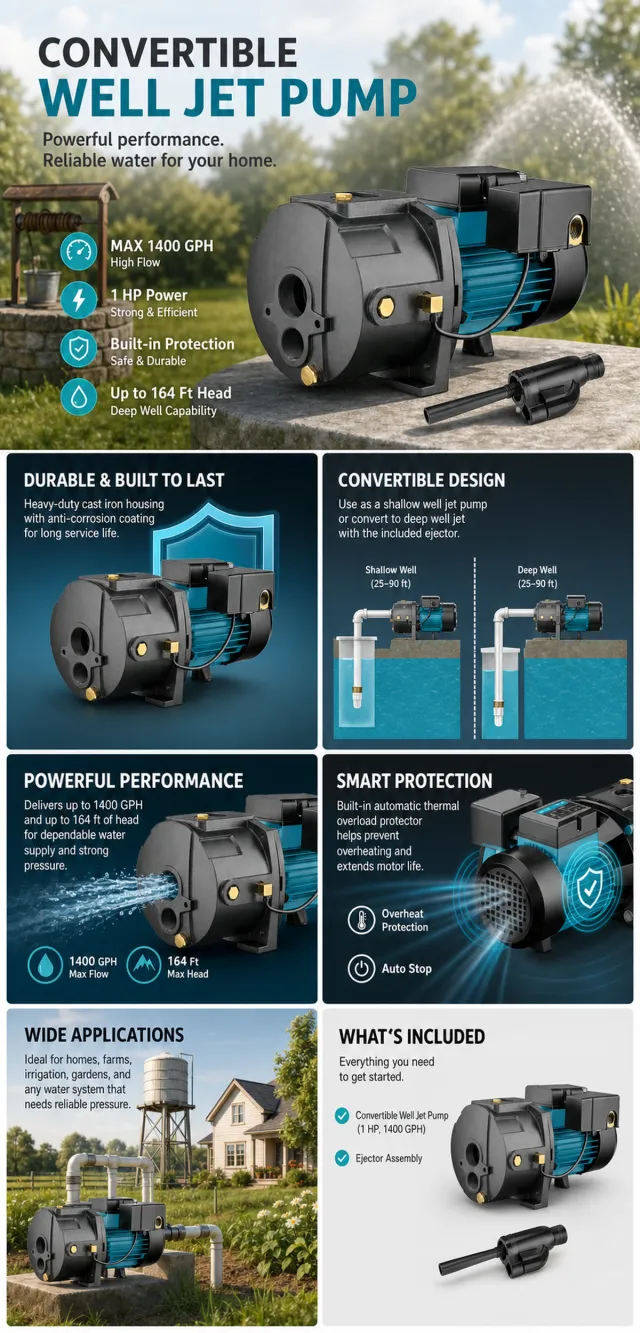
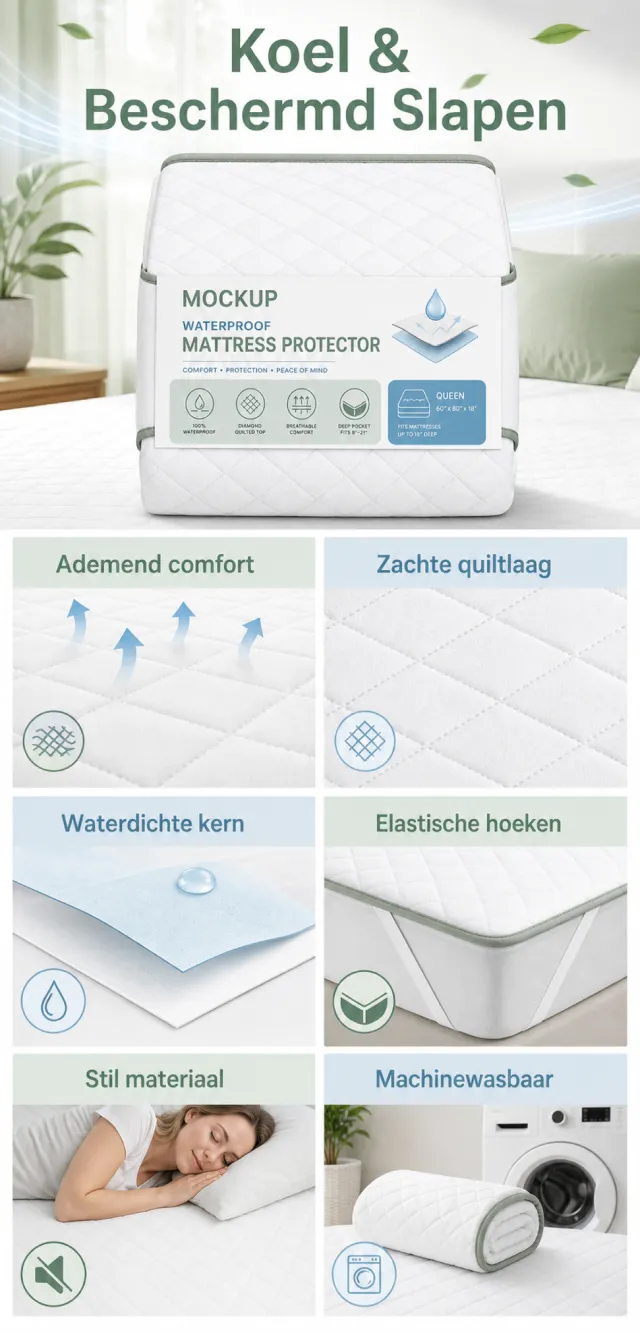
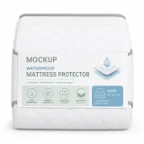
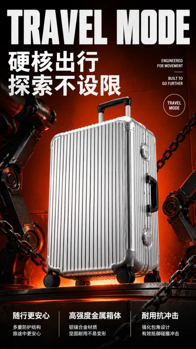
【Execution Route | Do Not Display】 If the image-generation tool can be invoked multiple times: concatenate the sharing rules with A–F separately, execute six times, generating only one 1000×1000 square image each time. If only a single image can be generated at a time: first set the interface/API to a 2:3 portrait orientation (do not use Auto), then arrange A/B, C/D, and E/F into a 2-column × 3-row grid; ensure all six cells are equal in size and maintain a visual aspect ratio of 1:1. The outer canvas must not be 1:1. 【Sharing Rules】 The provided product reference image serves as the sole basis for the product. The product is a digital tire pressure gauge kit. Strictly adhere to the reference image’s shape, structure, color, quantity, accessories, texture, and relative proportions; do not fabricate any unseen components, specifications, or functionalities. Use high-quality Amazon commercial photography and clear English infographics, with colors derived from the product itself, realistic lighting, and a clean layout. Maintain natural proportions for the product, figures, hands, icons, and props—no stretching, flattening, or independent scaling is allowed. Titles, products, and labels must remain fully within the safe zone, while the background extends seamlessly across all four edges. Only use MOCKUP for branding. No white borders, vertical sidebars, transparent fill‑ins, watermarks, contact information, social media accounts, original brand logos, platform identifiers, garbled text, distorted body parts, or unverified copywriting are permitted. A–F are solely control markers and must not be displayed. 【A | Product Overview】Title: “PRODUCT OVERVIEW.” The hero composition should fully showcase the product along with the accessories depicted in the reference image, accompanied by three brief English icon‑based selling points that highlight only visible or verifiable information. 【B | Materials & Design】Title: “MATERIAL & DESIGN.” Present materials, structure, surface finishes, or styling through an overall view of the product combined with 2–3 close-up details; ensure clear labeling without inventing material names. 【C | Function in Focus】Title: “FUNCTION IN FOCUS.” Demonstrate key functions within realistic usage scenarios; maintain natural proportions among figures, hands, and the product, with authentic gestures and easily understandable information. 【D | Details Up Close】Title: “DETAILS UP CLOSE.” Highlight 2–4 critical structural or operational areas using magnified details and short captions; do not alter the product’s underlying structure. 【E | Everyday Use】Title: “MADE FOR REAL LIFE.” Depict appropriate scenes of use, carrying, storage, or maintenance that align with the product; keep the focus on a single clear theme and avoid redundancy with C. 【F | Packaging Contents】Title: “WHAT’S INCLUDED.” Lay out or neatly arrange the actual products and accessories shown in the reference image, ensuring accurate quantities and relative sizes; if the contents cannot be confirmed, instead display visible specifications, dimensional relationships, or step-by-step instructions without fabricating numbers.

【Execution Routing | Do Not Display】 If the image-generation tool can be invoked multiple times: concatenate the sharing rules with A–F separately, execute six times, generating one 1000×1000 square image each time; do not submit all modules at once. If only one image can be generated per invocation: set the interface or API to a 2:3 portrait orientation and disable Auto mode; a recommended size is 1200×1800. Arrange the images in a 2-column × 3-row grid corresponding to A/B, C/D, and E/F, ensuring all six modules are equal in size and maintain a 1:1 aspect ratio. If the platform enforces a 1:1 ratio, switch to using an Agent or generate each module individually. 【Sharing Rules】 The provided product reference image serves as the sole basis for the product. Product: rose botanical facial serum. Copywriting must be in English, with brand placeholders replaced by MOCKUP only. Visuals should follow premium commercial e-commerce photography standards and stable graphic design principles. The product’s appearance, structure, color, quantity, accessories, and relative proportions must match the reference image; products, people, icons, and props should maintain natural proportions. All essential information must remain within the safe zone, with the background extending fully to all four edges. External white borders, vertical borders on left and right, transparent fill-in borders, watermarks, contact details, social media accounts, platform information, original branding, gibberish, irrelevant content, or unverified claims regarding efficacy or specifications are prohibited. Headlines must not be displayed. A–F must not appear. 【A | Core Selling Point】Write concise English copy focusing on this theme, using the full product main visual to highlight core value. 【B | Usage Instructions】Provide brief English copy addressing this theme, illustrating the usage process, combinations, or key operations. 【C | Applicable Scenarios】Present short English copy centered on this theme, showcasing realistic, credible, and product-relevant usage scenarios. 【D | Functional Details】Offer succinct English copy highlighting this theme, using close-up shots, cross-sections, or icons to explain structural and functional details. 【E | Daily Maintenance】Craft brief English copy addressing this theme, demonstrating methods for use, cleaning, storage, or maintenance. 【F | Specification List】Compose concise English copy covering this theme, listing materials, specifications, packaging details, or providing credible comparisons—without fabricating parameters.
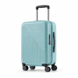
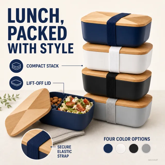

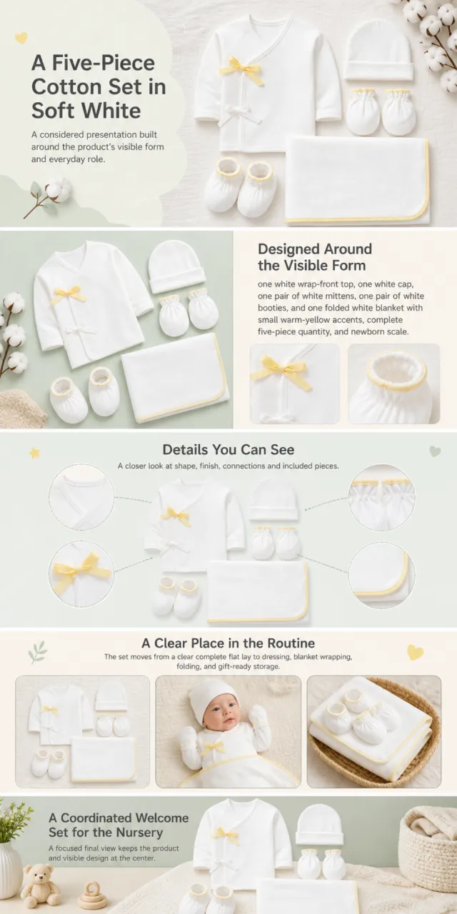
【Execution Route | Do Not Display】 If the image-generation tool can be invoked multiple times: concatenate the sharing rules with A–F separately, execute six times, generating only one 1000×1000 square image each time. If only a single image can be generated at a time: first set the interface/API to a 2:3 portrait orientation (do not use Auto), then arrange A/B, C/D, and E/F into a 2-column × 3-row grid; ensure all six cells are equal in size and maintain a visual aspect ratio of 1:1. The outer canvas must not be 1:1. 【Sharing Rules】 The provided product reference image serves as the sole basis for the product. The product is a neutral woven area rug. Strictly adhere to the shape, structure, color, quantity, accessories, texture, and relative proportions shown in the reference image; do not fabricate any components, specifications, or functionalities that are not depicted. Use high-quality Amazon commercial photography and clear English infographics; color schemes should match the product, lighting must be realistic, and layout kept simple. Maintain natural proportions among the product, figures, hands, icons, and props—no stretching, flattening, or independent scaling is allowed. Titles, products, and labels must remain fully within the safe zone, with the background extending evenly to all four edges. Only MOCKUP may be used for branding. No white borders, vertical sidebars, transparent fill‑ins, watermarks, contact information, social media accounts, original brand logos, platform identifiers, garbled text, distorted body parts, or unverified copywriting are permitted. A–F are solely control markers and must not be displayed. 【A | Product Overview】Title: “PRODUCT OVERVIEW.” The hero composition fully showcases the product along with the accessories included in the reference image; accompanied by three brief English icon‑based selling points, stating only information that is visible or verifiable. 【B | Materials & Design】Title: “MATERIAL & DESIGN.” Present materials, structure, surface finish, or styling through an overall view of the product combined with 2–3 close-up details; ensure clear labeling without inventing material names. 【C | Functional Focus】Title: “FUNCTION IN FOCUS.” Demonstrate key functions within realistic usage scenarios; maintain natural proportions among figures, hands, and the product, with actions appearing genuine and information instantly understandable. 【D | Detail Close‑ups】Title: “DETAILS UP CLOSE.” Highlight 2–4 critical structural or operational areas using magnified details and short captions; do not alter the product’s structure. 【E | Everyday Use】Title: “MADE FOR REAL LIFE.” Depict usage, carrying, storage, or maintenance scenarios consistent with the product; retain only one clear theme and avoid duplication with C. 【F | Packaging Contents】Title: “WHAT’S INCLUDED.” Lay out or neatly arrange the actual products and accessories featured in the reference image, ensuring accurate quantities and relative sizes; if the contents cannot be confirmed, instead display visible specifications, dimensional relationships, or step-by-step instructions, refraining from fabricating numbers.

Using the supplied reference image as the sole product reference, create a complete Amazon A+ design preview. Preserve the exact two-piece set: warm-taupe padded kneeling mat plus matching fold-over organizer with fabric and mesh pockets, muted-lilac binding, quantity, and relative scale. Do not invent dimensions, materials, safety, drying, cleaning, or certification claims. Generate entirely new adults and children where used. Use bright white, mist lavender, warm apricot, pale aqua, taupe, playful sea-creature line doodles, bubble forms, rounded panels, and friendly modern sans-serif typography. Alternate wide bath-time banners, an asymmetric two-piece overview, pocket close-ups, an organization sequence, and a calm family scene. Build this official A+ module order. Keep each module independently complete and mobile-safe; bubbles and line doodles may repeat across boundaries. MODULE 1 — Image with text overlay — introduction Exact headline: “Bring More Order to Bath Time” Exact supporting copy: “A coordinated kneeling mat and pocket organizer for a clearer setup around the tub.” Layout: wide bright-bathroom banner with a newly generated adult beside a bathing child; product set remains dominant and naturally scaled. MODULE 2 — Single image with side text — set overview Exact headline: “Two Coordinated Pieces” Exact supporting copy: “One padded mat for the floor and one fold-over organizer for the tub edge.” Layout: large product-only arrangement on white with soft lavender and apricot shapes. MODULE 3 — Four-image and text — visible details Exact headline: “A Place for the Small Essentials” Exact supporting copy: “Open fabric pockets. Mesh pockets. Rounded mat. Contrast edge binding.” Layout: centered organizer and mat with four rounded macro callouts; pockets remain empty. MODULE 4 — Multiple image and text — setup sequence Exact headline: “Set Up in Three Clear Steps” Exact supporting copy: “Place the mat. Fold the organizer over the tub edge. Arrange verified essentials.” Layout: three hand-only steps; use generic unlabeled bath objects only in the final frame. MODULE 5 — Full-width image with text overlay — closing Exact headline: “Everything Visible, Right Where You Need It” Exact supporting copy: “A calm two-piece layout helps keep the bath-side area visually organized.” Layout: wide family bathroom scene with the matching set dominant and a large safe text field. Create one continuous vertical A+ preview at 1200px width with content-driven height, clear module boundaries, and varied compositions for independent export. Render only the exact copy above. Do not add logos, prices, promotions, gifts, QR codes, URLs, contacts, dimensions, material or safety claims, certifications, testimonials, guarantees, packaging, fake UI, watermarks, pseudo-text, or unrelated labels. Keep people natural and all text mobile-safe.