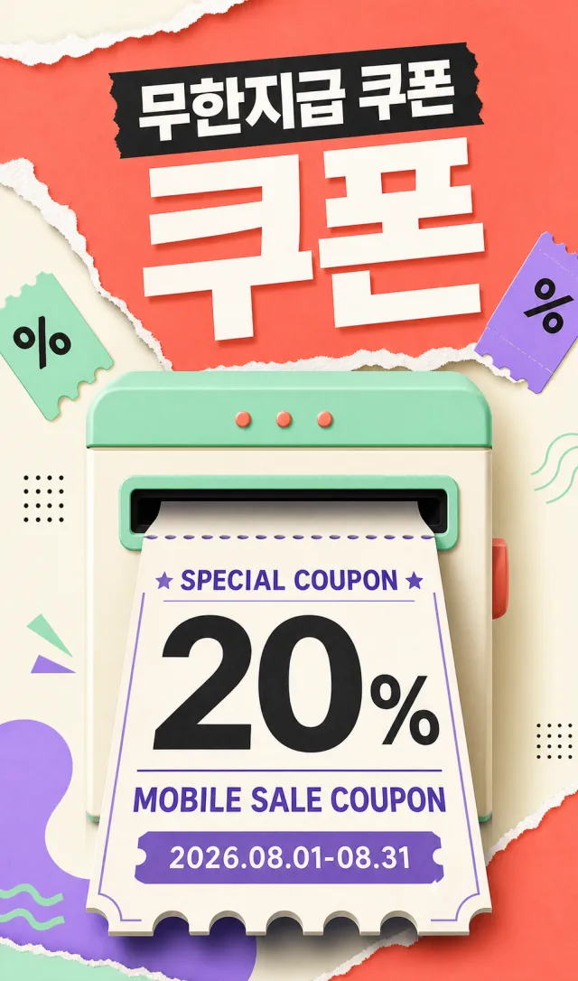
Create a brand-new Korean-language mobile coupon vertical poster.
Accurately display the text “무한지급 쿠폰”“SPECIAL COUPON 20%”“MOBILE SALE COUPON”“2026.08.01-08.31”.
Use coral orange, mint green, cream white, violet, and black.
Design a vertical coupon dispenser, with one large coupon sliding out from the center.
Add paper-tearing strips, perforations, and small abstract discount tags.
All Korean and English text must be bold and clear.
Do not include barcodes, coupon numbers, app names, brand names, website URLs, QR codes, or watermarks.
Output a high-quality static PNG image.
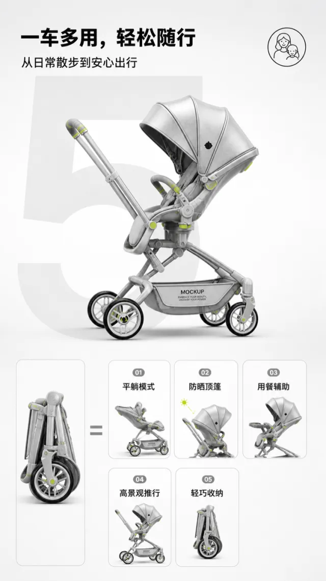
Based on the reference image, generate a multi‑mode stroller e‑commerce product detail page mockup.
A silver‑gray stroller is positioned slightly to the side in the upper central area, retaining its push handle, seat, canopy, storage basket, frame, and four wheels. Minor adjustments have been made to the wheel hubs, joints, and light‑green accent details. The product surface displays only “MOCKUP” and “EMBRACE YOUR BEAUTY, UNLEASH YOUR POWER.” The background features a clean gradient from light gray to white, with a large, light‑gray numeral “5” serving as the backdrop beneath the stroller.
At the top, centered left, a bold black Chinese headline reads “Multi‑Purpose, Easy On‑the‑Go,” accompanied by the subheading “From Everyday Walks to Peace of Mind Travel.” In the upper right corner, a simple circular parent‑child linear icon is placed. The lower half adopts an equation‑style layout: on the left is a folded stroller, while the right side features five small functional icons labeled, in order, “Flat‑Lying Mode,” “Sun‑Protective Canopy,” “Meal‑Assistance,” “High‑View Pushing,” and “Lightweight Storage.” Each icon is framed in light gray, with soft rounded corners and subtle pictograms.
The typography is modern, gentle, and clearly hierarchical; the spacing between icons is uniform, and the design avoids any superfluous brand logos or technical specifications in small print.
Output dimensions: 750 x 1334px. Avoid: real brand names, model numbers, footnotes, garbled text, watermarks, overlapping text, text overflow, subject obstruction, distorted subject proportions, duplicate products, low‑resolution icons, and excessive negative space.
【Execution Routing | Do Not Display】
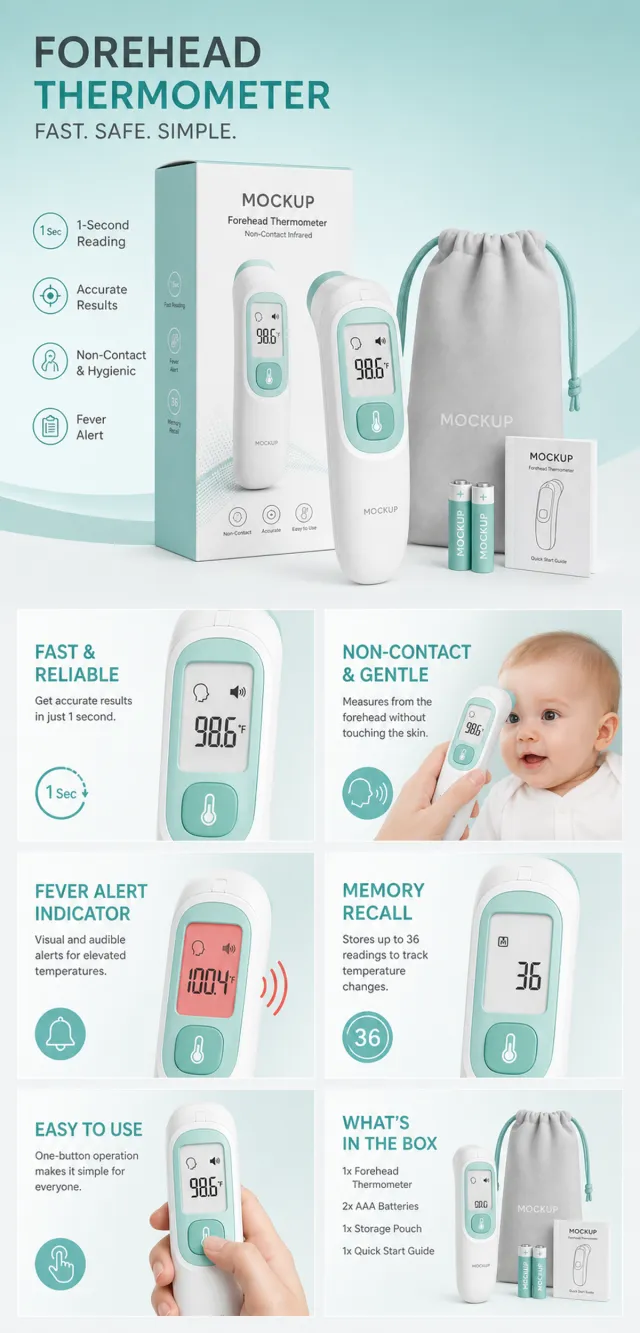
If the image-generation tool can be invoked multiple times: concatenate the sharing rules with A–F separately, execute six times, generating one 1000×1000 square image each time; do not submit all modules at once.
If only one image can be generated per run: set the interface or API to a 2:3 portrait orientation and avoid using Auto mode; a recommended size is 1200×1800. Arrange A/B, C/D, and E/F into a 2-column × 3-row grid of six modules, ensuring equal module sizes and maintaining a 1:1 aspect ratio. If the platform enforces a 1:1 ratio, switch to an Agent-based approach or generate each module individually.
【Sharing Rules】
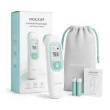
The provided product reference image serves as the sole product basis. Product: baby care thermometer kit. Copywriting must be in English, with brand placeholders replaced by MOCKUP only. Visuals should follow premium commercial e-commerce photography standards and maintain stable graphic design. The product’s appearance, structure, color, quantity, accessories, and relative proportions must match the reference image; products, people, icons, and props should retain natural proportions. All essential information must remain within the safe zone, with the background extending fully across all four edges. External white borders, vertical sidebars, transparent fill-in areas, watermarks, contact details, social media accounts, platform information, original branding, gibberish, irrelevant content, or unverified claims regarding efficacy or specifications are prohibited. Headlines must not be displayed. A–F must not appear.
【A | Core Selling Point】Write concise English copy focusing on this theme, using the full product main visual to highlight core value.
【B | Usage Instructions】Provide brief English copy addressing this theme, illustrating the usage process, combinations, or key operations.
【C | Applicable Scenarios】Present short English copy centered on this theme, showcasing realistic, credible, and product-relevant usage scenarios.
【D | Functional Details】Offer succinct English copy highlighting structural and functional details through close-up shots, cross-sections, or icons.
【E | Daily Maintenance】Craft brief English copy explaining how to use, clean, store, or maintain the product.
【F | Specification List】Compose concise English copy covering materials, specifications, packaging details, or credible comparisons—avoid fabricating parameters.
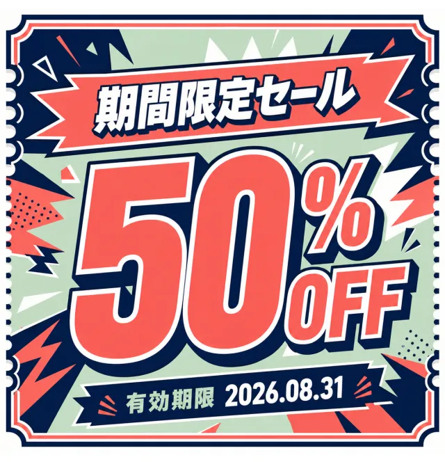
Create a new original coupon or sale design: bold retail promotion poster with oversized offer typography, punchy outlined lettering, and energetic graphic accents.
Style: clean commercial graphic, polished and print-ready, with harmonious indigo, coral, and pale sage.
Layout: Square promotional composition with a strong centered hierarchy and balanced margins.
Main text exactly: "期間限定セール", "50% OFF", "有効期限 2026.08.31".
Language: Japanese; keep that language and script only, preserve its natural typographic hierarchy, and do not translate.
Design changes: use a different dominant palette, rearrange icons and patterns, and redesign borders, corners, perforations, shadows, gradients, and decorative angles.
Background: Use a newly colored commercial backdrop with no copied texture or decoration.
Remove every brand, store or platform name, logo, watermark, website, QR code, author mark, barcode, and any note beginning with "*".
Avoid exact copying, original colors, copyrighted elements, random text, tiny unreadable legal text, misspellings, fake logos, and scannable codes.
【Execution Routing | Do Not Display】
If the image-generation tool can be invoked multiple times: concatenate the sharing rules with A–F separately, execute six times, generating one 1000×1000 square image each time; do not submit all modules at once.
If only one image can be generated per invocation: set the interface or API to a 2:3 portrait orientation and disable Auto mode; a recommended size is 1200×1800. Arrange the images in a 2-column × 3-row grid labeled A/B, C/D, and E/F, ensuring all six modules are equal in size and maintain a 1:1 aspect ratio. If the platform enforces a 1:1 ratio, switch to using an Agent or generate each module individually.
【Sharing Rules】
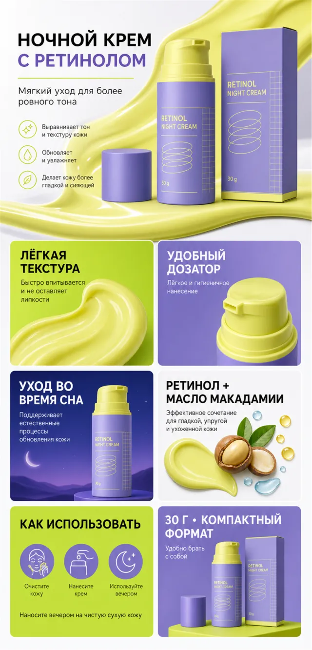
Use the provided product reference image as the sole basis for the product. Product: retinol night cream. Copywriting should be in Russian, with brand placeholders replaced by MOCKUP only. Visuals must follow high-end commercial e‑commerce photography standards—sharp imagery, clear hierarchy, and concise, easy-to-read copy. The product’s appearance, structure, color, quantity, accessories, and relative proportions must match the reference image; products, people, icons, and props should maintain natural proportions. All essential information must remain within the safe zone, with the background extending fully across all four edges. Avoid white borders, vertical sidebars, transparent fill-in areas, watermarks, contact details, social media accounts, platform information, original branding, gibberish, irrelevant content, or unverified claims regarding efficacy or specifications; titles must not appear. A–F must not be displayed.
【A | Theme】Copy: “The effect of this product is remarkable—its benefits are evident in every detail.” “This product combines advanced technology with gentle care, making it ideal for daily use.” Focus on conveying the core value through the complete main visual of the product.
【B | Theme】Copy: “This product addresses key concerns while delivering exceptional results.” Design an independent square image around this theme, ensuring no overlap in selling points, composition, or product perspective with other modules.
【C | Theme】Copy: “This product delivers powerful results while remaining gentle and effective.” Design an independent square image centered on this theme, avoiding duplication of selling points, compositions, or product angles compared to other modules.
【D | Theme】Copy: “Combining superior care with practicality, this product offers both convenience and effectiveness.” Design an independent square image based on this theme, ensuring no overlap in selling points, composition, or product perspectives with other modules.
【E | Theme】Copy: “This product provides comprehensive care, addressing multiple needs with ease.” Design an independent square image around this theme, avoiding duplication of selling points, compositions, or product angles compared to other modules.
【F | Theme】Copy: “30 days of continuous care—this product delivers remarkable results while being gentle on your skin.” “It helps restore vitality, relieve fatigue, and promote overall well-being, leaving you feeling refreshed and revitalized.” Design an independent square image based on this theme, ensuring no overlap in selling points, compositions, or product angles with other modules.
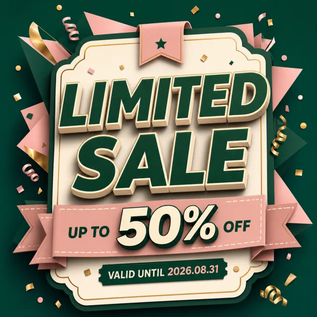
Create a new original coupon or sale design: high-impact seasonal sale poster with dimensional display lettering, layered paper shapes, confetti, and a clear central offer.
Style: clean commercial graphic, polished and print-ready, with harmonious forest green, blush, and cream.
Layout: Square promotional composition with a strong centered hierarchy and balanced margins.
Main text exactly: "LIMITED SALE", "UP TO 50% OFF", "VALID UNTIL 2026.08.31".
Language: English; keep that language and script only, preserve its natural typographic hierarchy, and do not translate.
Design changes: use a different dominant palette, rearrange icons and patterns, and redesign borders, corners, perforations, shadows, gradients, and decorative angles.
Background: Use a newly colored commercial backdrop with no copied texture or decoration.
Remove every brand, store or platform name, logo, watermark, website, QR code, author mark, barcode, and any note beginning with "*".
Avoid exact copying, original colors, copyrighted elements, random text, tiny unreadable legal text, misspellings, fake logos, and scannable codes.
Views
37K
Sales
147
Revenue
$7K
【Output Rules | Do Not Display】
Generate only one 1000×1000, 1:1 Amazon Listing secondary image. No collage images, six-grid layouts, multi-card grids, or multiple scenes are allowed.
【Sharing Rules】
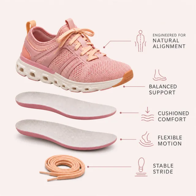
Use the provided product reference image as the sole basis for the product. Product: supportive women's athletic sneaker with removable insoles. Copywriting must be in English; brand placeholders should use MOCKUP only. Visuals must follow high-end commercial e-commerce photography standards—sharp imagery, clear hierarchy, and concise, easy-to-read copy. The product’s appearance, structure, color, quantity, accessories, and relative proportions must match the reference image exactly. Maintain natural proportions among the product, figures, icons, and props. All essential information must remain within the safe area, with the background extending fully to all four edges. Prohibit outer white borders, vertical sidebars, transparent fill-in areas, watermarks, contact details, social media accounts, platform information, original branding, gibberish, irrelevant content, or unverified claims regarding efficacy or specifications. Headlines must not appear.
【Image Composition】
Create a premium pale-blush 1000 x 1000px Amazon infographic using the redesigned product master. Show a vertical exploded view of the shoe, two insole layers, and spare laces with thin leader lines and simple support icons. Use exact copy: "ENGINEERED FOR NATURAL ALIGNMENT", "BALANCED SUPPORT", "CUSHIONED COMFORT", "FLEXIBLE MOTION", "STABLE STRIDE". Keep every item and word within the safe margins.
【Execution Routing | Do Not Display】
If the image-generation tool can be invoked multiple times: concatenate the sharing rules with A–F separately, execute six times, generating one 1000×1000 square image each time; do not submit all modules at once.
If only one image can be generated per run: set the aspect ratio to 2:3 portrait mode on the interface or via API, and avoid using Auto; a recommended size is 1200×1800. Arrange the modules in a 2-column × 3-row grid labeled A/B, C/D, and E/F, ensuring all six modules are equal in size and maintain a 1:1 proportion. If the platform enforces a 1:1 ratio, switch to an Agent-based approach or generate each module individually.
【Sharing Rules】
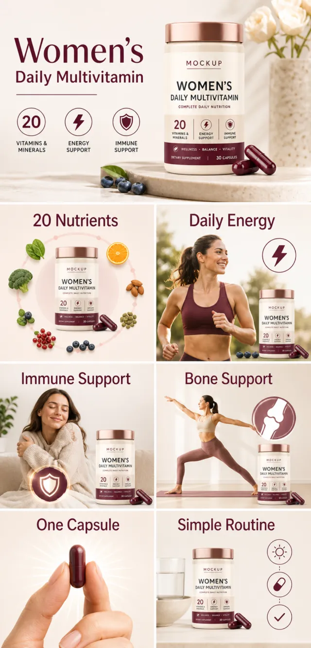
The provided product reference image serves as the sole basis for the product. Product: women's daily multivitamin. Copywriting must be in English, and brand placeholders should use MOCKUP only. Visuals should incorporate ivory, burgundy, rose gold, and charcoal. The product’s appearance, structure, colors, quantity, accessories, and relative proportions must match the reference image; product, figures, icons, and props should maintain natural proportions. All essential information must remain within the safe zone, with the background extending fully to all four edges. External white borders, vertical borders on left and right, transparent padding, watermarks, contact details, social media accounts, platform information, original branding, gibberish, irrelevant content, or unverified claims regarding efficacy or specifications are prohibited. Headlines must not be displayed. A–F must not appear.
【A | Theme】Copy: “Women's Daily Multivitamin”; focus on conveying the core value through a complete primary visual centered on the product.
【B | Theme】Copy: “20 Nutrients”; design an independent square image around this theme, ensuring no overlap in selling points, composition, or product angles with other modules.
【C | Theme】Copy: “Daily Energy”; design an independent square image around this theme, avoiding overlaps in selling points, composition, and product angles with other modules.
【D | Theme】Copy: “Immune Support”; design an independent square image around this theme, avoiding overlaps in selling points, composition, and product angles with other modules.
【E | Theme】Copy: “Bone Support”; design an independent square image around this theme, avoiding overlaps in selling points, composition, and product angles with other modules.
【F | Theme】Copy: “One Capsule”; “Simple Routine”; design independent square images around these themes, ensuring no overlap in selling points, composition, or product angles with other modules.
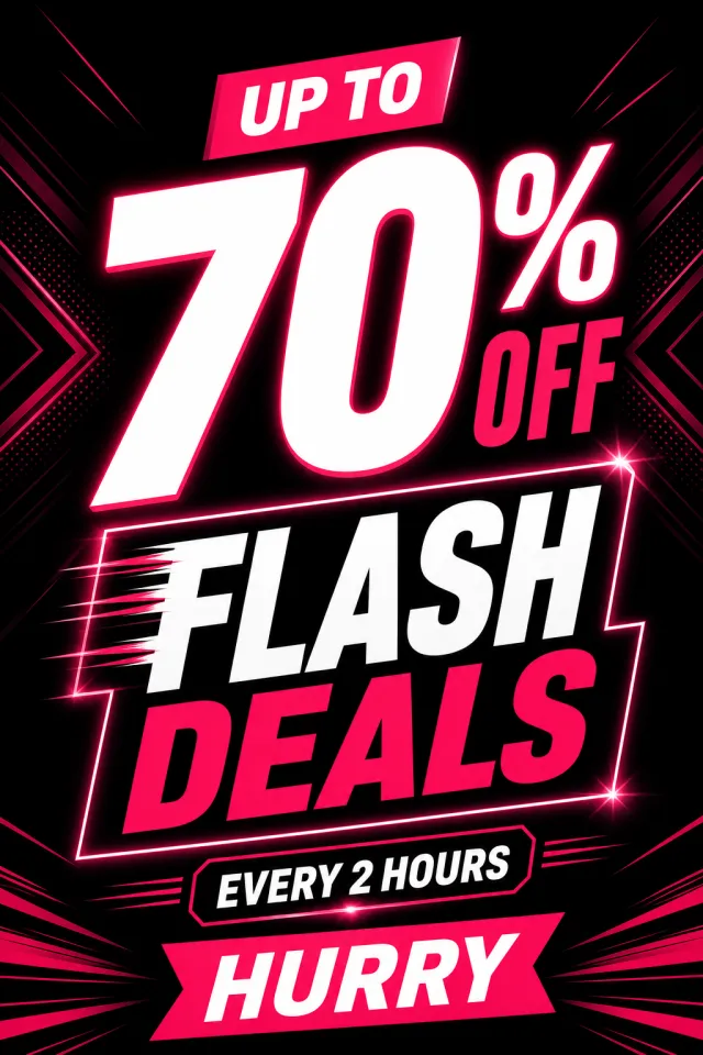
Create an original portrait 2:3 English flash-deals poster in black, hot pink, and white, with a bold central discount, a compact time note, and restrained geometric glow.
Text: “UP TO 70% OFF”, “FLASH DEALS”, “EVERY 2 HOURS”, “HURRY”.
No brand, watermark, QR code, website, non-English text, or random tiny text.
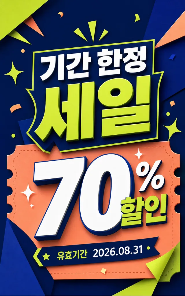
Create a new original coupon or sale design: high-impact seasonal sale poster with dimensional display lettering, layered paper shapes, confetti, and a clear central offer.
Style: clean commercial graphic, polished and print-ready, with harmonious midnight blue, lime, and peach.
Layout: Vertical poster composition preserving the source-like hierarchy of headline, large value, supporting line, and date while using entirely new shapes and spacing.
Main text exactly: "기간 한정 세일", "70% 할인", "유효기간 2026.08.31".
Language: Korean; keep that language and script only, preserve its natural typographic hierarchy, and do not translate.
Design changes: use a different dominant palette, rearrange icons and patterns, and redesign borders, corners, perforations, shadows, gradients, and decorative angles.
Background: Use a newly colored commercial backdrop with no copied texture or decoration.
Remove every brand, store or platform name, logo, watermark, website, QR code, author mark, barcode, and any note beginning with "*".
Avoid exact copying, original colors, copyrighted elements, random text, tiny unreadable legal text, misspellings, fake logos, and scannable codes.
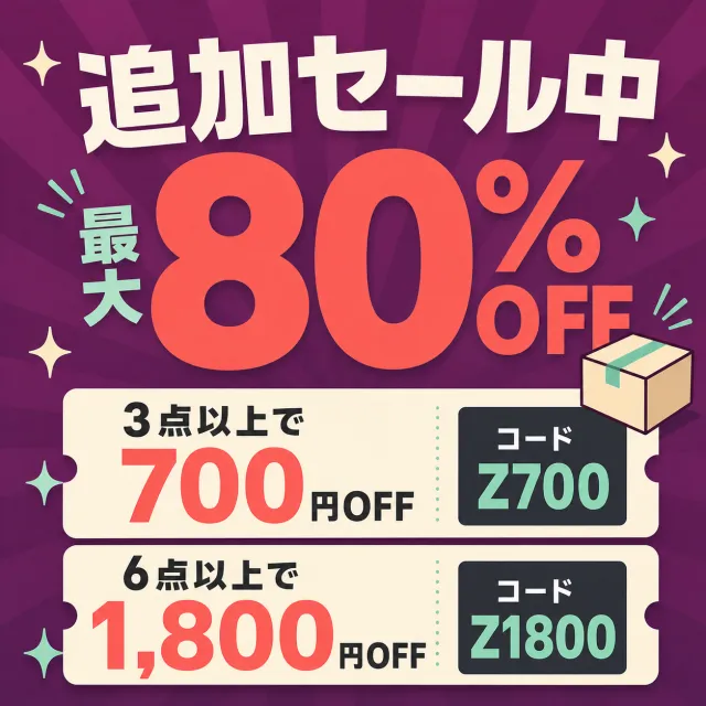
Create a brand-new Japanese additional promotion square poster.
Accurately display the text “追加セール中”“最大80%OFF”“3点以上で700円OFF”“6点以上で1,800円OFF”“コード Z700”“コード Z1800”.
Use plum purple, coral orange, mint green, creamy white, and charcoal black.
Reorganize the horizontal information into a square format, featuring a massive 80% discount and two stacked discount coupons as the main elements.
All Japanese text and discount codes must be large and sharp, with clearly defined sections.
Add simple packaging and sparkling icons to avoid cluttering the design.
Do not include any brands, logos, URLs, QR codes, watermarks, or fine print.
Output a high-quality static PNG.
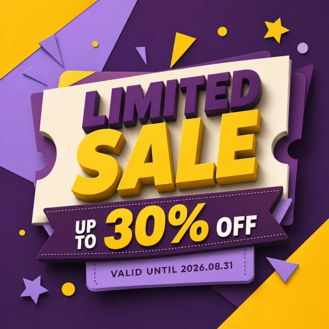
Create a new original coupon or sale design: high-impact seasonal sale poster with dimensional display lettering, layered paper shapes, confetti, and a clear central offer.
Style: clean commercial graphic, polished and print-ready, with harmonious aubergine, lemon, and soft lilac.
Layout: Square promotional composition with a strong centered hierarchy and balanced margins.
Main text exactly: "LIMITED SALE", "UP TO 30% OFF", "VALID UNTIL 2026.08.31".
Language: English; keep that language and script only, preserve its natural typographic hierarchy, and do not translate.
Design changes: use a different dominant palette, rearrange icons and patterns, and redesign borders, corners, perforations, shadows, gradients, and decorative angles.
Background: Use a newly colored commercial backdrop with no copied texture or decoration.
Remove every brand, store or platform name, logo, watermark, website, QR code, author mark, barcode, and any note beginning with "*".
Avoid exact copying, original colors, copyrighted elements, random text, tiny unreadable legal text, misspellings, fake logos, and scannable codes.
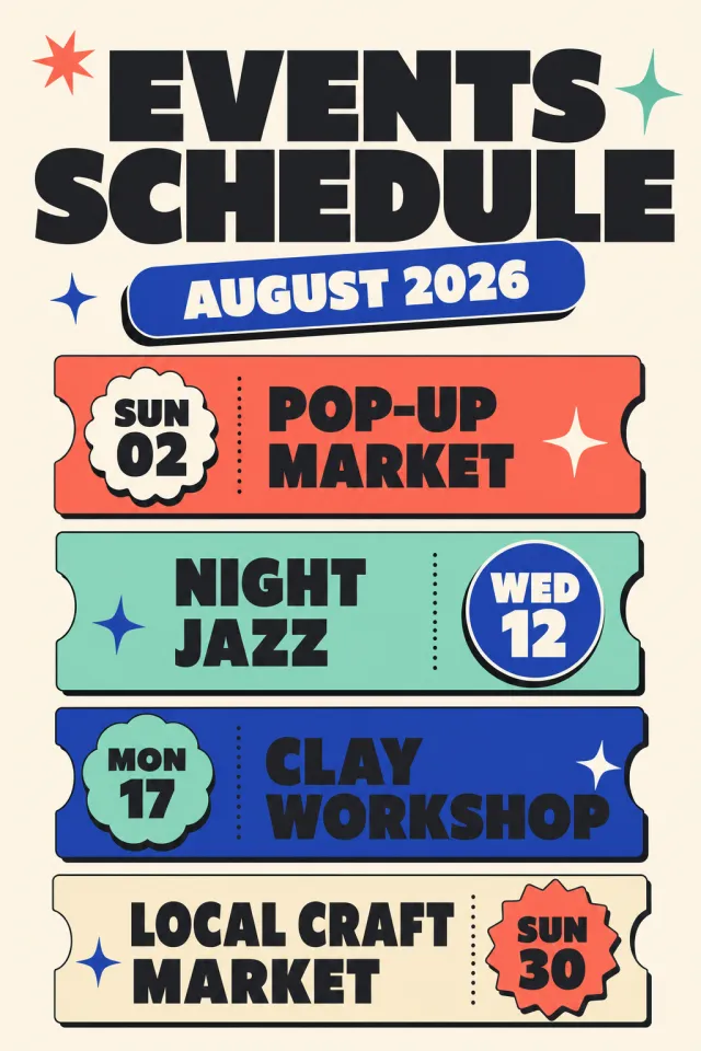
Create a new original English events schedule poster with a playful editorial calendar layout.
Style: bold retro typography, rounded ticket rows, varied date badges, sparse star icons.
Layout: portrait 5:7 composition with a large header and four clearly separated event rows.
Main text: "EVENTS SCHEDULE", "AUGUST 2026", "SUN 02 POP-UP MARKET", "WED 12 NIGHT JAZZ", "MON 17 CLAY WORKSHOP", "SUN 30 LOCAL CRAFT MARKET".
Language: English only; keep every phrase correctly spelled.
Design changes: use cobalt blue, coral, mint, warm cream, and black with new ticket shapes and badges.
Background: warm-cream paper field with generous spacing and simple graphic stars.
Remove: venue address, watermark, brand logo, QR code, website, author mark, and fine print.
Avoid: exact copying, original colors, random tiny text, misspelled text, and copyrighted brand elements.
【Execution Route | Do Not Display】
If the image-generation tool can be invoked multiple times: concatenate the sharing rules with A–F separately, execute six times, generating only one 1000×1000 square image each time.
If only a single image can be generated at a time: first set the interface/API to a 2:3 portrait orientation (do not use Auto), then arrange A/B, C/D, and E/F into a 2-column × 3-row grid; ensure all six cells are equal in size and maintain a visual aspect ratio of 1:1. The outer canvas must not be 1:1.
【Sharing Rules】
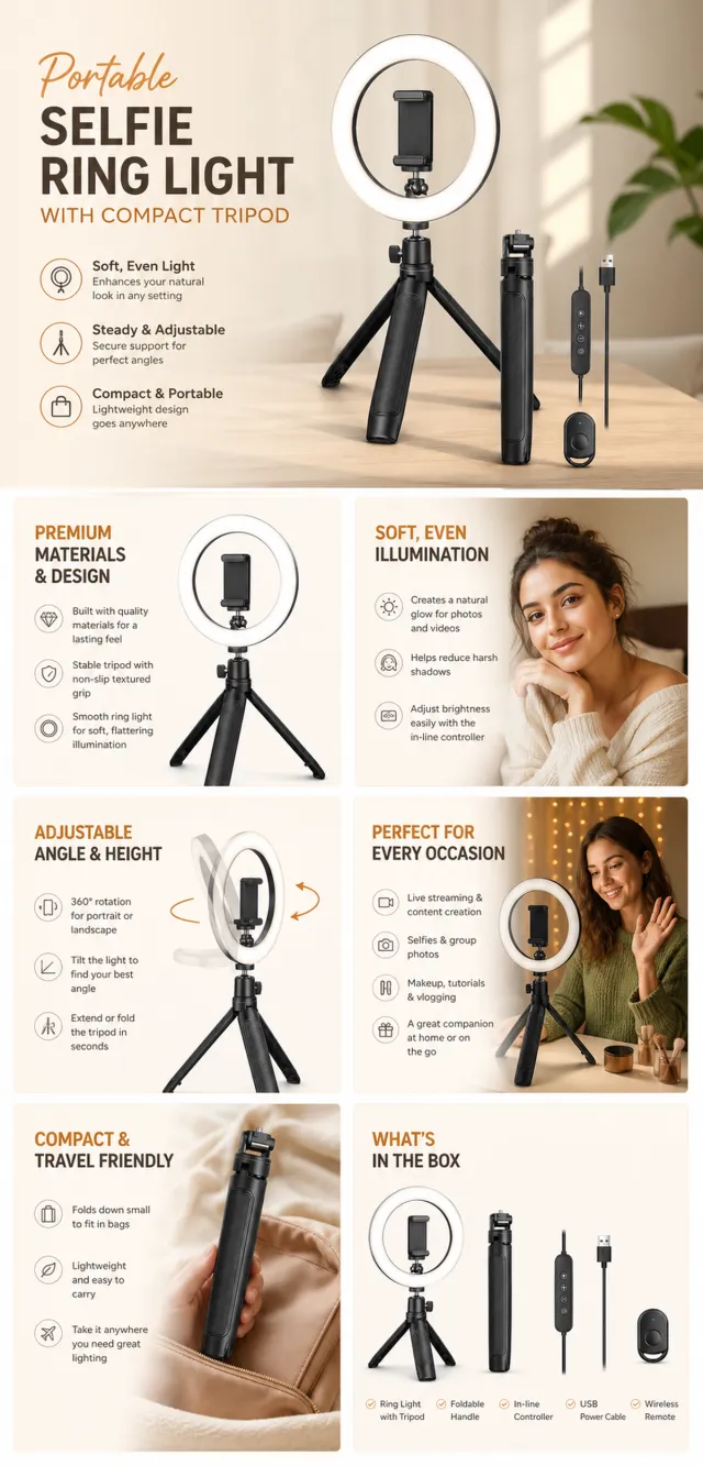
The provided product reference image serves as the sole basis for the product. The product is a portable selfie ring light with a compact tripod. Strictly adhere to the reference image’s shape, structure, color, quantity, accessories, texture, and relative proportions; do not fabricate any unseen components, specifications, or functions. Use high-quality Amazon commercial photography and clear English infographics; color schemes should match the product, lighting must be realistic, and layout kept simple. Maintain natural proportions among the product, human subjects, hands, icons, and props—no stretching, flattening, or independent scaling is allowed. Titles, products, and labels must remain fully within the safe zone, while the background extends across the entire frame on all four sides. Only MOCKUP may be used for branding. No white borders, vertical edges on either side, transparent fill-in borders, watermarks, contact information, social media accounts, original brand logos, platform identifiers, garbled text, distorted body parts, or unverified copywriting are permitted. A–F are solely control markers and must not be displayed.
【A | Product Overview】Title: “PRODUCT OVERVIEW.” The hero composition fully showcases the product along with the accessories depicted in the reference image; include three brief English icon-based selling points, stating only information that is visible or verifiable.
【B | Materials & Design】Title: “MATERIAL & DESIGN.” Present materials, structure, surface finish, or styling through an overall view of the product combined with 2–3 close-up details; ensure clear labeling without inventing material names.
【C | Function in Focus】Title: “FUNCTION IN FOCUS.” Demonstrate key functions within realistic usage scenarios; maintain natural proportions between people, hands, and the product, with authentic gestures and easily understandable information.
【D | Details Up Close】Title: “DETAILS UP CLOSE.” Highlight 2–4 critical structural or operational areas using magnified details and short captions; do not alter the product’s structure.
【E | Everyday Use】Title: “MADE FOR REAL LIFE.” Depict usage, portability, storage, or maintenance scenarios consistent with the product; retain only one clear theme and avoid duplication with C.
【F | Packaging Contents】Title: “WHAT’S INCLUDED.” Lay out or neatly arrange the actual products and accessories shown in the reference image, ensuring accurate quantities and relative sizes; if the contents cannot be confirmed, instead display visible specifications, dimensional relationships, or usage steps without fabricating numbers.
Create a new original coupon or sale design: high-impact seasonal sale poster with dimensional display lettering, layered paper shapes, confetti, and a clear central offer.
Style: clean commercial graphic, polished and print-ready, with harmonious charcoal, electric cyan, and tangerine.
Layout: Vertical poster composition preserving the source-like hierarchy of headline, large value, supporting line, and date while using entirely new shapes and spacing.
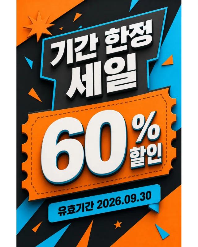
Main text exactly: "기간 한정 세일", "60% 할인", "유효기간 2026.09.30".
Language: Korean and English; keep that language and script only, preserve its natural typographic hierarchy, and do not translate.
Design changes: use a different dominant palette, rearrange icons and patterns, and redesign borders, corners, perforations, shadows, gradients, and decorative angles.
Background: Use a newly colored commercial backdrop with no copied texture or decoration.
Remove every brand, store or platform name, logo, watermark, website, QR code, author mark, barcode, and any note beginning with "*".
Avoid exact copying, original colors, copyrighted elements, random text, tiny unreadable legal text, misspellings, fake logos, and scannable codes.
Create a square discount poster in Spanish with a large number and clear commercial hierarchy.
Style: modern typography, curved ribbon with cut corners and soft offset shadows.
Design: square composition with 45% dominant and two information strips below.
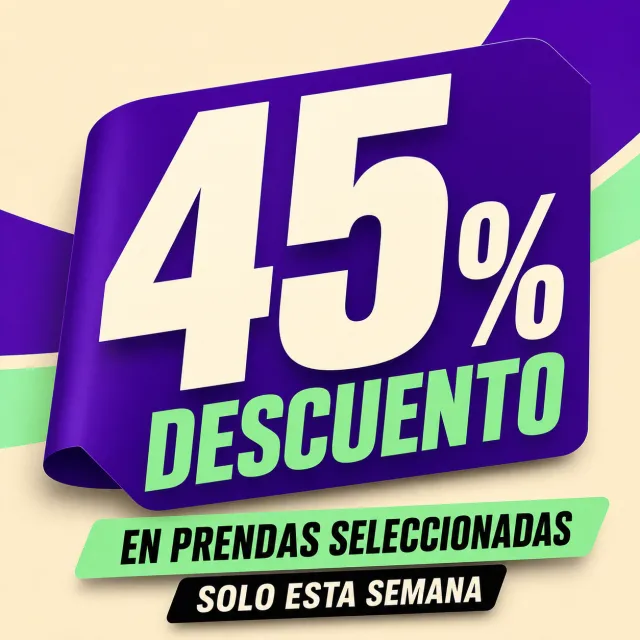
Main text: "45% DESCUENTO", "EN PRENDAS SELECCIONADAS", "SOLO ESTA SEMANA".
Language: Spanish only; do not translate and maintain correct spelling.
Changes: use deep violet, mint green, cream, and black with a completely new layout.
Background: warm cream with large violet curves and green accents.
Remove: marks, logos, URLs, watermarks, QR codes, author credits, and fine print.
Avoid: exact copying, original colors, random text, errors, and brand elements.
Create a new original coupon or sale design: graphic Black Friday promotion with torn-paper or label-like typography, strong contrast, and geometric framing.
Style: clean commercial graphic, polished and print-ready, with harmonious plum, mint, and champagne gold.
Layout: Vertical poster composition preserving the source-like hierarchy of headline, large value, supporting line, and date while using entirely new shapes and spacing.
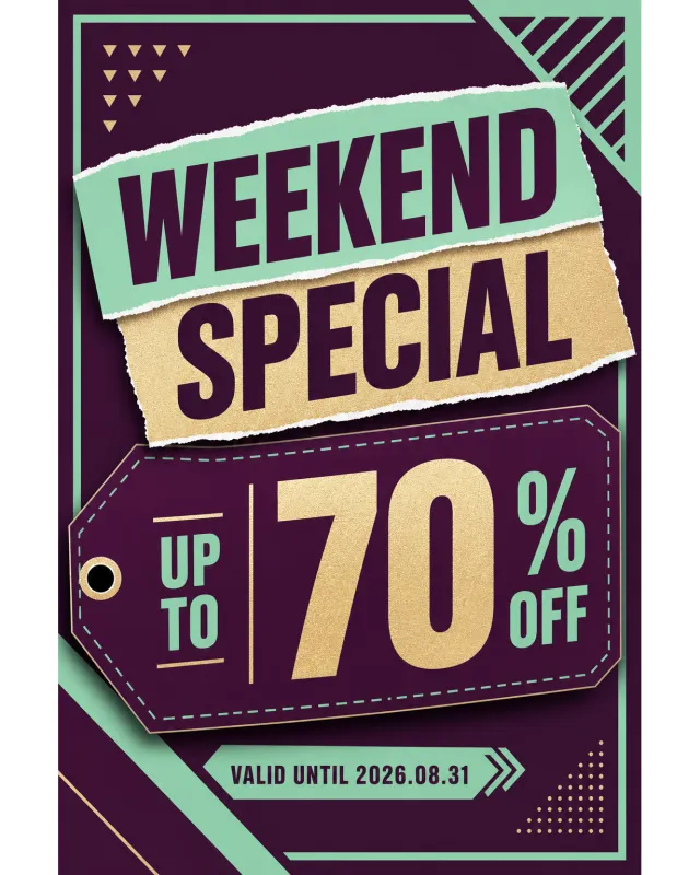
Main text exactly: "WEEKEND SPECIAL", "UP TO 70% OFF", "VALID UNTIL 2026.08.31".
Language: English; keep that language and script only, preserve its natural typographic hierarchy, and do not translate.
Design changes: use a different dominant palette, rearrange icons and patterns, and redesign borders, corners, perforations, shadows, gradients, and decorative angles.
Background: Use a newly colored commercial backdrop with no copied texture or decoration.
Remove every brand, store or platform name, logo, watermark, website, QR code, author mark, barcode, and any note beginning with "*".
Avoid exact copying, original colors, copyrighted elements, random text, tiny unreadable legal text, misspellings, fake logos, and scannable codes.
Create a new original coupon or sale design: print-ready voucher collection with rounded ticket corners, perforations, notches, bold value hierarchy, and decorative non-scannable stripe motifs.
Style: clean commercial graphic, polished and print-ready, with harmonious teal, vermilion, and warm sand.
Layout: Square promotional composition with a strong centered hierarchy and balanced margins.
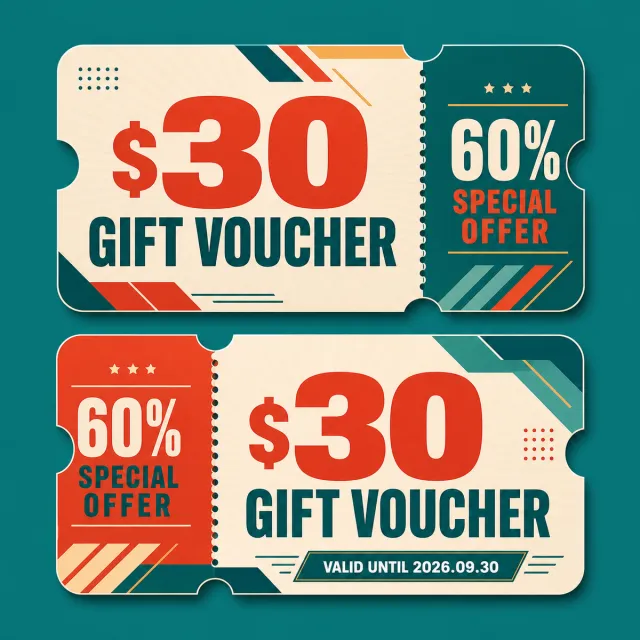
Main text exactly: "$30 GIFT VOUCHER", "60% SPECIAL OFFER", "VALID UNTIL 2026.09.30".
Language: English; keep that language and script only, preserve its natural typographic hierarchy, and do not translate.
Design changes: use a different dominant palette, rearrange icons and patterns, and redesign borders, corners, perforations, shadows, gradients, and decorative angles.
Background: Use a newly colored commercial backdrop with no copied texture or decoration.
Remove every brand, store or platform name, logo, watermark, website, QR code, author mark, barcode, and any note beginning with "*".
Avoid exact copying, original colors, copyrighted elements, random text, tiny unreadable legal text, misspellings, fake logos, and scannable codes.
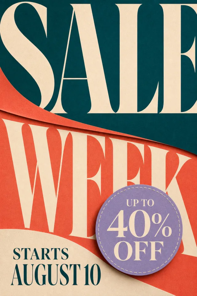
Create a brand-new vertical promotional weekly poster in English, intended for advertising and marketing.
Accurately present the text “SALE WEEK”“UP TO 40% OFF”“STARTS AUGUST 10”.
Use a color palette of deep cyan, coral orange, warm cream, and lavender purple.
Employ cut-style serif headlines, stitched badges, and large-scale numerals to establish visual hierarchy.
Add soft paper textures and subtle shadows to create an editorial design feel.
Discount information must stand out, with dates clearly legible.
Do not include any brand logos, trademarks, website URLs, QR codes, watermarks, or fine print.
Output a high-quality static PNG image.
Views
193K
Sales
515
Revenue
$81
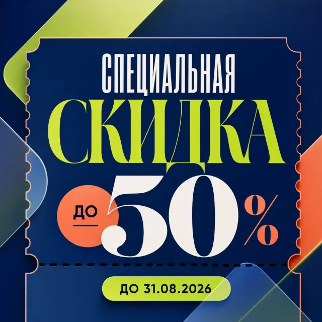
Create a new original coupon or sale design: fashion-forward sale campaign poster with expressive display type, layered translucent shapes, and a refined editorial grid.
Style: clean commercial graphic, polished and print-ready, with harmonious midnight blue, lime, and peach.
Layout: Square promotional composition with a strong centered hierarchy and balanced margins.
Main text exactly: "СПЕЦИАЛЬНАЯ СКИДКА", "ДО 50%", "ДО 31.08.2026".
Language: Russian; keep that language and script only, preserve its natural typographic hierarchy, and do not translate.
Design changes: use a different dominant palette, rearrange icons and patterns, and redesign borders, corners, perforations, shadows, gradients, and decorative angles.
Background: Use a newly colored commercial backdrop with no copied texture or decoration.
Remove every brand, store or platform name, logo, watermark, website, QR code, author mark, barcode, and any note beginning with "*".
Avoid exact copying, original colors, copyrighted elements, random text, tiny unreadable legal text, misspellings, fake logos, and scannable codes.
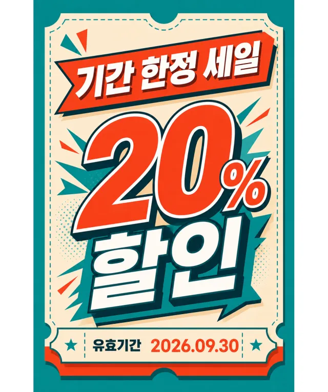
Create a new original coupon or sale design: bold retail promotion poster with oversized offer typography, punchy outlined lettering, and energetic graphic accents.
Style: clean commercial graphic, polished and print-ready, with harmonious teal, vermilion, and warm sand.
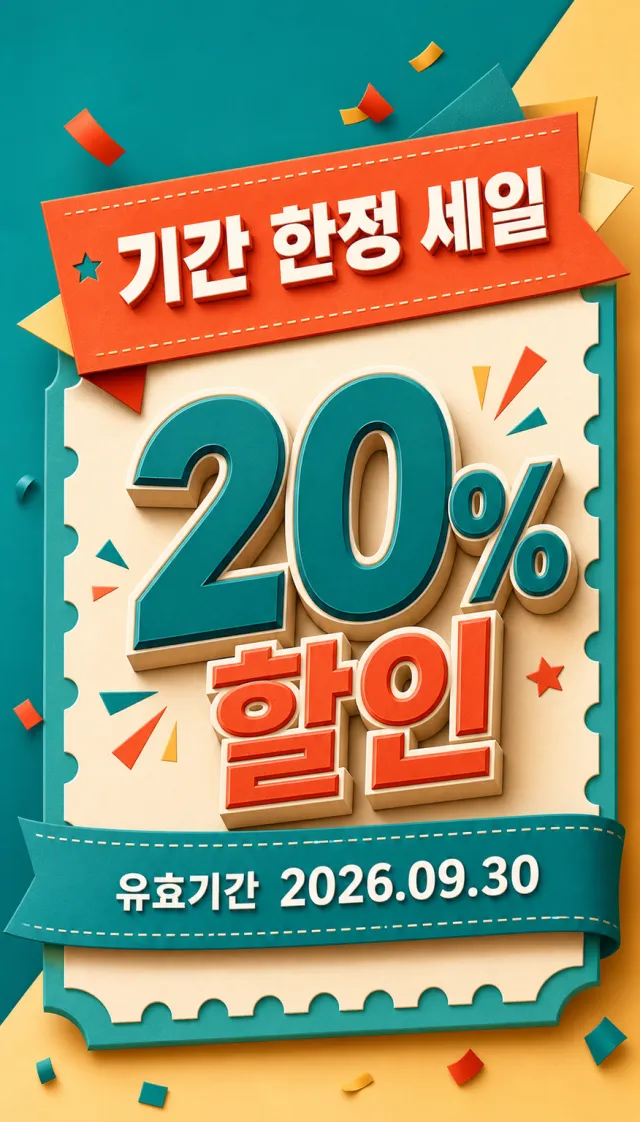
Layout: Vertical poster composition preserving the source-like hierarchy of headline, large value, supporting line, and date while using entirely new shapes and spacing.
Main text exactly: "기간 한정 세일", "20% 할인", "유효기간 2026.09.30".
Language: Korean; keep that language and script only, preserve its natural typographic hierarchy, and do not translate.
Design changes: use a different dominant palette, rearrange icons and patterns, and redesign borders, corners, perforations, shadows, gradients, and decorative angles.
Background: Use a newly colored commercial backdrop with no copied texture or decoration.
Remove every brand, store or platform name, logo, watermark, website, QR code, author mark, barcode, and any note beginning with "*".
Avoid exact copying, original colors, copyrighted elements, random text, tiny unreadable legal text, misspellings, fake logos, and scannable codes.
Views
2M
Sales
2K
Revenue
$2K
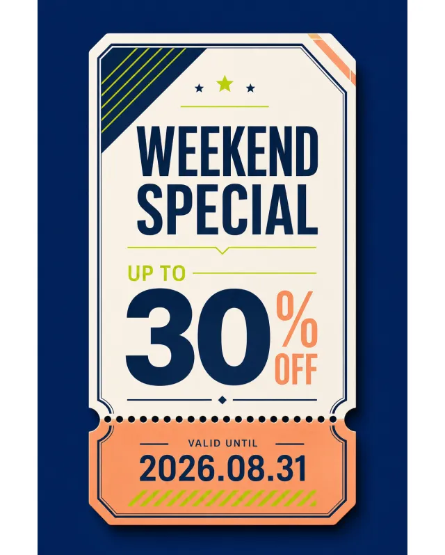
Create a new original coupon or sale design: editorial shipping-ticket graphic with a detachable stub, perforation, and a decorative non-scannable stripe pattern.
Style: clean commercial graphic, polished and print-ready, with harmonious midnight blue, lime, and peach.
Layout: Vertical poster composition preserving the source-like hierarchy of headline, large value, supporting line, and date while using entirely new shapes and spacing.
Main text exactly: "WEEKEND SPECIAL", "UP TO 30% OFF", "VALID UNTIL 2026.08.31".
Language: English; keep that language and script only, preserve its natural typographic hierarchy, and do not translate.
Design changes: use a different dominant palette, rearrange icons and patterns, and redesign borders, corners, perforations, shadows, gradients, and decorative angles.
Background: Use a newly colored commercial backdrop with no copied texture or decoration.
Remove every brand, store or platform name, logo, watermark, website, QR code, author mark, barcode, and any note beginning with "*".
Avoid exact copying, original colors, copyrighted elements, random text, tiny unreadable legal text, misspellings, fake logos, and scannable codes.
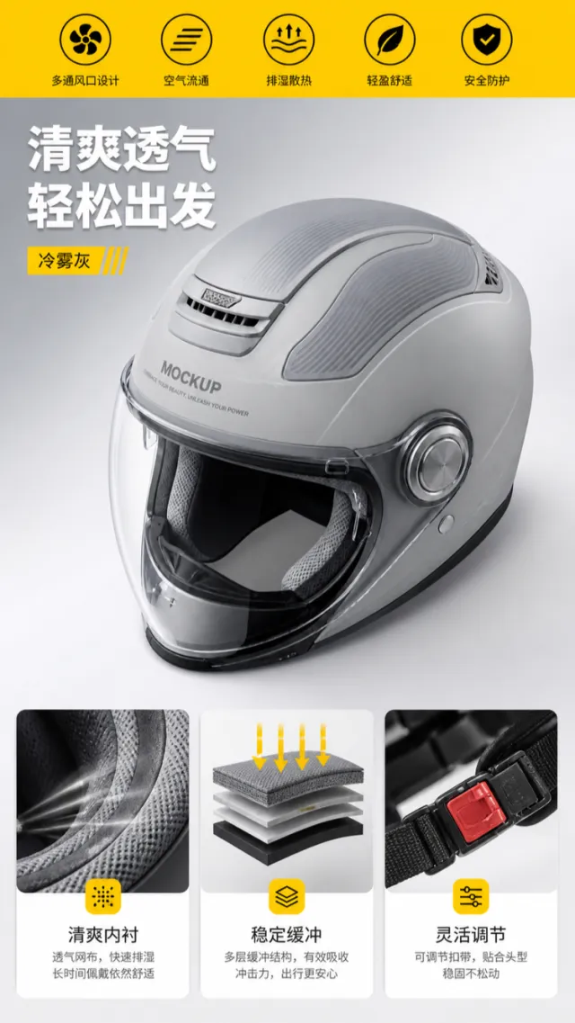
Based on the reference image, generate a mockup for an e‑commerce product detail page showcasing the ventilation structure of a commuter helmet.
A cool‑mist gray full-face helmet occupies the center of the frame from a three‑quarter overhead perspective, retaining its streamlined shell, transparent visor, large top vents, chin guard, and interior lining. Minor adjustments have been made to the vent channels, visor hinges, and shell texture. The product surface displays only the words “MOCKUP” and “EMBRACE YOUR BEAUTY, UNLEASH YOUR POWER.” The background features an industrial‑style gradient ranging from light gray to silver white, with a bright yellow banner at the top and minimalist black circular icons, creating clear visual anchors.
On the left side, two lines of bold white Chinese text read “Refreshing & Breathable” and “Set Off with Ease,” below which sits a yellow capsule label reading “Cool‑Mist Gray.” Beneath the helmet, three equally sized functional icon cards are arranged, illustrating in sequence the breathable inner lining material, cushioning structure, and adjustable strap. Short captions—“Breathable Lining,” “Stable Cushioning,” and “Flexible Adjustment”—accompany each card, paired with a brief line of description. The typography is bold and legible, while the yellow accent blocks and the black‑gray information cards establish a clean, organized layout.
Output dimensions: 750 x 1334px. Avoid: real brand names, model numbers, footnotes, garbled characters, watermarks, overlapping text, text overflow, subject occlusion, distorted subject proportions, duplicate products, low‑resolution icons, and excessive negative space.
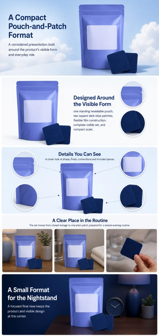
Using the supplied reference image as the sole product reference, create an Amazon A+ design preview for a pouch-and-patch personal-care set. Preserve exact geometry, proportions, colors, construction, quantity, accessories, and scale. Visible details: one standing resealable pouch, two square dark-blue patches, flexible film construction, complete visible set, and compact scale. Do not invent hidden parts or claims.
Visual system: periwinkle blue, deep navy, white, and pale cloud blue. Composition motifs: soft cloud fields, rounded instruction panels, circular placement crops, and botanical still lifes. Alternate a wide banner, asymmetric overview, centered detail graphic, three-scene sequence, and wide closing scene. Use readable sans-serif type and mobile-safe margins.
Build this official A+ module order. Keep every module independently complete; never split copy or product details.
MODULE 1 — Image with text overlay — introduction
Exact headline: “A Compact Pouch-and-Patch Format”
Exact supporting copy: “A considered presentation built around the product’s visible form and everyday role.”
Layout: wide image-led hero; dominant complete product and large safe headline area.
MODULE 2 — Single image with side text — product overview
Exact headline: “Designed Around the Visible Form”
Exact supporting copy: “one standing resealable pouch, two square dark-blue patches, flexible film construction, complete visible set, and compact scale.”
Layout: large three-quarter product, side text field, and two detail crops.
MODULE 3 — Four-image and text — visible evidence
Exact headline: “Details You Can See”
Exact supporting copy: “A closer look at shape, finish, connections and included pieces.”
Layout: centered product with four rounded macro callouts; show only visible facts.
MODULE 4 — Multiple image and text — routine or use setting
Exact headline: “A Clear Place in the Routine”
Exact supporting copy: “The set moves from closed storage to one plain patch prepared for a simple evening routine.”
Layout: three framed scenes with consistent product design and newly generated people or animals only when relevant.
MODULE 5 — Full-width image with text overlay — closing
Exact headline: “A Small Format for the Nightstand”
Exact supporting copy: “A focused final view keeps the product and visible design at the center.”
Layout: wide editorial scene, strong silhouette, restrained props, safe text area.
Create one vertical A+ preview at 1200px width with content-driven height, clear module boundaries, and varied compositions for independent export. Render only the exact copy above. Do not add logos, prices, promotions, QR codes, URLs, contacts, competitors, testimonials, ratings, guarantees, unverified claims, certifications, fake UI, watermarks, pseudo-text, or unrelated labels. Keep all elements natural and mobile-safe.
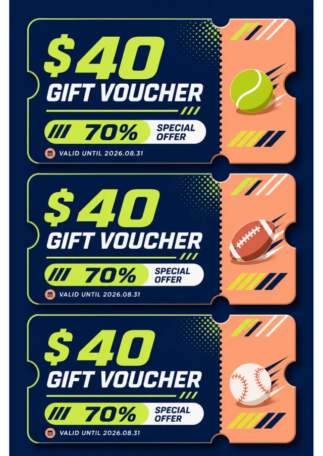
Create a new original coupon or sale design: print-ready voucher collection with rounded ticket corners, perforations, notches, bold value hierarchy, and decorative non-scannable stripe motifs.
Style: clean commercial graphic, polished and print-ready, with harmonious midnight blue, lime, and peach.
Layout: Vertical poster composition preserving the source-like hierarchy of headline, large value, supporting line, and date while using entirely new shapes and spacing.
Main text exactly: "$40 GIFT VOUCHER", "70% SPECIAL OFFER", "VALID UNTIL 2026.08.31".
Language: English; keep that language and script only, preserve its natural typographic hierarchy, and do not translate.
Design changes: use a different dominant palette, rearrange icons and patterns, and redesign borders, corners, perforations, shadows, gradients, and decorative angles.
Background: Use a newly colored commercial backdrop with no copied texture or decoration.
Remove every brand, store or platform name, logo, watermark, website, QR code, author mark, barcode, and any note beginning with "*".
Avoid exact copying, original colors, copyrighted elements, random text, tiny unreadable legal text, misspellings, fake logos, and scannable codes.
【Execution Route | Do Not Display】
If the image-generation tool can be invoked multiple times: concatenate the sharing rules with A–F separately, execute six times, generating only one 1000×1000 square image each time.
If only a single image can be generated at a time: first set the interface/API to a 2:3 portrait orientation (do not use Auto), then arrange A/B, C/D, and E/F into a 2-column × 3-row grid; ensure all six cells are equal in size and maintain a visual aspect ratio of 1:1. The outer canvas must not be 1:1.
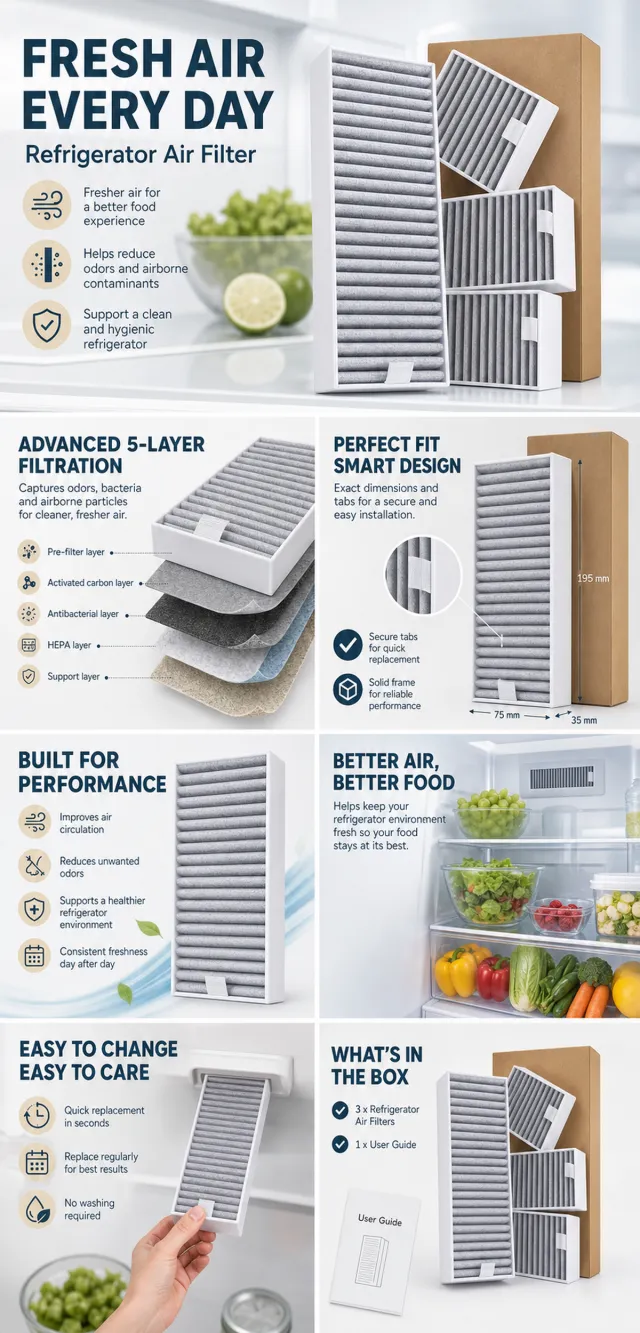
【Sharing Rules】
The provided product reference image serves as the sole basis for the product. The product is a refrigerator air filter. Strictly adhere to the reference image’s shape, structure, color, quantity, accessories, texture, and relative proportions; do not fabricate any unseen components, specifications, or functions. Use high-quality Amazon commercial photography and clear English infographics, with colors derived from the product itself, realistic lighting, and a clean layout. Maintain natural proportions for the product, figures, hands, icons, and props—no stretching, flattening, or independent scaling is allowed. Titles, products, and labels must remain fully within the safe zone, and the background should extend across the entire frame on all four sides. Only use MOCKUP for branding. No white borders, vertical edges on either side, transparent fill-in areas, watermarks, contact information, social media accounts, original brand logos, platform identifiers, garbled text, distorted body parts, or unverified copywriting are permitted. A–F are solely control markers and must not be displayed.
【A | Product Overview】Title: “PRODUCT OVERVIEW.” The hero composition fully showcases the product along with the accessories depicted in the reference image, accompanied by three brief English icon-based selling points that highlight only visible or verifiable information.
【B | Materials & Design】Title: “MATERIAL & DESIGN.” Present materials, structure, surface finishes, or styling through an overall view of the product combined with 2–3 close-up details; ensure clear labeling without inventing material names.
【C | Function in Focus】Title: “FUNCTION IN FOCUS.” Demonstrate key functions within realistic usage scenarios; maintain natural proportions among people, hands, and the product, with authentic actions and easily understandable information.
【D | Details Up Close】Title: “DETAILS UP CLOSE.” Highlight 2–4 critical structural or operational areas using magnified details and short captions; do not alter the product’s structure.
【E | Everyday Use】Title: “MADE FOR REAL LIFE.” Showcase usage, portability, storage, or maintenance scenarios consistent with the product; retain only one clear theme and avoid duplication with C.
【F | Packaging Contents】Title: “WHAT’S INCLUDED.” Lay out or neatly arrange the actual products and accessories shown in the reference image, ensuring accurate quantities and relative sizes; if the list cannot be confirmed, instead display visible specifications, dimensional relationships, or usage steps without fabricating numbers.
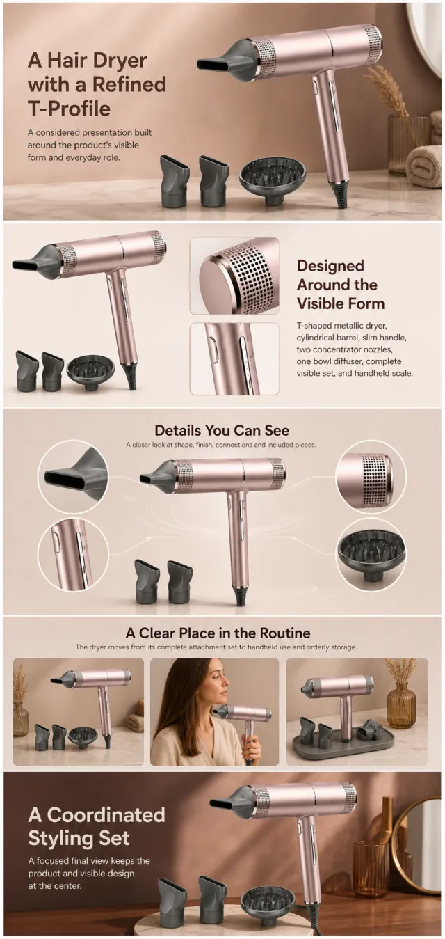
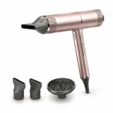
Using the supplied reference image as the sole product reference, create an Amazon A+ design preview for a hair dryer attachment set. Preserve exact geometry, proportions, colors, construction, quantity, accessories, and scale. Visible details: T-shaped metallic dryer, cylindrical barrel, slim handle, two concentrator nozzles, one bowl diffuser, complete visible set, and handheld scale. Do not invent hidden parts or claims.
Visual system: rose champagne, cocoa brown, warm beige, and charcoal. Composition motifs: microfilter close-ups, circular airflow graphics, attachment tiles, and softly lit salon scenes. Alternate a wide banner, asymmetric overview, centered detail graphic, three-scene sequence, and wide closing scene. Use readable sans-serif type and mobile-safe margins.
Build this official A+ module order. Keep every module independently complete; never split copy or product details.
MODULE 1 — Image with text overlay — introduction
Exact headline: “A Hair Dryer with a Refined T-Profile”
Exact supporting copy: “A considered presentation built around the product’s visible form and everyday role.”
Layout: wide image-led hero; dominant complete product and large safe headline area.
MODULE 2 — Single image with side text — product overview
Exact headline: “Designed Around the Visible Form”
Exact supporting copy: “T-shaped metallic dryer, cylindrical barrel, slim handle, two concentrator nozzles, one bowl diffuser, complete visible set, and handheld scale.”
Layout: large three-quarter product, side text field, and two detail crops.
MODULE 3 — Four-image and text — visible evidence
Exact headline: “Details You Can See”
Exact supporting copy: “A closer look at shape, finish, connections and included pieces.”
Layout: centered product with four rounded macro callouts; show only visible facts.
MODULE 4 — Multiple image and text — routine or use setting
Exact headline: “A Clear Place in the Routine”
Exact supporting copy: “The dryer moves from its complete attachment set to handheld use and orderly storage.”
Layout: three framed scenes with consistent product design and newly generated people or animals only when relevant.
MODULE 5 — Full-width image with text overlay — closing
Exact headline: “A Coordinated Styling Set”
Exact supporting copy: “A focused final view keeps the product and visible design at the center.”
Layout: wide editorial scene, strong silhouette, restrained props, safe text area.
Create one vertical A+ preview at 1200px width with content-driven height, clear module boundaries, and varied compositions for independent export. Render only the exact copy above. Do not add logos, prices, promotions, QR codes, URLs, contacts, competitors, testimonials, ratings, guarantees, unverified claims, certifications, fake UI, watermarks, pseudo-text, or unrelated labels. Keep all elements natural and mobile-safe.
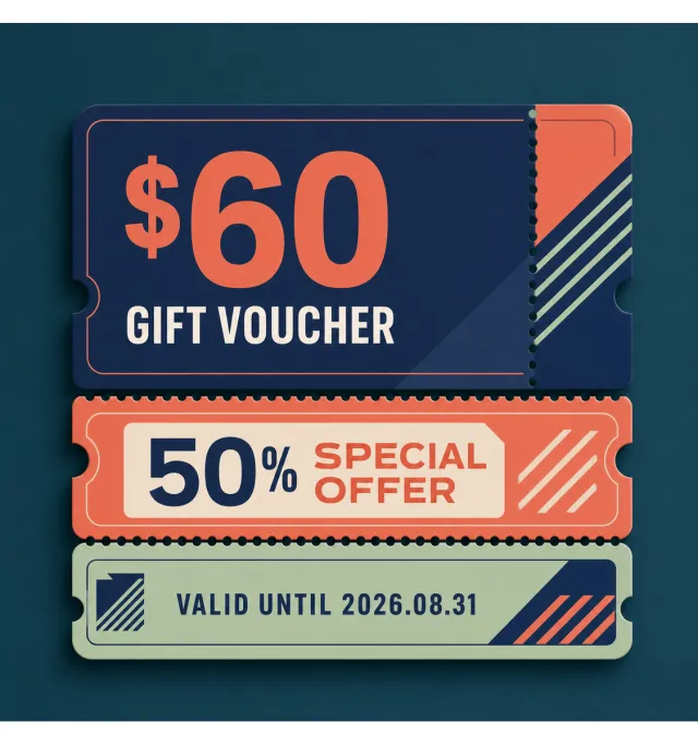
Create a new original coupon or sale design: print-ready voucher collection with rounded ticket corners, perforations, notches, bold value hierarchy, and decorative non-scannable stripe motifs.
Style: clean commercial graphic, polished and print-ready, with harmonious indigo, coral, and pale sage.
Layout: Square promotional composition with a strong centered hierarchy and balanced margins.
Main text exactly: "$60 GIFT VOUCHER", "50% SPECIAL OFFER", "VALID UNTIL 2026.08.31".
Language: English; keep that language and script only, preserve its natural typographic hierarchy, and do not translate.
Design changes: use a different dominant palette, rearrange icons and patterns, and redesign borders, corners, perforations, shadows, gradients, and decorative angles.
Background: Use a newly colored commercial backdrop with no copied texture or decoration.
Remove every brand, store or platform name, logo, watermark, website, QR code, author mark, barcode, and any note beginning with "*".
Avoid exact copying, original colors, copyrighted elements, random text, tiny unreadable legal text, misspellings, fake logos, and scannable codes.
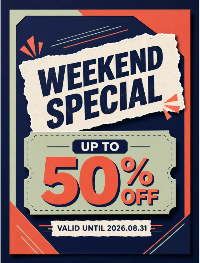
Create a new original coupon or sale design: graphic Black Friday promotion with torn-paper or label-like typography, strong contrast, and geometric framing.
Style: clean commercial graphic, polished and print-ready, with harmonious indigo, coral, and pale sage.
Layout: Vertical poster composition preserving the source-like hierarchy of headline, large value, supporting line, and date while using entirely new shapes and spacing.
Main text exactly: "WEEKEND SPECIAL", "UP TO 50% OFF", "VALID UNTIL 2026.08.31".
Language: English; keep that language and script only, preserve its natural typographic hierarchy, and do not translate.
Design changes: use a different dominant palette, rearrange icons and patterns, and redesign borders, corners, perforations, shadows, gradients, and decorative angles.
Background: Use a newly colored commercial backdrop with no copied texture or decoration.
Remove every brand, store or platform name, logo, watermark, website, QR code, author mark, barcode, and any note beginning with "*".
Avoid exact copying, original colors, copyrighted elements, random text, tiny unreadable legal text, misspellings, fake logos, and scannable codes.
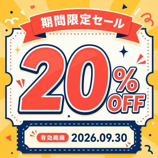
Create a new original coupon or sale design: cheerful Japanese retail coupon poster with large numerical offer, lively illustrated accents, bordered information panels, and clean hierarchy.
Style: clean commercial graphic, polished and print-ready, with harmonious deep cobalt, warm ivory, and coral.
Layout: Square promotional composition with a strong centered hierarchy and balanced margins.
Main text exactly: "期間限定セール", "20% OFF", "有効期限 2026.09.30".
Language: Japanese; keep that language and script only, preserve its natural typographic hierarchy, and do not translate.
Design changes: use a different dominant palette, rearrange icons and patterns, and redesign borders, corners, perforations, shadows, gradients, and decorative angles.
Background: Use a newly colored commercial backdrop with no copied texture or decoration.
Remove every brand, store or platform name, logo, watermark, website, QR code, author mark, barcode, and any note beginning with "*".
Avoid exact copying, original colors, copyrighted elements, random text, tiny unreadable legal text, misspellings, fake logos, and scannable codes.
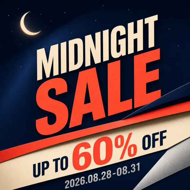
Create a new original English midnight sale poster with bold diagonal typography.
Style: dramatic commercial print, layered folded bands, subtle metallic accents.
Layout: square composition with a huge two-line title, offer strip, date, and small crescent icon.
Main text: "MIDNIGHT SALE", "UP TO 60% OFF", "2026.08.28-08.31".
Language: English only; keep every phrase correctly spelled.
Design changes: use midnight navy, electric coral, warm cream, and silver with new diagonal angles.
Background: deep navy night field with restrained stars and layered paper bands.
Remove: watermark, stock mark, brand logo, QR code, website, author mark, and fine print.
Avoid: exact copying, original colors, random tiny text, misspelled text, and copyrighted brand elements.
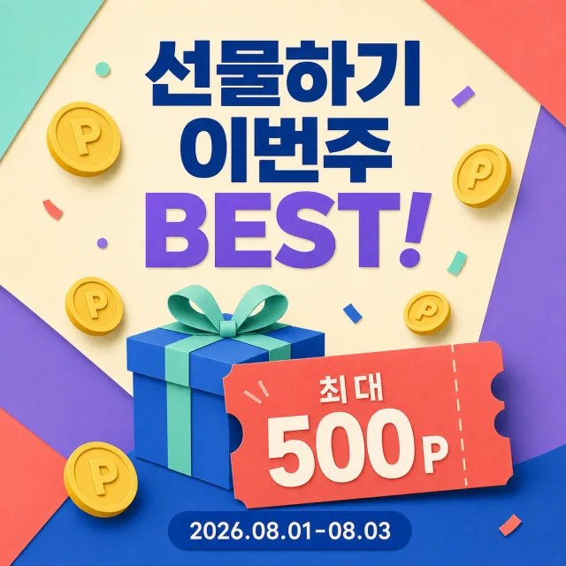
Create a brand-new Korean gift points square promotional graphic.
Accurately display the text “선물하기 이번주 BEST!”“최대 500P”“2026.08.01-08.03”.
Use cobalt blue, coral orange, mint green, creamy white, and violet.
Incorporate cheerful universal gift boxes, floating points coins, and a large 500P coupon.
The Korean title should be bold and centered, suitable for mobile viewing.
Add friendly three-dimensional paper art shapes and restrained paper scraps.
Do not include telecom brands, mascots, logos, URLs, QR codes, watermarks, or fine print.
Output a high-quality static PNG.
【Execution Routing | Do Not Display】
If the image-generation tool can be invoked multiple times: concatenate the sharing rules with A–F separately, execute six times, generating one 1000×1000 square image each time; do not submit all modules at once.
If only one image can be generated per invocation: set the interface or API to a 2:3 portrait orientation and disable Auto mode; a recommended size is 1200×1800. Arrange A/B, C/D, and E/F into a 2-column × 3-row grid of six modules, ensuring equal module sizes and maintaining a 1:1 aspect ratio. If the platform enforces a 1:1 ratio, switch to using an Agent or generate each module individually.
【Sharing Rules】
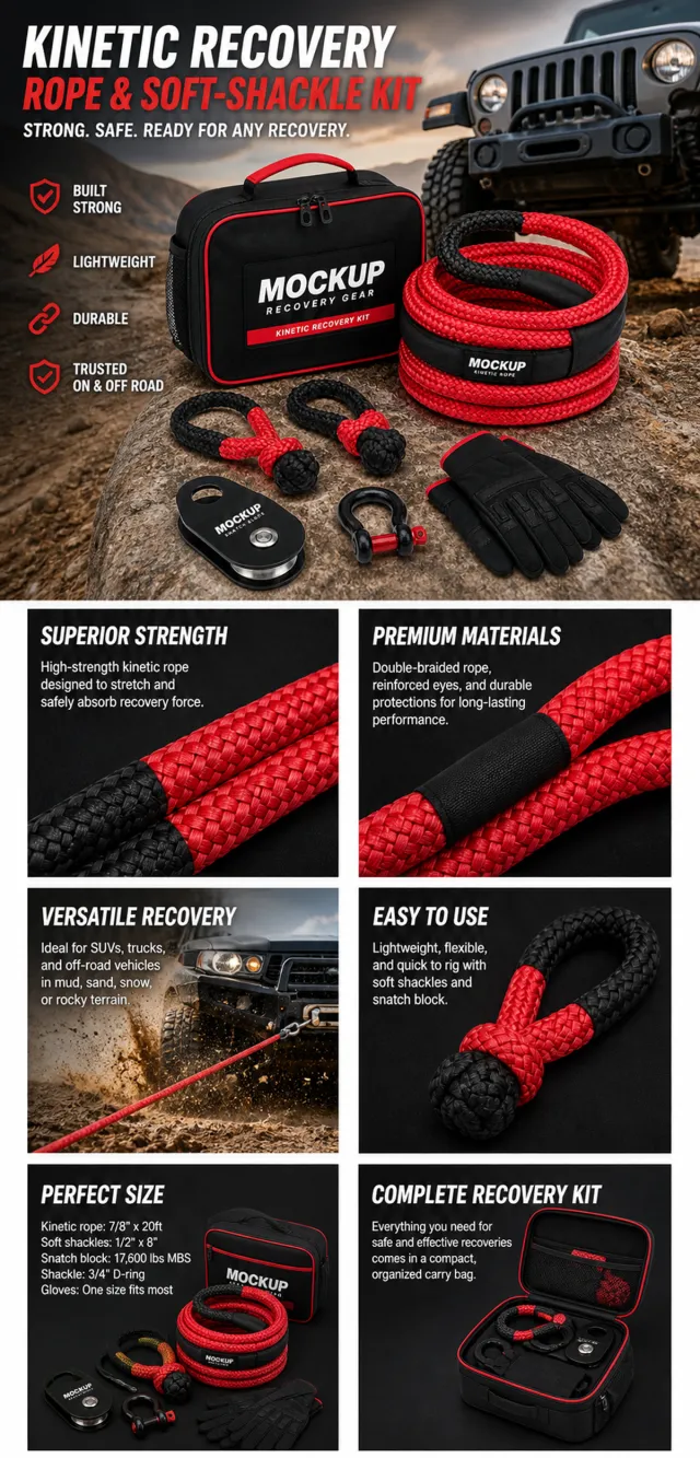
The provided product reference image serves as the sole product basis. Product: vehicle kinetic recovery rope and soft-shackle kit. Copywriting must be in English, with brand placeholders replaced by MOCKUP only. Visuals should employ premium commercial e-commerce photography and stable graphic design. The product’s appearance, structure, color, quantity, accessories, and relative proportions must match the reference image; products, people, icons, and props must maintain natural proportions. All essential information must remain within the safe zone, with the background extending fully across all four edges. External white borders, vertical sidebars, transparent fill-in areas, watermarks, contact details, social media accounts, platform information, original branding, gibberish, irrelevant content, or unverified claims regarding efficacy or specifications are prohibited. Headlines must not be displayed. A–F must not appear.
【A | Core Selling Point】Write concise English copy focusing on this theme, using the full product main visual to highlight core value.
【B | Usage Instructions】Provide brief English copy addressing this theme, illustrating the usage process, assembly relationships, or key operations.
【C | Applicable Scenarios】Present short English copy centered on this theme, showcasing realistic, credible, and product-relevant use cases.
【D | Functional Details】Offer succinct English copy highlighting this theme, using close-up shots, cross-sections, or icons to explain structural and functional specifics.
【E | Daily Maintenance】Craft brief English copy covering this theme, demonstrating methods for use, cleaning, storage, or maintenance.
【F | Specification List】Compose concise English copy addressing this theme, listing materials, specifications, packaging details, or providing credible comparisons—without fabricating parameters.
Create a new original coupon or sale design: high-impact seasonal sale poster with dimensional display lettering, layered paper shapes, confetti, and a clear central offer.
Style: clean commercial graphic, polished and print-ready, with harmonious teal, vermilion, and warm sand.
Layout: Vertical poster composition preserving the source-like hierarchy of headline, large value, supporting line, and date while using entirely new shapes and spacing.
Main text exactly: "기간 한정 세일", "20% 할인", "유효기간 2026.09.30".
Language: Korean and English; keep that language and script only, preserve its natural typographic hierarchy, and do not translate.
Design changes: use a different dominant palette, rearrange icons and patterns, and redesign borders, corners, perforations, shadows, gradients, and decorative angles.
Background: Use a newly colored commercial backdrop with no copied texture or decoration.
Remove every brand, store or platform name, logo, watermark, website, QR code, author mark, barcode, and any note beginning with "*".
Avoid exact copying, original colors, copyrighted elements, random text, tiny unreadable legal text, misspellings, fake logos, and scannable codes.
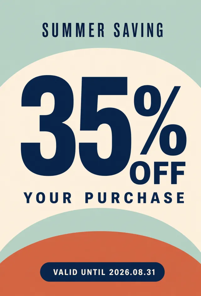
Create a new original English purchase discount poster with clean geometric color blocks.
Style: minimalist fashion-retail graphic, oversized numerals, smooth semicircular layers.
Layout: portrait 2:3 composition with a small seasonal title, huge offer, and rounded validity tab.
Main text: "35% OFF YOUR PURCHASE", "SUMMER SAVING", "VALID UNTIL 2026.08.31".
Language: English only; keep every phrase correctly spelled.
Design changes: use terracotta, pale mint, cream, and midnight blue with a new curved composition.
Background: soft mint field with layered cream and terracotta semicircles.
Remove: watermark, brand logo, QR code, website, author mark, navigation text, and fine print.
Avoid: exact copying, original colors, random tiny text, misspelled text, and copyrighted brand elements.
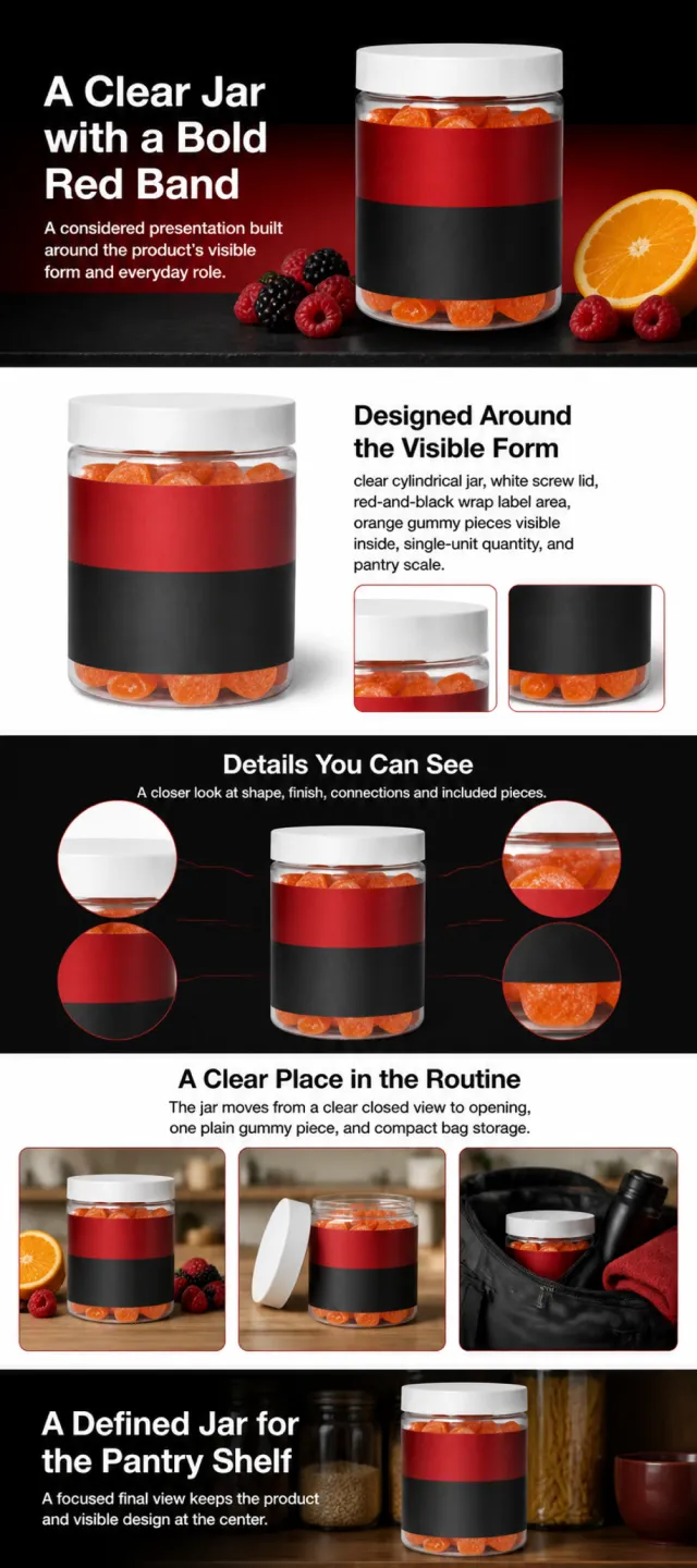
Using the supplied reference image as the sole product reference, create an Amazon A+ design preview for a gummy-supplement jar. Preserve exact geometry, proportions, colors, construction, quantity, accessories, and scale. Visible details: clear cylindrical jar, white screw lid, red-and-black wrap label area, orange gummy pieces visible inside, single-unit quantity, and pantry scale. Do not invent hidden parts or claims.
Visual system: black, vivid red, white, orange, and berry accents. Composition motifs: high-contrast dark panels, red horizontal bands, fruit still lifes, and gym-bag storage scenes. Alternate a wide banner, asymmetric overview, centered detail graphic, three-scene sequence, and wide closing scene. Use readable sans-serif type and mobile-safe margins.
Build this official A+ module order. Keep every module independently complete; never split copy or product details.
MODULE 1 — Image with text overlay — introduction
Exact headline: “A Clear Jar with a Bold Red Band”
Exact supporting copy: “A considered presentation built around the product’s visible form and everyday role.”
Layout: wide image-led hero; dominant complete product and large safe headline area.
MODULE 2 — Single image with side text — product overview
Exact headline: “Designed Around the Visible Form”
Exact supporting copy: “clear cylindrical jar, white screw lid, red-and-black wrap label area, orange gummy pieces visible inside, single-unit quantity, and pantry scale.”
Layout: large three-quarter product, side text field, and two detail crops.
MODULE 3 — Four-image and text — visible evidence
Exact headline: “Details You Can See”
Exact supporting copy: “A closer look at shape, finish, connections and included pieces.”
Layout: centered product with four rounded macro callouts; show only visible facts.
MODULE 4 — Multiple image and text — routine or use setting
Exact headline: “A Clear Place in the Routine”
Exact supporting copy: “The jar moves from a clear closed view to opening, one plain gummy piece, and compact bag storage.”
Layout: three framed scenes with consistent product design and newly generated people or animals only when relevant.
MODULE 5 — Full-width image with text overlay — closing
Exact headline: “A Defined Jar for the Pantry Shelf”
Exact supporting copy: “A focused final view keeps the product and visible design at the center.”
Layout: wide editorial scene, strong silhouette, restrained props, safe text area.
Create one vertical A+ preview at 1200px width with content-driven height, clear module boundaries, and varied compositions for independent export. Render only the exact copy above. Do not add logos, prices, promotions, QR codes, URLs, contacts, competitors, testimonials, ratings, guarantees, unverified claims, certifications, fake UI, watermarks, pseudo-text, or unrelated labels. Keep all elements natural and mobile-safe.
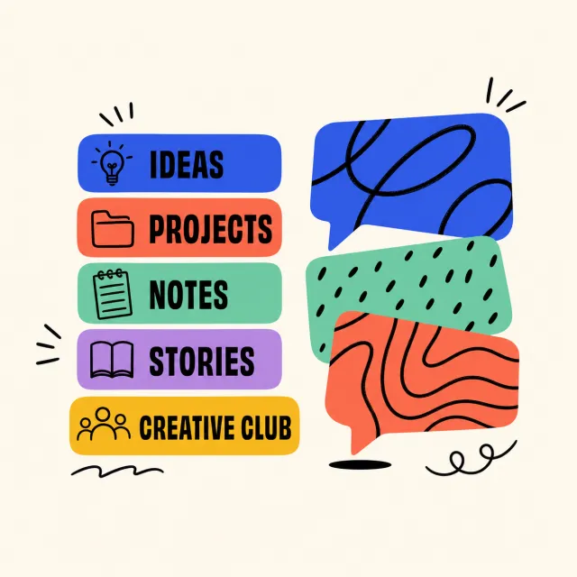
Create a new original English creative-club graphic with stacked labels and abstract speech cards.
Style: clean editorial vector illustration, rounded tabs, hand-drawn black accent lines.
Layout: square canvas with five colorful topic tabs on the left and three overlapping cards on the right.
Main text: "IDEAS", "PROJECTS", "NOTES", "STORIES", "CREATIVE CLUB".
Language: English only; keep every phrase correctly spelled.
Design changes: use cobalt blue, coral, mint, violet, and mustard with a fully rearranged composition.
Background: warm-cream square canvas with generous whitespace around the centered graphic.
Remove: watermark, brand logo, QR code, website, author mark, and signatures.
Avoid: exact copying, original colors, random tiny text, misspelled text, and copyrighted brand elements.