How to write prompts for GPT Image 2.5? A guide to structured image generation and precise editing with PixPix.
GPT Image 2.5 prompts don’t require stacking mysterious keywords. What truly affects the outcome is your ability to clearly articulate the purpose, subject, composition, lighting, materials, and constraints as a well-defined visual task, and during editing, explicitly specify “what to change and what must remain unchanged.”
This article uses PixPix’s currently publicly available GPT Image 2.5 workflow as an entry point, employing an original portable projector example to demonstrate a complete approach—from vague requirements through structured prompts, precise text, multiple reference images, to single-variable editing. The examples and prompts presented here are original educational content and do not reuse the coffee cup or human figure cases from referenced articles.
Quick conclusion: Write the scene first, then add constraints.
A GPT Image 2.5 prompt that’s easy to maintain can be organized in the following order:
Purpose → Subject → Scene → Composition → Lighting & Materials → Precise Text → Items to Keep → Items to Exclude
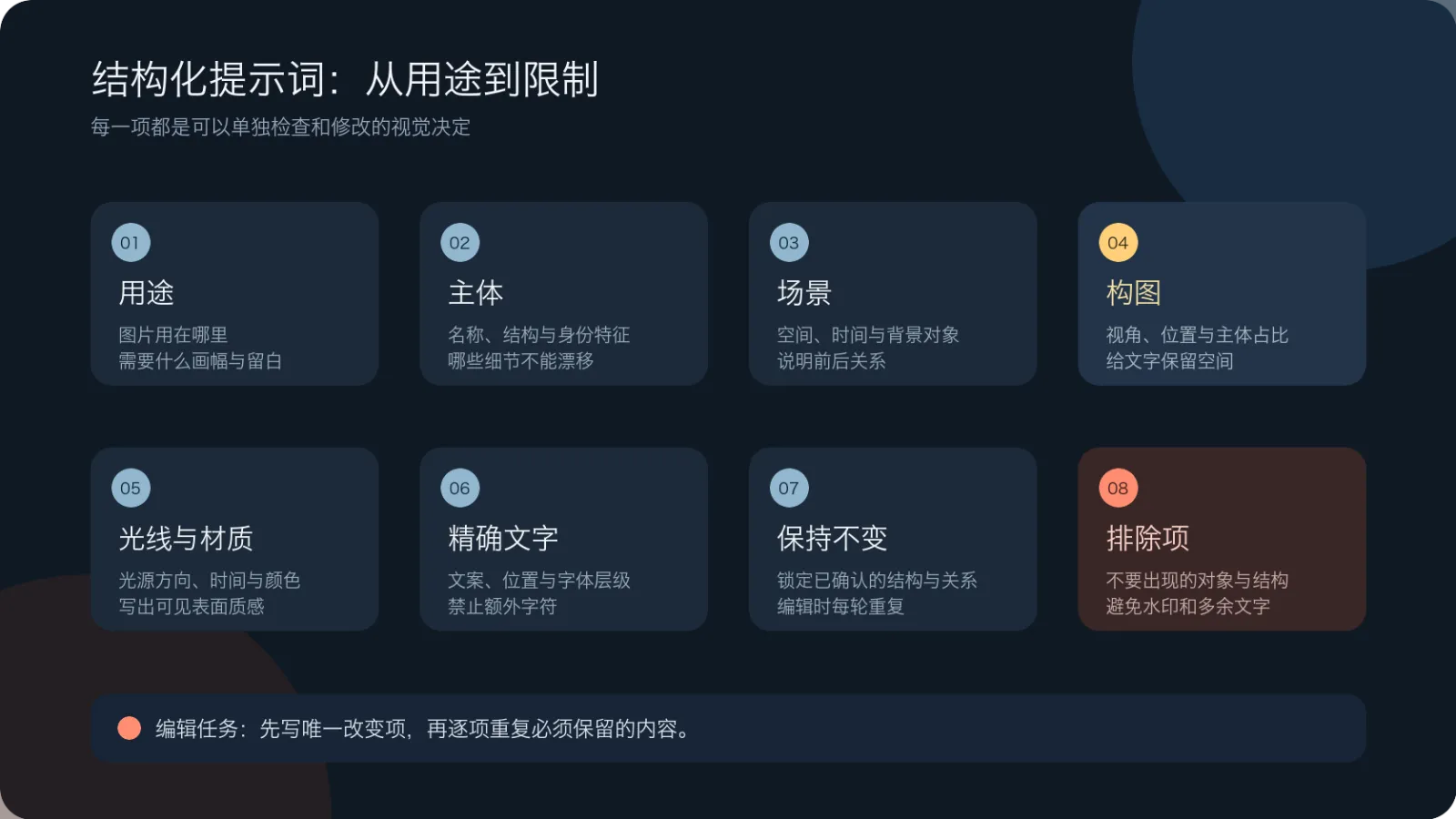
Caption: Eight sections break down the prompt into independently verifiable decisions; when editing, start by specifying the single change, then reiterate what must remain intact.
You don’t necessarily need to fill all eight items every time. For pure text-to-image generation, you can begin with purpose, subject, composition, and visual style; for reference image editing, prioritize listing “changes” and “retentions” at the very beginning.
If you only remember five key principles, keep these in mind:
First tell the model where the image will be used, then describe the scene;
Replace “high-end, warm, cinematic” with tangible elements like lighting, materials, and space;
Enclose text within the image in quotation marks, and specify its position, font style, and any other text that should be avoided;
For multiple reference images, assign roles to each one individually—don’t just say “refer to these images”;
When editing, modify only one major variable at a time, while repeatedly emphasizing what must stay unchanged.
How to choose between GPT Image 2.5’s two models
OpenAI currently divides GPT Image 2.5 into Flare and Sunburst. Both support image generation, editing, and transparent backgrounds, but they serve different purposes.
Model | Official positioning | Tasks better suited for initial experimentation |
|---|---|---|
GPT Image 2.5 Flare | A compact, speed-oriented model | Exploration of directions, everyday materials, batch drafts, rapid iterations |
GPT Image 2.5 Sunburst | A foundational model focused on quality and fine control | Complex compositions, precise editing, important finished works, scenes requiring close scrutiny |
This isn’t a fixed ranking. OpenAI’s official guidance also recommends comparing quality and response times based on your own real-world tasks, since outcomes depend on factors such as prompt wording, reference images, output dimensions, and quality settings.
In PixPix, you can access the workspace from the GPT Image 2.5 model page: upload a reference image or directly describe a new scene, specify your creative requirements, and then refine the output through iterative adjustments. Aspect ratio, quality, and other optional settings are determined by the current workspace interface—don’t assume that simply including “4K” in your prompt will automatically meet delivery standards.
What makes a good prompt?
Purpose: First, clearly tell the model what task the image needs to accomplish.
For the same product, composition requirements differ depending on whether it’s used for a homepage banner, a product detail page, a social media cover, or a packaging concept.
For example, instead of just writing:
A high‑end portable projector image.
it’s better to first clarify:
A 16:9 horizontal main visual for the homepage of a new portable projector, with space reserved at the top left for the title area.
The intended purpose influences the size of the subject, available negative space, direction of gaze, and information hierarchy. This isn’t decorative description—it’s a compositional guideline.
Subject: Clearly define identifying features
If the subject must remain consistent across multiple images, don’t just say “the same product.” Instead, list the specific elements that establish its identity.
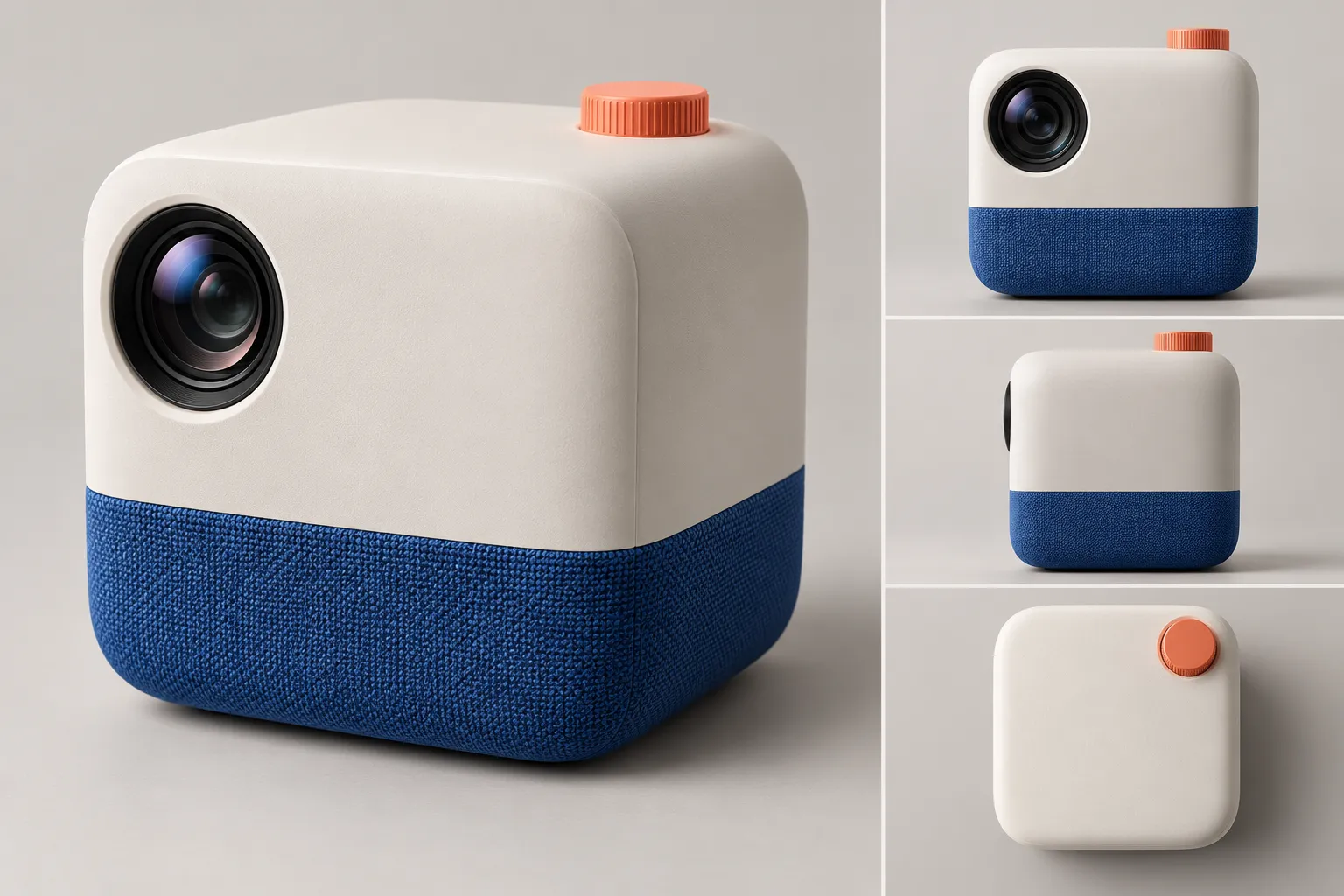
This article uses the original product “LumaCube Portable Projector”:
An ivory‑white, rounded‑corner square body with nearly equal width and height;
A black circular lens positioned at the upper left front;
A cobalt‑blue fabric band encircling the lower part of the body;
Only one coral‑orange knob located at the upper right rear of the top surface;
No actual brand logo, no text labels.
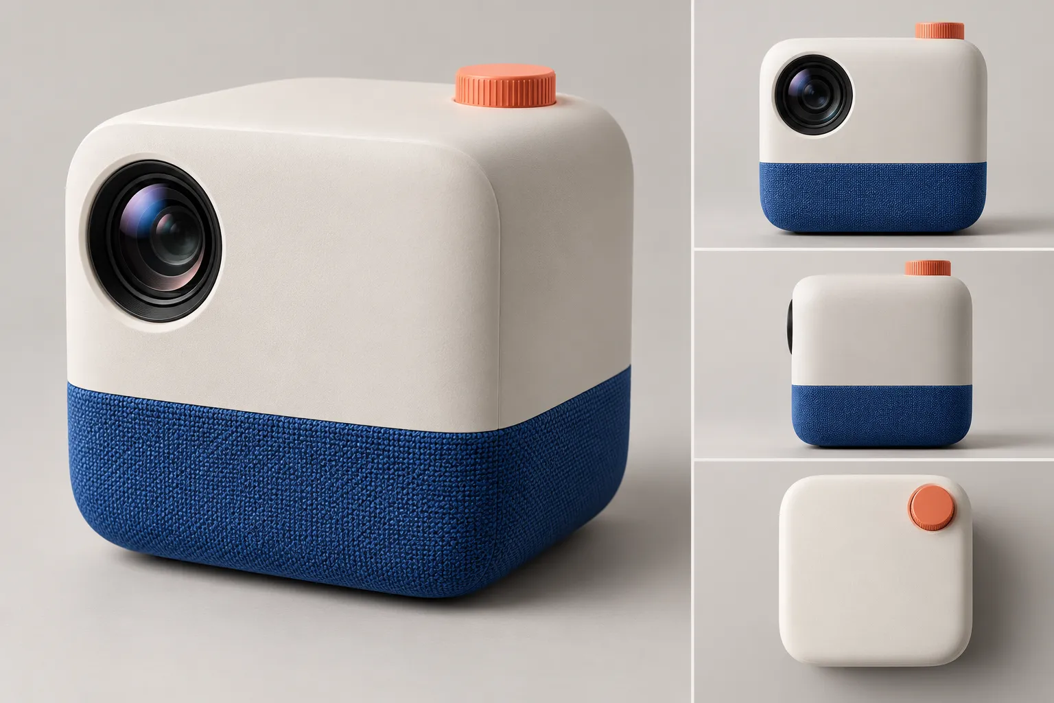
Caption: The master version of the product is fixed with an ivory‑white body, a black lens at the upper left, a cobalt‑blue fabric band, and an orange knob at the upper right rear; subsequent scenes only vary in composition, text, or ambient lighting.
These features serve as anchors for the product’s identity. While the background may change, the positions of the lens, fabric band, and knob must remain fixed.
Composition: Specify where the subject should be placed and how much space it occupies.
A compositional description should address at least three key questions:
From which angle does the camera view the scene?
Where is the subject positioned within the frame, and what proportion of the frame does it occupy?
Which areas require empty space or room for text?
For example:
A slightly elevated three‑quarter perspective, with the projector positioned in the right third of the frame, occupying roughly half the vertical height; leaving a clean, dark wall in the upper left as a title area, while keeping the foreground desk minimal.
“Right third,” “about half the height,” and “left‑upper blank space” are all easily verifiable, far more concrete than vague terms like “sophisticated composition.”
Lighting, materials, and colors: Translate emotions into visible details.
“Warmth,” “futuristic feel,” and “high‑end” are too broad. A more reliable approach is to specify the light source, material textures, and color relationships.
For example:
In the evening, natural light streaming through the large window on the left illuminates the ivory-white body, while a restrained warm orange rim light appears in the rear-right corner; the black glass lens retains clear reflections, and the cobalt-blue fabric band reveals its finely woven texture. The background is dominated by deep blue-gray and warm walnut wood, with no fluorescent colors present.
Each item here corresponds to a verifiable visual outcome.
Original Case: From Vague Requirements to the Landing Page’s Main Visual
Version 1: Only Feelings, No Execution Conditions
Suppose the first prompt is:
Create a high-end, cinematic advertisement image for a portable projector, placed in a living room.
The issue with this prompt isn’t that it’s too short—it’s that “high-end” and “cinematic” haven’t been translated into concrete visuals; nor have the product’s identity, camera position, usage scenario, layout and white space, or exclusion criteria been specified.
The model might generate a beautiful image, but it’s hard to determine whether it suits the landing page, let alone ensure consistency when creating a second version of the same product.
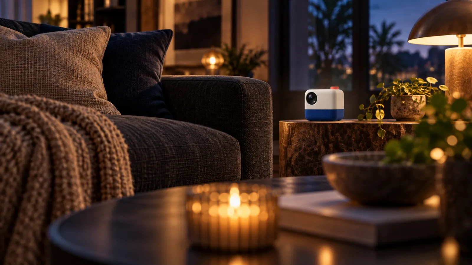
Caption: While the image itself isn’t rough, the product appears too small, the foreground and decorative elements dominate the scene, and there’s no usable whitespace for a headline—clearly indicating that “high-end” and “cinematic” still don’t constitute a complete task.
Version 2: Writing the Visual Task in a Fixed Sequence
It can be rewritten as:
**Purpose:** The homepage banner for a new portable projector, in a 16:9 landscape format, with designated headline space in the upper-left corner.
**Subject:** The original LumaCube portable projector, featuring an ivory-white, rounded-corner square body, a black circular lens at the top-left front, a cobalt-blue fabric band encircling the lower section, and only one coral-orange knob positioned at the rear-right top.
**Scene:** A quiet, modern living room, with the product resting on a low, warm walnut sideboard against a backdrop of subtle micro-cement walls and a softly blurred low-back sofa.
**Composition:** A three-quarter view looking straight up at the product, placing it in the right third of the frame, occupying roughly half the vertical height, while leaving clean wall space in the upper-left corner.
**Lighting and Materials:** Blue-toned evening natural light streaming in from the left window, complemented by soft, warm orange rim lighting from the rear-right; the body has a fine matte finish, the lens is made of genuine black glass, and the fabric texture remains clearly visible.
**Restrictions:** No people, text, logos, remote controls, cables, additional lenses, extra knobs, or secondary projectors; the product’s structure must remain unchanged.
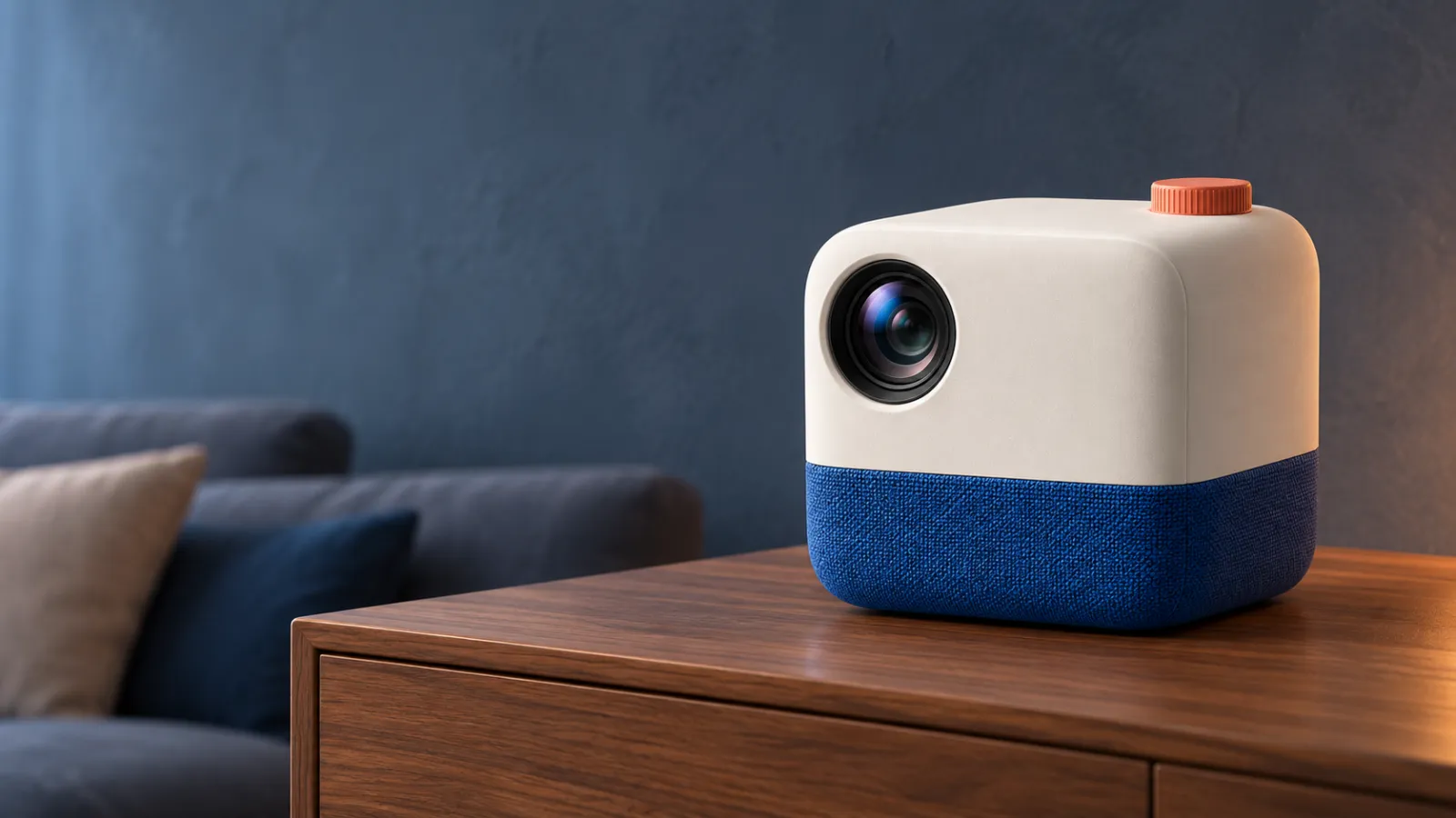
Caption: The structured version explicitly defines purpose, product identity, subject proportion, whitespace, light direction, and materials, making the final image easier to review and further edit.
The value of this prompt lies not in its length, but in the fact that each line can be modified independently. If the product appears too small, simply adjust the composition line; if the scene feels too cold, tweak only the lighting line—without needing to rewrite the entire content.
How to Write Text Within Images
GPT Image 2.5 can process text embedded within images, but “more accurate” doesn’t mean no verification is needed. Headlines, prices, dates, brand names, and regulatory information all require word-for-word checking.
When writing text, provide at least four types of information:
Precise copywriting, enclosed in quotation marks;
Placement of the text within the image;
General style, thickness, and hierarchy of the font;
Explicit prohibition of any other text.
For example, when transforming the previous landing-page main visual into an event poster, you could add:
**Text:** Only two lines of Chinese appear in the upper-left corner. The main title reads “Tonight, Watch the World from Home,” using bold sans-serif typeface; the subtitle says “Cast Your Next Journey,” approximately one-third the size of the main title. Both lines are left-aligned in warm white. No other text, letters, numbers, logos, or watermarks are permitted.
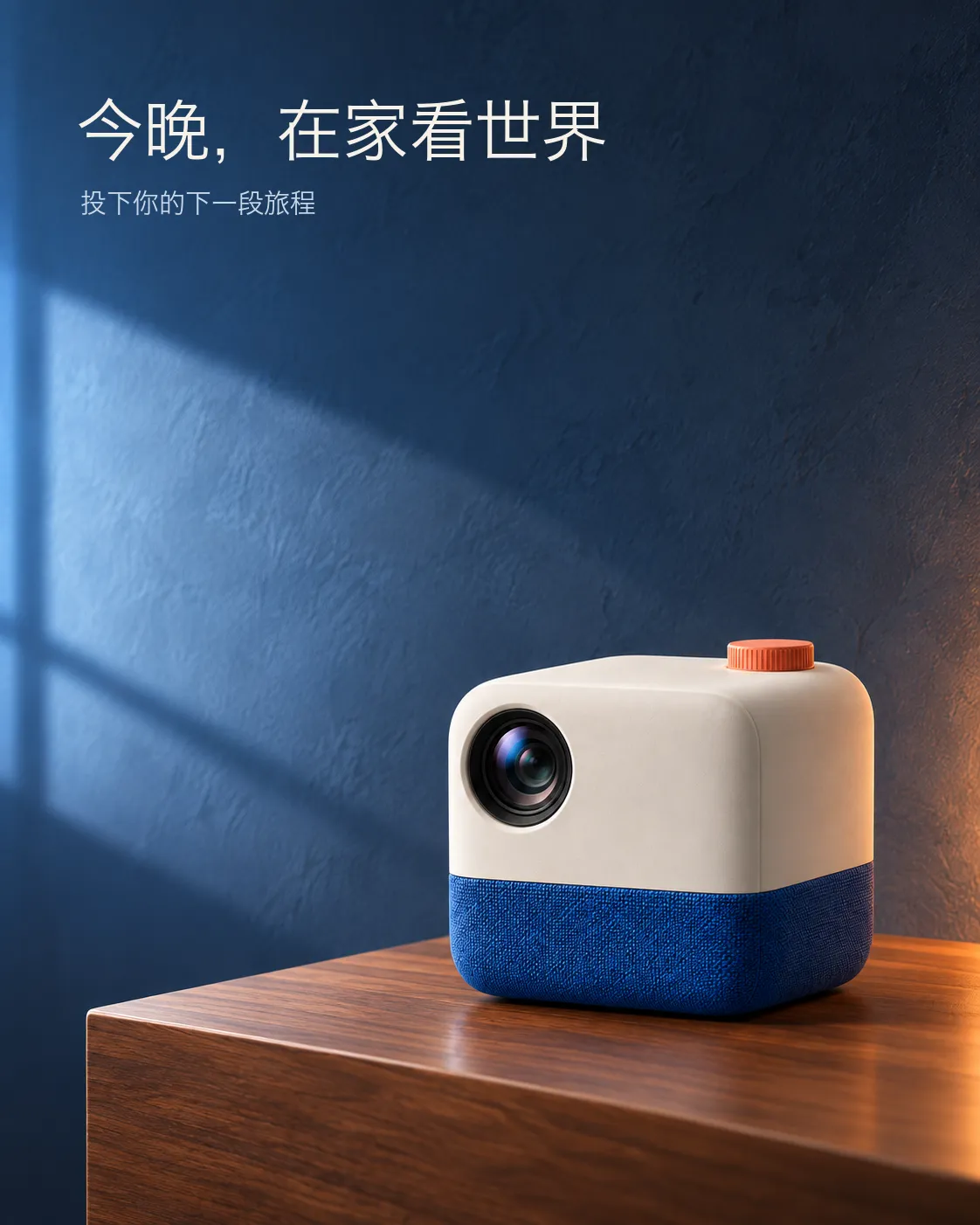
Caption: The poster retains only the designated main and sub-titles, establishing hierarchy through position, font size, and color; however, the copy should still be checked word by word before publication.
If a name is rare, it can be explained letter by letter or character by character. After generation, zoom in to check spelling, punctuation, line breaks, and repeated characters; for important commercial materials, it’s still recommended to finalize typesetting within a design tool.
Assign roles to multiple reference images
When uploading product images, interior references, and color scheme references simultaneously, failing to specify their intended use can easily lead to confusion: the model might copy background textures onto the product, or even bring objects from the color scheme into the scene.
A clearer way to write it would be:
**Reference Image 1: Product Identity.** Retain the projector’s body proportions, lens position, cobalt-blue fabric band, and orange knob.
**Reference Image 2: Spatial Composition.** Only reference the spatial relationships among the sideboard, wall, and sofa—do not replicate any lamps or decorative items present.
**Reference Image 3: Color Reference.** Use only deep blue-gray, warm walnut wood, and restrained orange color schemes—do not copy products shown in the image.
Place the product from Reference Image 1 within the space depicted in Reference Image 2, ensuring that the light direction from the left window aligns with the spatial reference.
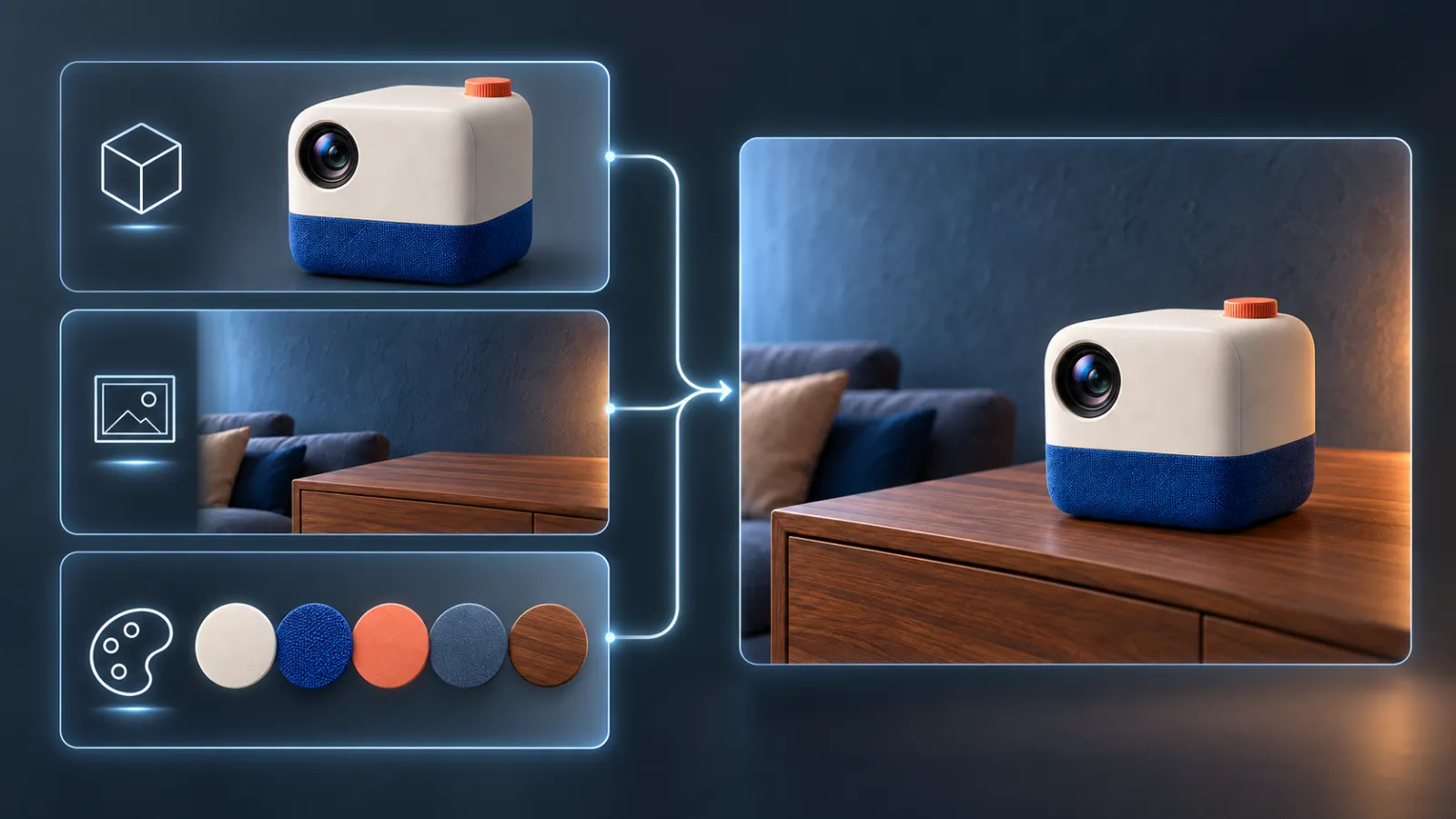
Caption: The first input focuses solely on product identity, the second on spatial composition, and the third on color scheme; the final composite on the right combines all three responsibilities but avoids copying background textures onto the product.
Each reference image has only one primary responsibility, making subsequent troubleshooting much easier.
Precise Editing: First list changes, then reiterate what remains unchanged
The focus of editing prompts differs from that of text-to-image prompts. Rather than describing an entirely new image from scratch, first identify the single change, then lock in the parts that are already correct.
Single-variable editing template
Only change: [a specific object, area, or condition requiring modification].
Keep unchanged: [main identity, composition, camera, lighting, shadows, text, other objects].
Do not add: [elements prone to unintended generation].
For example, changing a living room from evening to morning:
Simply adjust the time outside the window and ambient lighting to morning: replace the dusk sky with a pale blue one, and make the natural light on the left brighter and softer. Keep the projector’s size, position, body structure, lens reflections, cobalt-blue fabric band, orange knob, camera angle, sideboard, sofa, title placement, and shadow contact with the tabletop unchanged. Do not add plants, lamps, people, wires, or a second projector.
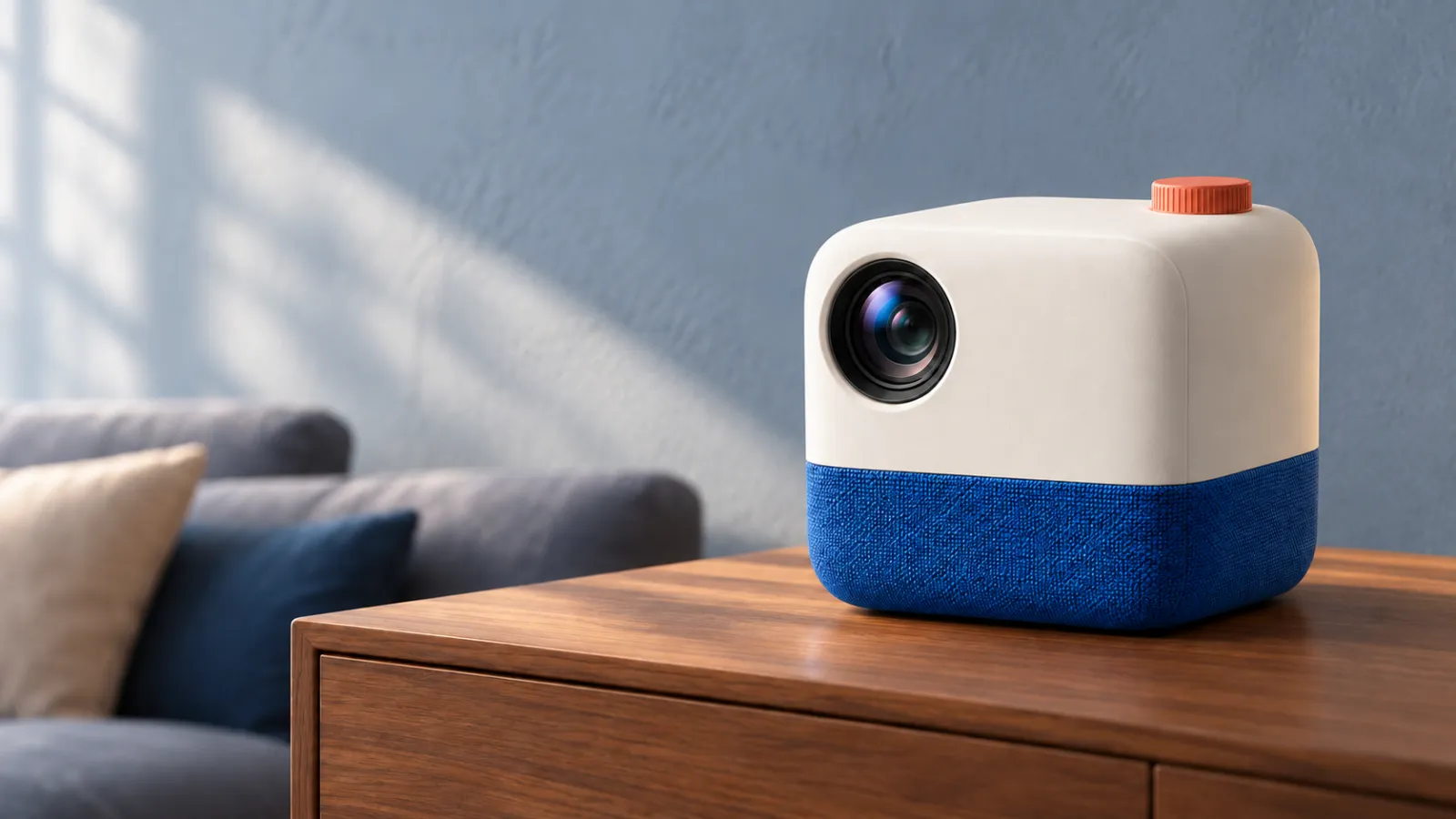
Caption: The revised version merely swaps the bluish evening light for bright morning natural light; the product, sideboard, sofa, composition, and camera position remain consistent.
In the next round, if you need to delete text, do so separately—don’t simultaneously swap furniture, adjust product placement, or alter the weather. By addressing one major variable at a time, you can more clearly determine whether the modifications were successful.
How to fairly compare Flare and Sunburst
If you’re deciding which model to use in PixPix, don’t give Flare a simple prompt while giving Sunburst a complex one, then compare the results.
At least keep these conditions fixed:
Same prompt;
Same set of reference images and upload order;
Same aspect ratio, quality settings, and output quantity;
Same textual content;
No remedial terms targeting a specific model are added in the first round.
Results can be recorded across five dimensions: subject consistency, composition execution, textual accuracy, local editing control, and the number of revision rounds required to achieve an acceptable outcome.
If Flare has already met the delivery standards, it is better suited to continue handling rapid exploration and routine materials; if the task requires close examination of textures, complex typesetting, or strict preservation of pre-edit content, then Sunburst should be tested instead. Conclusions should be based on your actual tasks, rather than merely considering the model names.
Common Errors and Correction Methods
Treating “advanced” as a complete prompt
Correction: Add details such as light sources, material surfaces, color schemes, and negative space to provide a visible basis for the intended mood.
Forcing multiple conflicting objectives into one prompt
Correction: First determine the single purpose of this image. If you need both a white-background product shot, a lifestyle scene, and poster-style layout, these should typically be split into separate tasks.
Multiple reference images lack character descriptions
Correction: Clearly specify for each image “product identity, spatial composition, colors, or materials,” and indicate which elements must not be copied.
Only writing “keep everything else unchanged” during editing
Correction: Explicitly list product structure, character identities, camera settings, shadows, text, and surrounding objects. General phrases may be retained, but they cannot replace a detailed checklist.
Believing that higher quality settings can fix vague requirements
Correction: Quality settings cannot substitute for clear subjects, compositions, and constraints. Refine the prompt first, then compare output settings.
Publishing images directly when they contain text
Correction: Carefully check spelling, numbers, punctuation, prices, and dates word by word. When dealing with brand or regulatory information, use editable typesetting tools to finalize the draft.
Reusable GPT Image 2.5 prompt templates
Purpose: [Image usage location, aspect ratio, and required negative space]
Subject: [People or products and their unchangeable identifying features]
Scene: [Space, time, background objects, and relationships between elements]
Composition: [Camera angle, subject placement, proportion of subject, depth of field]
Style: [Photography, illustration, 3D, or other specific media]
Lighting and Color: [Light source direction, time of day, dominant colors, and excluded hues]
Materials: [Surface characteristics such as metal, glass, fabric, paper, etc.]
Precise Text: “[Content that must appear verbatim],” including position, hierarchy, and font style]
Reference Image Responsibilities: [What Figure 1, Figure 2, and Figure 3 are respectively responsible for]
Unchanged Elements: [Parts that must remain locked during editing]
Exclusions: [Texts, objects, structures, or visual effects that must not appear]
Short tasks do not require mechanically filling every section. The template’s purpose is to help you identify missing decisions, not to make prompts unnecessarily long.
FAQ
Does GPT Image 2.5 require special syntax or weighting?
No. Both OpenAI and relevant articles emphasize clear, coherent, and maintainable natural language. Subject matter, composition, style, and constraints are more important than piling up symbols.
Are the prompt formats for Flare and Sunburst different?
The core approach remains the same. First, compare using the same prompt and reference images, then select the model based on speed, quality, and editing precision—do not adjust the task difficulty for either model in advance.
Can I upload multiple reference images at once?
Yes, but each image should have a clearly defined role. Specify which image is responsible for the subject’s identity, which one handles the scene, and which provides only color schemes, while explicitly stating elements that must not be mixed across images.
Does “keep unchanged” guarantee pixel-perfect consistency?
No. It serves as an editorial constraint rather than a pixel-level guarantee. After each round of modifications, you still need to compare with the previous version to check whether the subject, text, composition, or shadows have shifted.
Which model should I use first in PixPix?
For routine exploration and quick variations, start by testing Flare; when you need complex final outputs or stricter editing control, test Sunburst. The final choice should be based on actual results obtained from the same input.
Summary
The key to GPT Image 2.5 prompts isn’t writing them beautifully, but breaking down visual tasks into verifiable decisions: what the image should do, who the main subject is, how the composition should be arranged, how light and materials are rendered, which text must remain accurate, and what content absolutely cannot be altered.
In PixPix, begin with a well-structured basic prompt, assign roles to each reference image, and then make gradual adjustments through single-variable edits. When deciding between Flare and Sunburst, keep the prompt, reference images, and settings consistent, and evaluate the results according to your own delivery standards.

AI Image Tool Built for E-commerce Teams
For new product launches, advertising, and promotional campaigns, use AI to generate product images, scene visuals, ad creatives, and short video assets — making content production faster.