6 Amazon A+ Content Layout Examples
Amazon A+ Content design starts with deciding what shoppers need to see first. For a storage box, that might be whether it fits inside a cabinet. Divider options and included accessories come next. Give fit, everyday use, and package contents their own space, and each section has a clear job.
The six layouts below pair visual ideas with sample product copy. A storage-box page plan then shows how to combine selected ideas into one page. Use it to choose images, brief your copywriter, and spot information that needs to remain readable on mobile. You do not need all six layouts for every product.
Understand A+ Content types before planning the layout
A+ Content adds enhanced product information to an Amazon detail page. A module is a block you can add in A+ Content Manager, such as an image-and-text block or a comparison chart. A layout is your editorial arrangement of that content.
Content type | What matters for this guide |
|---|---|
Basic A+ | Up to five modules per ASIN, with options for images, text, comparison charts, and more |
Premium A+ | Up to seven modules per ASIN, with additional options such as video, hotspots, carousels, and Q&A; eligibility requirements apply |
Brand Story | A separate brand-story area, rather than an extra ordinary image module inside Basic A+ |
The six layouts in this article are design suggestions, not six official Amazon module names. The original AI-generated illustrations show ways to organize content. They are not Seller Central screenshots or real brand case studies.
Check which modules are available in A+ Content Manager, then write down the buying questions your page needs to answer. If cabinet fit is the main concern, a dimension explanation deserves an earlier position than a brand mood image.
Six Amazon A+ layouts and the product questions they answer
1. A lifestyle layout that introduces one use
A lifestyle image helps shoppers understand where a product belongs. Place a coffee grinder on a coffee counter, with a small cup nearby and few background props. The grinder should draw attention before the setting does.
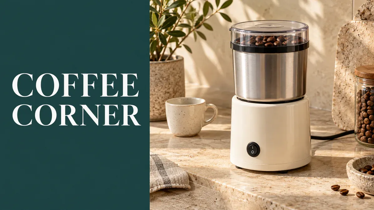
A coffee-grinder lifestyle layout pairs a short heading with a clear product scene.
A suitable heading might be A grinder for your coffee corner. Follow it with a factual use description, such as grinding coffee beans as part of a daily brewing routine, if that matches the product. Do not casually add “works with every brewing method” or “professional-grade grind consistency.” Those are separate claims that need product evidence.
If you have a clean product photo but no lifestyle shot, bring the front view and a scene brief to the product image set tool. Specify the background, countertop, and product orientation. Choose an output that matches the real item; the opening section does not need the entire generated image set.
2. A detail layout that identifies a specific feature
Clothing details benefit from close-ups. A shirt's front placket, cuffs, and back pleats do not all need to compete for attention in one full-length model shot. Pick two features worth showing and give each a clear photograph.
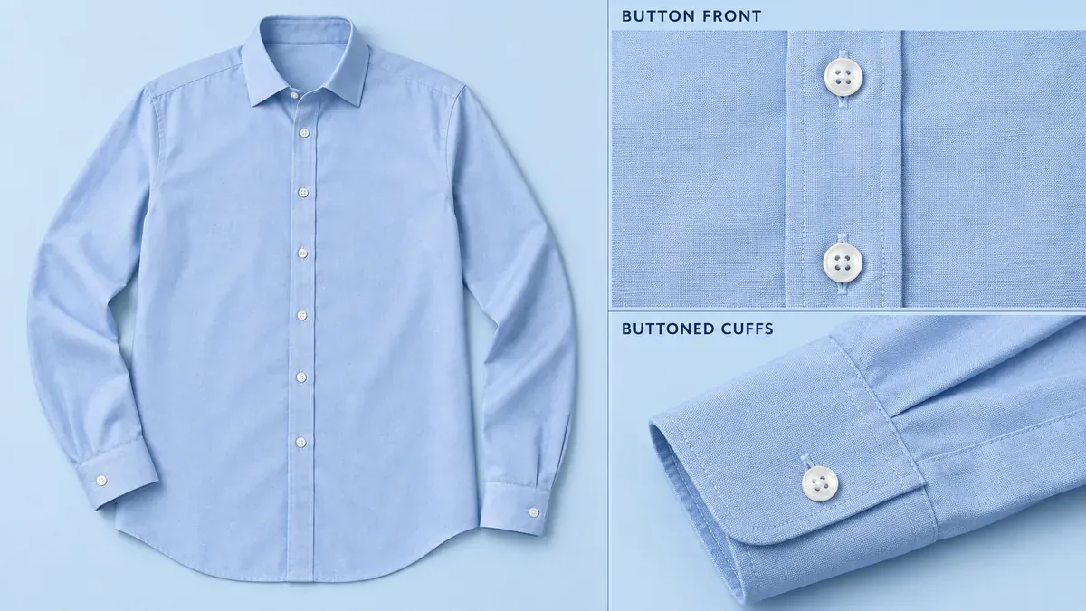
A shirt overview sits beside separate close-ups of the button front and buttoned cuff.
“Exquisite craftsmanship and exceptional quality” tells a shopper very little. If the item and photos support it, Button front with buttoned cuffs is more useful. Care instructions, fabric composition, and wrinkle resistance need their own evidence; a close-up cannot establish them.
Keep each callout line attached to one feature instead of drawing it across the whole garment. For background specks or dust picked up during a shoot, use product retouching while preserving the actual seams, buttons, and pleats. Loose threads or damage on the item itself should be dealt with on the product, not concealed in the image.
3. A step-by-step layout with action-based copy
Assembly, opening, and preparation are good candidates for a sequence. The grinder example shows adding beans, closing the lid and grinding, then unplugging before removing the cup. Follow the product manual and keep every component consistent from frame to frame.
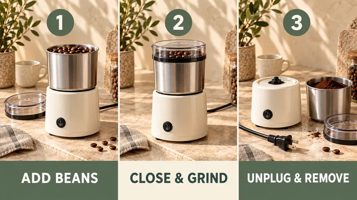
Three-step layout illustration: add beans, close and grind, then unplug and remove; use separate images and text fields in the actual A+ module.
Short action labels work well: Add beans, Close & grind, and Unplug & remove. Put operating conditions beside the relevant action. If the grinder must be stopped and disconnected before removing the cup, that instruction should not appear only in fine print at the end of the page. Fill in loading limits, run times, and cleaning instructions from that model's manual, not another listing.
The illustration places the steps side by side to show their order. For the actual module, export three action images separately and enter each instruction in its own text field. Choose a suitable multi-image module in the editor. The sequence should still make sense if it stacks vertically on mobile. Uploading the entire illustration as one A+ image would make the words shrink along with the photos.
4. A fit layout that connects measurements to available space
A storage box labeled “Large” still leaves shoppers guessing about cabinet fit. Show width, depth, and height separately, then show where to measure the shelf or cabinet. Exterior dimensions, usable interior space, and clearance for a drawer to open are different measurements.
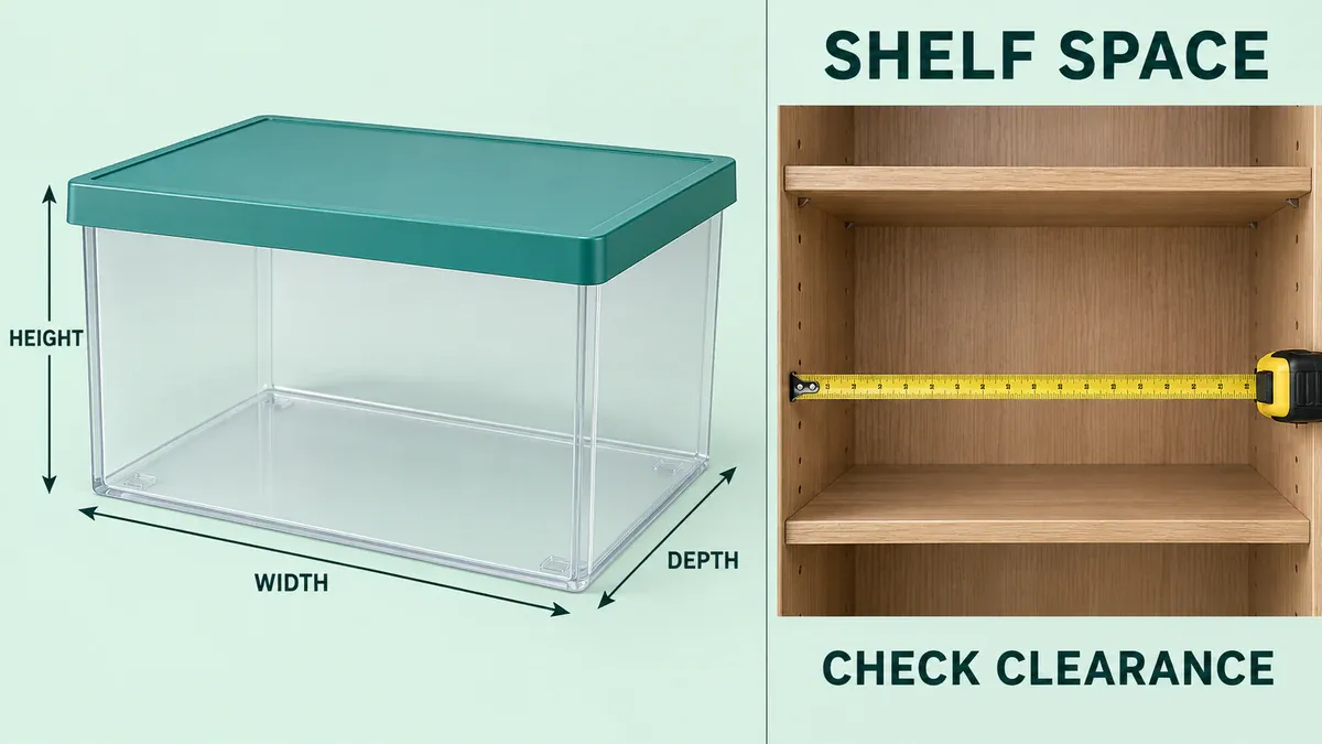
The storage-box illustration separates width, depth, and height from the available shelf space.
Try a heading such as Measure your shelf before choosing. Use confirmed exterior dimensions in the copy and explain any relevant clearance around handles, doors, or pipes. Measurements must come from the real item or manufacturer specifications, not proportions in an AI-generated scene.
The example uses Width, Depth, and Height to explain directions without inventing numbers. Add the real model's measurements when preparing product content. Do not make a box appear to fit by shrinking it, enlarging the cabinet, or cropping away the space needed to open it.
5. A package-contents layout that makes every item countable
For a bundle, answer the straightforward question: what will arrive? This example contains a storage box, a matching lid, and two dividers. Set the lid beside the open box and show both dividers completely, so shoppers can count the pieces without guessing.
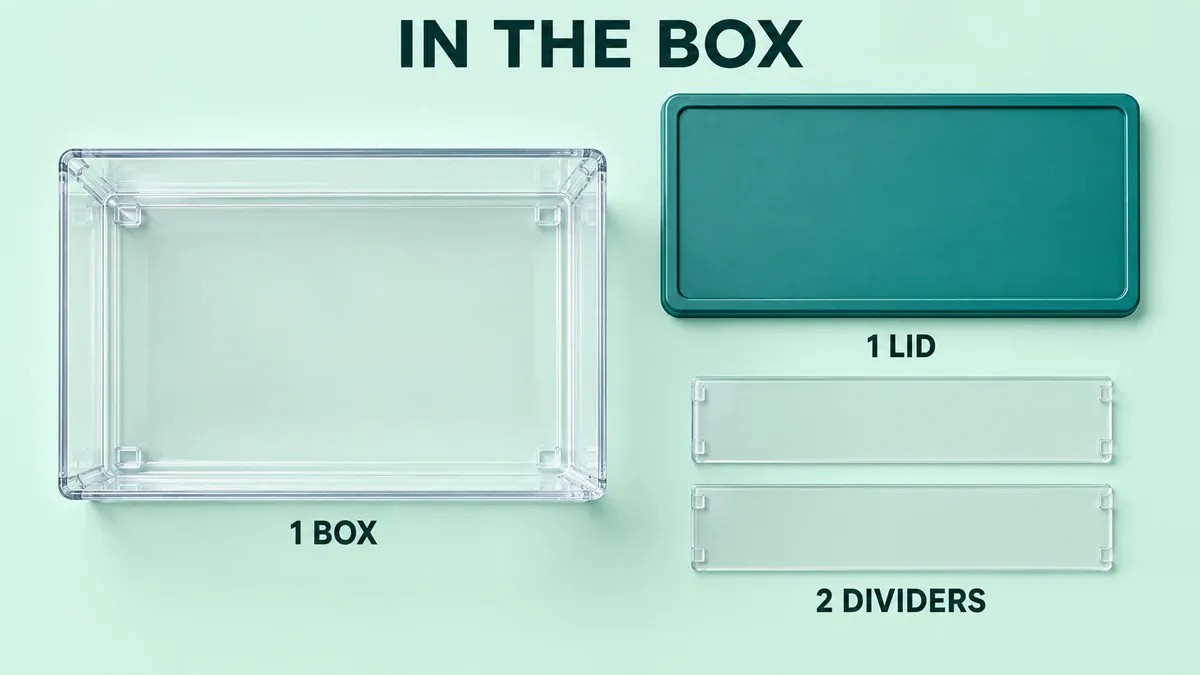
The illustrated set contains one box, one matching lid, and two separate divider panels.
The copy can be equally simple: In the box: 1 storage box, 1 lid, 2 dividers. That is the demonstration set shown here. When switching products, update both the image and the inventory text.
Keep decorative vases, clothes, or coffee beans outside an “In the box” area if they are only styling props. This section does not need to explain every product feature again. Its job is to make the included contents clear.
6. A comparison layout focused on meaningful model differences
If your brand sells two storage-box models, a comparison chart can help shoppers choose. Use real model names as columns and relevant differences as rows: exterior dimensions, divider configuration, or clearance requirements. Apply the same units and definitions across each row.
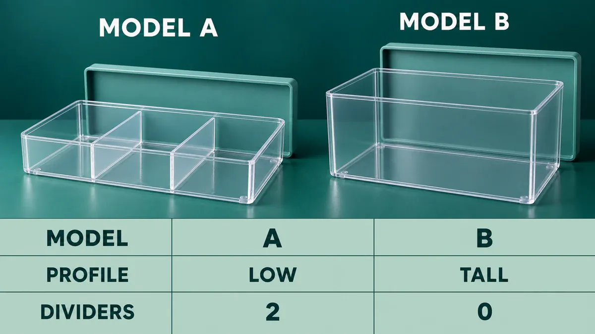
Illustrative Model A has a low profile and two dividers; Model B is taller and has no dividers.
Filling every cell with “Excellent” does not help someone choose a model. Use specific differences. The table below is a fill-in structure; bracketed text is not finished product information.
Comparison point | Model A | Model B |
|---|---|---|
Exterior dimensions | [Measured width × depth × height] | [Measured width × depth × height, same units] |
Dividers included | [Actual package configuration] | [Actual package configuration] |
Fit requirements | [Required clearance or installation conditions] | [Required clearance or installation conditions] |
Build the actual A+ comparison chart in the editor using the relevant products and approved specifications. Compare your own related products, not named competitors or invented “us versus other brands” claims. Two or three columns are enough for a small range.
Combine selected layouts into a five-module page
For a first-time storage-box buyer, start with fit, then show organization and included accessories. Here is one Basic A+ content plan, to be assembled using the modules available in your editor.
Position | Content | Suggested image-and-text format | Buyer question |
|---|---|---|---|
1 | Fit | Dimension image with separate explanatory text | Will it fit in my cabinet? |
2 | Everyday use | One lifestyle image with heading and body copy | How will it help me organize the space? |
3 | Details | Close-ups with individual feature descriptions | What do the lid, handles, or dividers look like? |
4 | Package contents | Flat lay with an inventory list | What is included in this purchase? |
5 | Model comparison | A comparison chart in the editor | Is another model from this brand a better fit? |
Delete the fifth section if there is no other model. Four useful modules are better than repeating a photo to fill five slots. Clothing may need an on-body view before details and sizing; a small appliance may need operating steps earlier. Let the product determine the order instead of opening every page with a brand story.
Once the order is set, bring your original product photos, verified feature copy, and an image brief for each module to the AI A+ detail-page tool. Give each image a concrete task, such as “Show the storage box inside a cabinet, keep the entire box visible, and do not generate dimension numbers.” “Create a high-converting page” is not a usable visual brief by itself.
Check each output against the original product photos: lid construction, divider count, proportions, and appearance. Verified feature copy means descriptions checked against the item, manufacturer specifications, or its manual. Add dimensions from those specifications separately; do not trust numbers generated inside an image.
For example, a handoff folder called “01 Fit module” could contain a product image without dimension numbers, a text file with confirmed exterior width, depth, and height, and the measurement record or specification sheet. Upload the image and enter the text separately. In preview, check for cropping, correct measurement labels, and consistent units. This is easier to review than a single long image filled with numbers.
Export the remaining module images separately, size them to the requirements of the selected Amazon modules, and keep headings and body copy in separate text files. Assemble them in A+ Content Manager. PixPix produces visual assets; generating a long image does not create or submit an Amazon A+ page.
Check Amazon A+ Content at normal mobile reading size
Wide images shrink on mobile, and some modules rearrange their content. Put headings and explanations in the editor's text fields where possible. Images can show the product, action, or position without carrying every sentence inside their pixels.
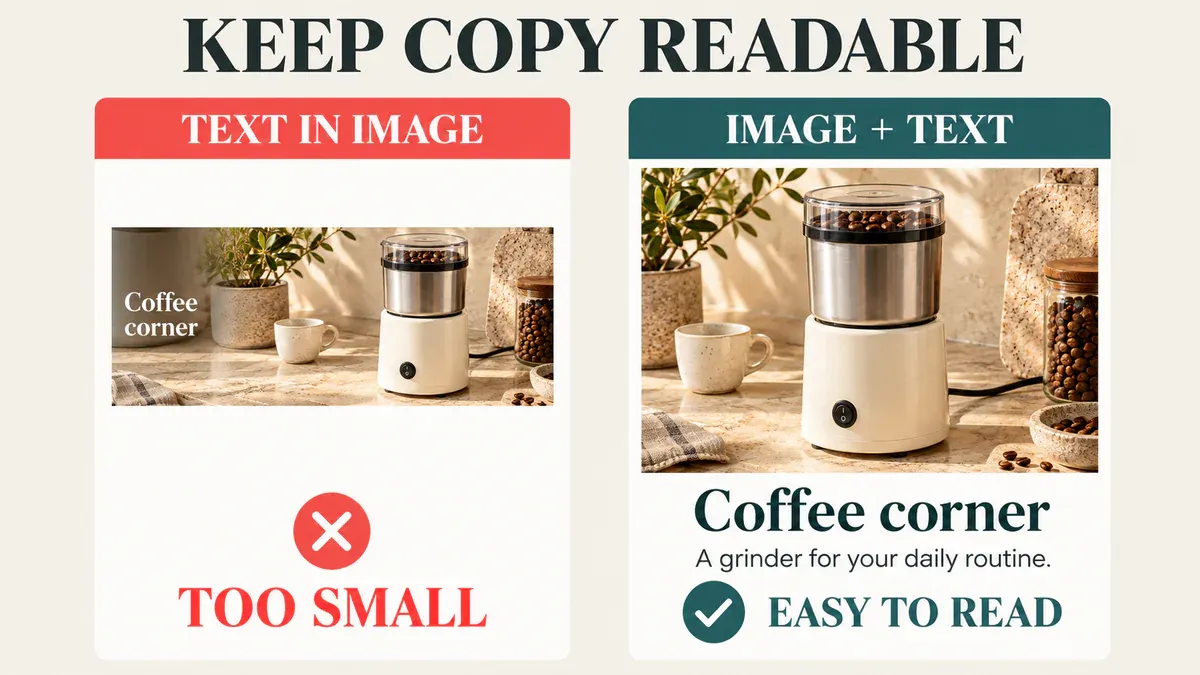
Mobile readability comparison: text inside a wide banner becomes small, while separate copy remains easier to read.
Open both desktop and mobile previews in A+ Content Manager. Review them at a normal browsing size instead of zooming in to make the page work. If a sentence is unreadable, shorten it or move it into a separate text field. If a product edge is cropped, adjust that module's composition. Where a module provides a separate mobile-image input, follow its requirements; do not assume one file always adapts automatically.
Send the reviewer the image files, headings and body copy, sources for product specifications, and module order together. Before submitting, check model names, units, and included quantities. Do not add discounts, off-Amazon URLs, QR codes, contact details, competitor comparisons, or wording such as “best-selling” and “top-rated” to your A+ copy or images.
Amazon A+ Content design FAQ
1. Can I reuse secondary listing images in A+ Content?
You can reuse relevant product photography, but reassess its purpose and dimensions in A+. A secondary image packed with small text is a poor fit for a smaller module. Start with the text-free original where possible and use A+ to answer remaining buyer questions rather than repeat the whole gallery.
2. Should every A+ module repeat the product name and target keywords?
No. Use accurate product, component, and use-case terms where they help the explanation. Do not force the same phrase into every block. Image keywords or alt text should describe the corresponding image, not hold a list of unrelated search terms. They do not replace normal optimization of the product title, bullet points, and other listing fields.
3. Can several colors or models share the same A+ Content?
Consider sharing content only when it applies in full, after checking every image, specification, accessory, and description. Even a color-only variation should not show a white item on a blue item's page without a clear explanation. Models with different construction or package contents need matching information. A comparison chart can explain differences, but it cannot replace accurate details for each model.
References: Amazon A+ Content design guide · Amazon A+ Content types · Amazon A+ Content guidelines

AI Image Tool Built for E-commerce Teams
For new product launches, advertising, and promotional campaigns, use AI to generate product images, scene visuals, ad creatives, and short video assets — making content production faster.